Ongoing project since 2013
Bestiario Sushi Bar is a restaurant located in the City of Aguascalientes, Mexico. Before its opening, I was entrusted with the proposal of the name, logo design, branding and advertising design.
In this publication I show the creative process that goes from "naming", the design of the graphic identity to the product photography, menu design, uniforms and promotional material. I currently do content and graphic design for weekly posts on their social media. At the end of this article I show some examples of how I am using the graphic style in advertising and other applications.
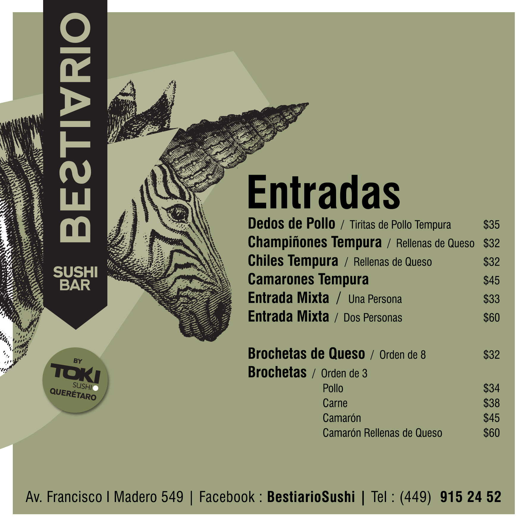
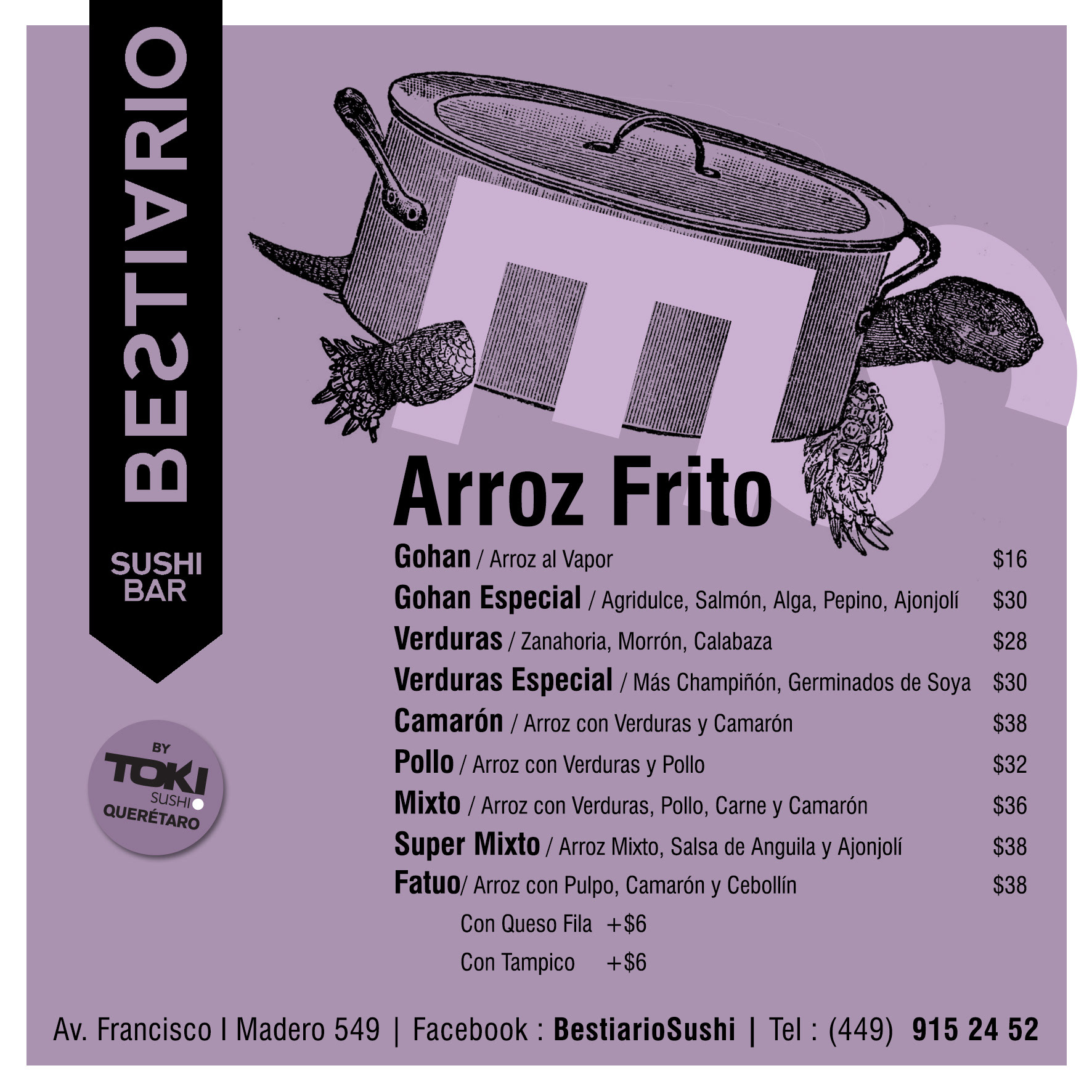
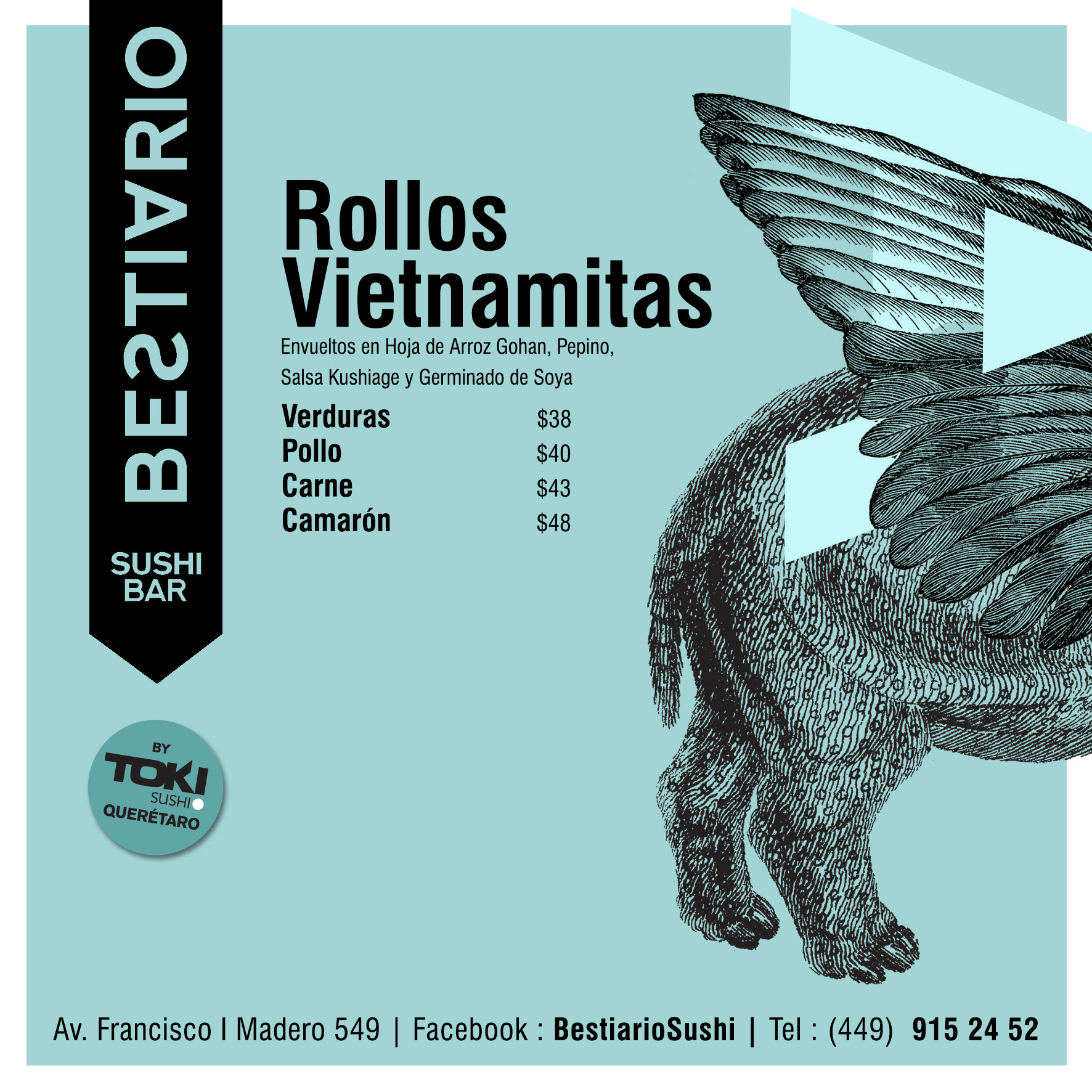
"BESTIARIO", the naming
My client was restoring an old house in the Historic Center of the City of Aguascalientes when he proposed to work on the "naming" and logo design for his future restaurant. The architect was giving it an urban, raw and minimalist touch, respecting the essence of the house that dates back to the 50s and its style is very characteristic in this area of the city.
I set out to find a name that had no relation to sushi or Japanese food. I wanted something that had strength and personality. A name that would give rise to create a graphic concept around it. I made a list with some possibilities that I remember some female names and cities like "Malibu", but none really convinced us.
I then focused on what distinguished my client and it was that in this place two cuisines would constantly mix: Mexican and Japanese. Sushi would be "Mexicanized" and there would be new creations, new "creatures." This is how "Bestiario" came to my mind, I thought that this name had great possibilities to create a whole ecosystem of interesting graphics and my client agreed that it was a perfect name for the project.
Once I had the name ready, I started with ideas for the logo.
The logo
When I am in the process of designing logos and corporate identity, I always keep in mind what my client offers, a product or service, and what differentiates it from its competition. I also like to take into account the context and who your potential customers will be, where they will see the logo and the advertising.
Inspired by the name and the essence of the restaurant, I also wanted to replicate the fact of building new "creatures" by mixing graphic elements. I would avoid obvious things like oriental fonts, chopsticks, sushi rolls, etc. for sure.
At first I thought about the possibility of experimenting with collages. Give weight to the illustrations resulting from these "mixtures" of images. So I needed a logo that was simple and very clear so that it would not compete with the illustrations but would accompany them.
A stamp or engraving...
José Guadalupe Posada was born in the City of Aguascalientes, he worked illustrating newspapers and used the engraving technique. In 1910 he created "La Catrina", a character that Diego Rivera made famous in 1947 by depicting her in his mural "Dream of a Sunday afternoon in Alameda Central" and which today is a piece of great importance in Mexican popular history.
Both Posada and "La Catrina" are true icons in the City of Aguascalientes, so much so that each year they are paid well-deserved tribute with a great cultural festival that coincides with the Day of the Dead.
Inspired by the aesthetics of the engravings and taking these facts into account, I made the first proposals.
I also played with organic shapes and vintage type styles.
Criatures
I looked for different possibilities by experimenting with a sans serif typeface and added small elements that suggest parts of animals or "creatures and beasts".
Using this same typeface I played with the letters of the name, combined them, repeated and joined them to create some "creatures".
Simplicity
When I got here I thought that the most important thing in this logo would be legibility and that the time to play with the "beasts and creatures" would be when working on the illustrations.
I opted not to use additional elements in the typeface, but to simply modify some characters, subtly showing that there is something "weird" in the name.
I reflected the S horizontally, which since I was a child reminds me of a snake or an eel. I also vertically mirrored the A, which may well represent a simplified figure of the head of a cow or the head of a fish.
To continue the idea of "engraving" or stamp, I reversed the letters on a black background.
At this point in the process I had a conversation with the architect where we talked about the facade. We thought about making a vertical version of the logo so that it would hang on the wall as a pennant and be more visible. So I rotated it and added the descriptive.
I immediately did tests applying this vertical format of the logo in some photographs and illustrations that I would use for the publicity of the opening and I saw that it worked well so I presented it to my client and it seemed like a good idea. We already had a name and logo ready. Now I kept applying it.
BESTIARIO
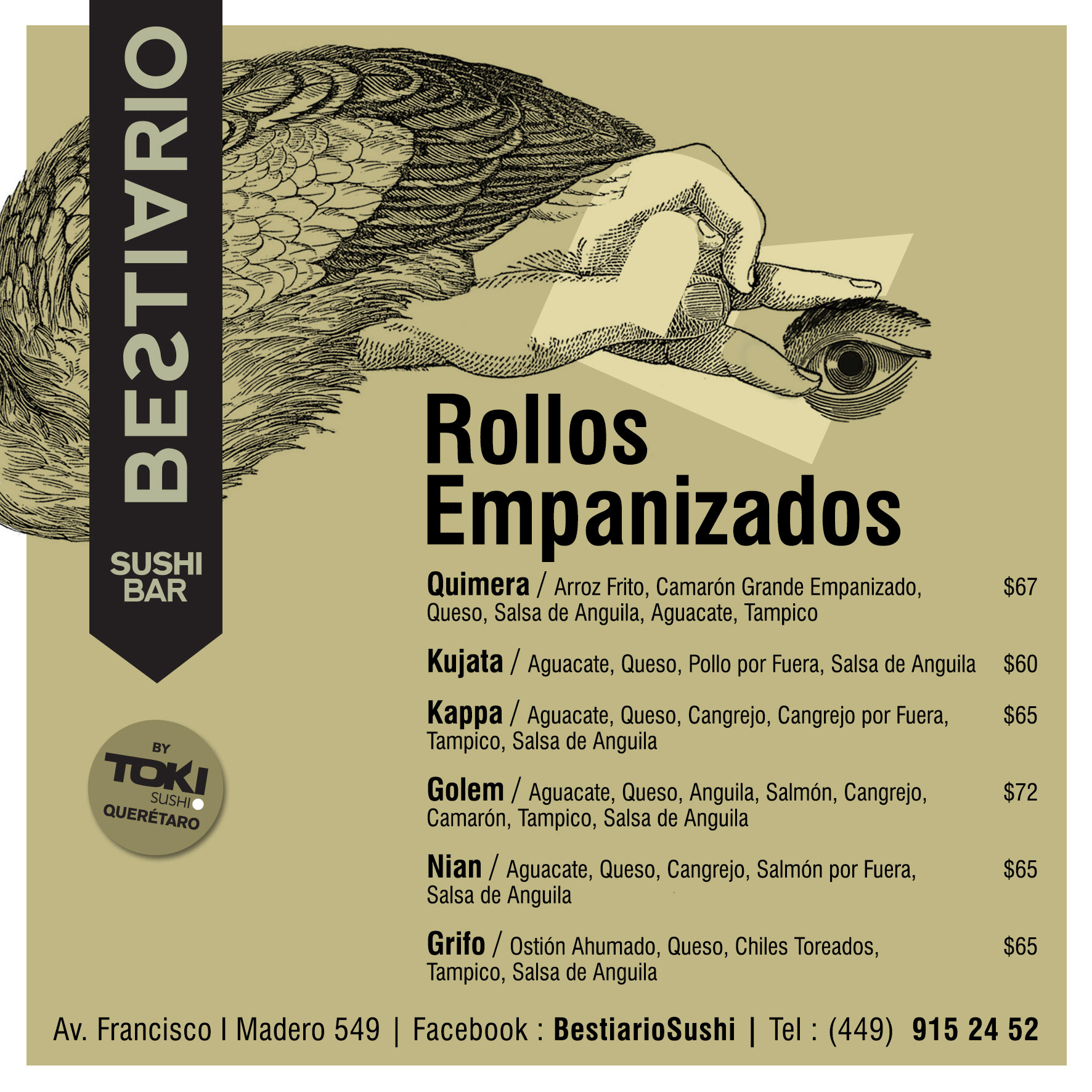
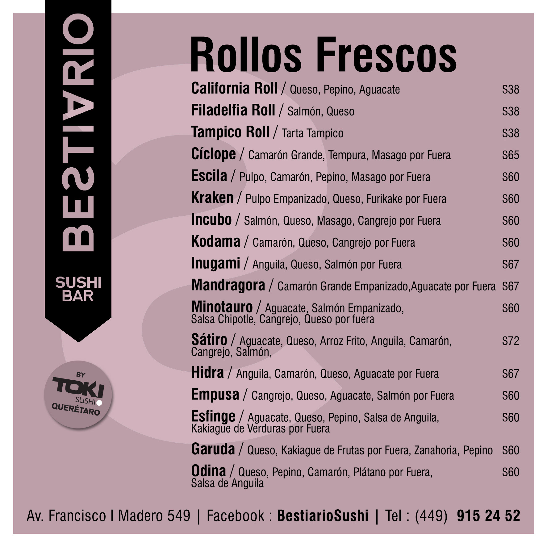
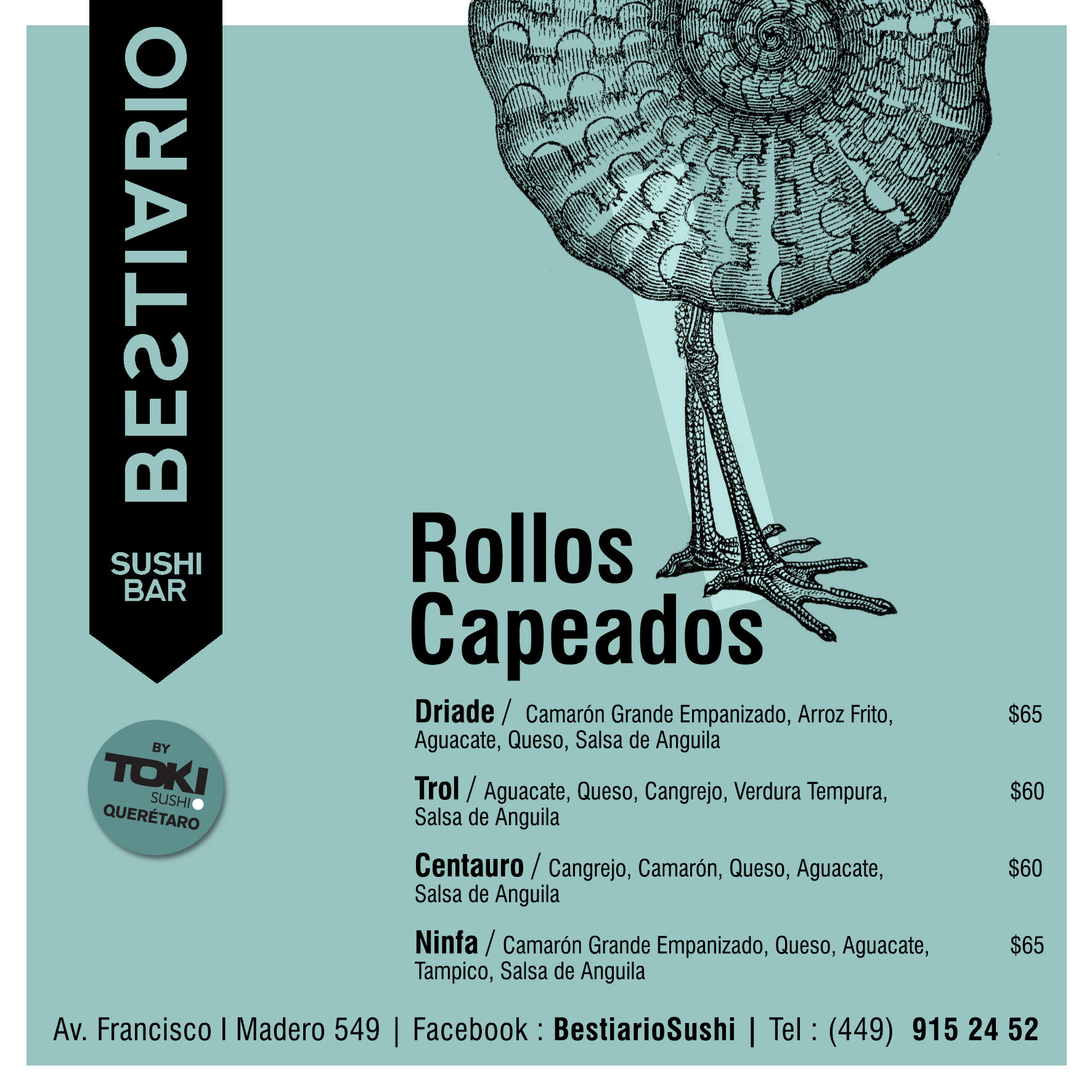
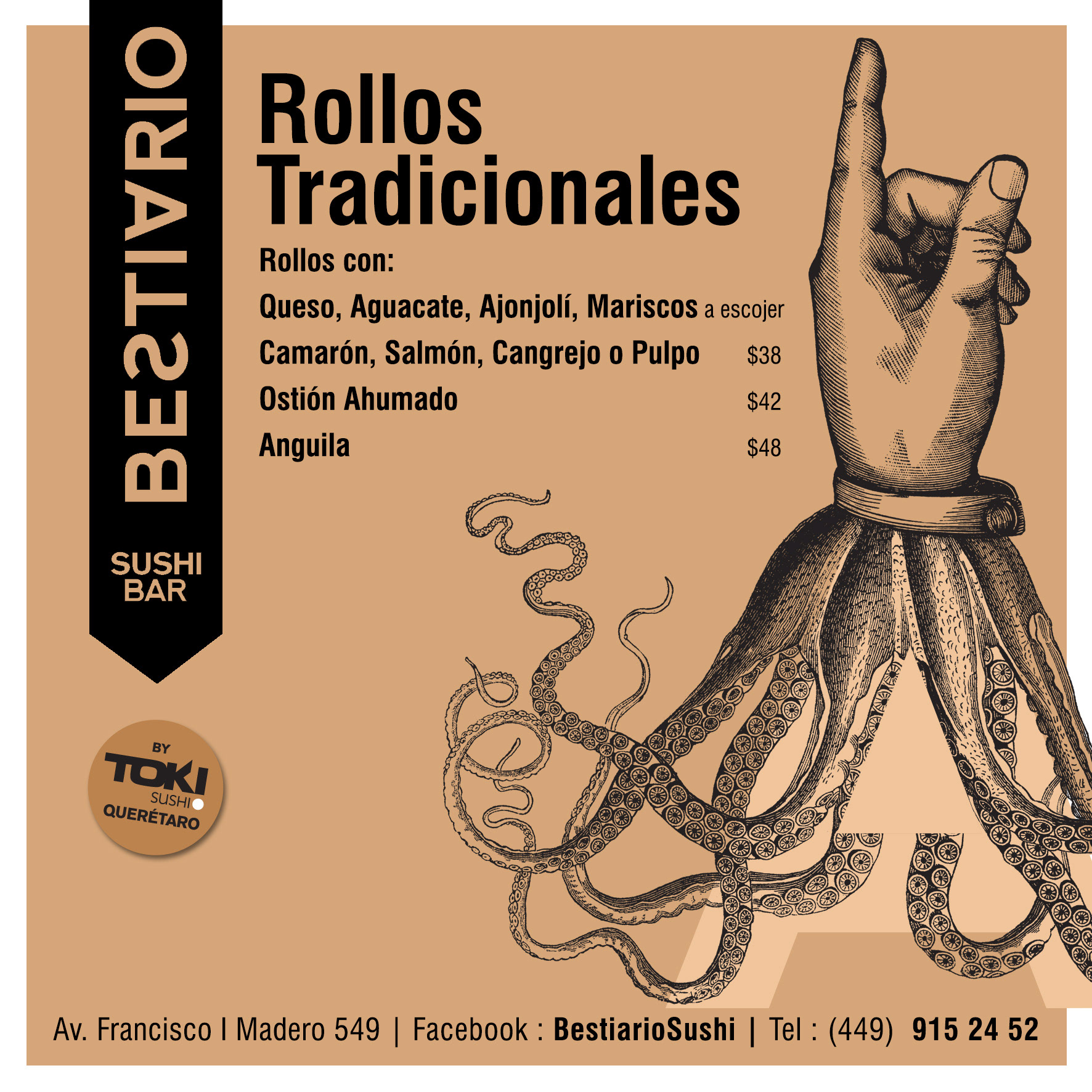
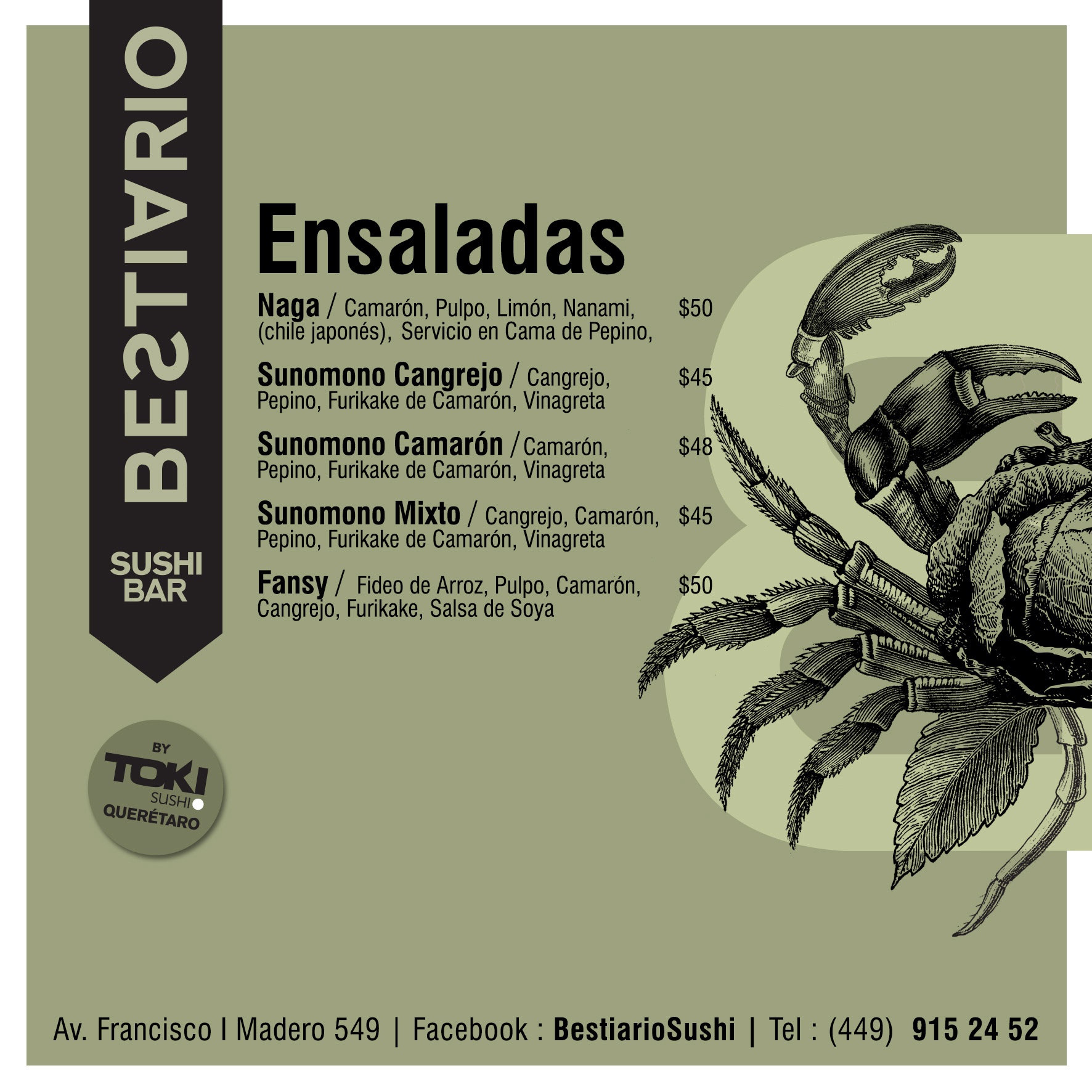
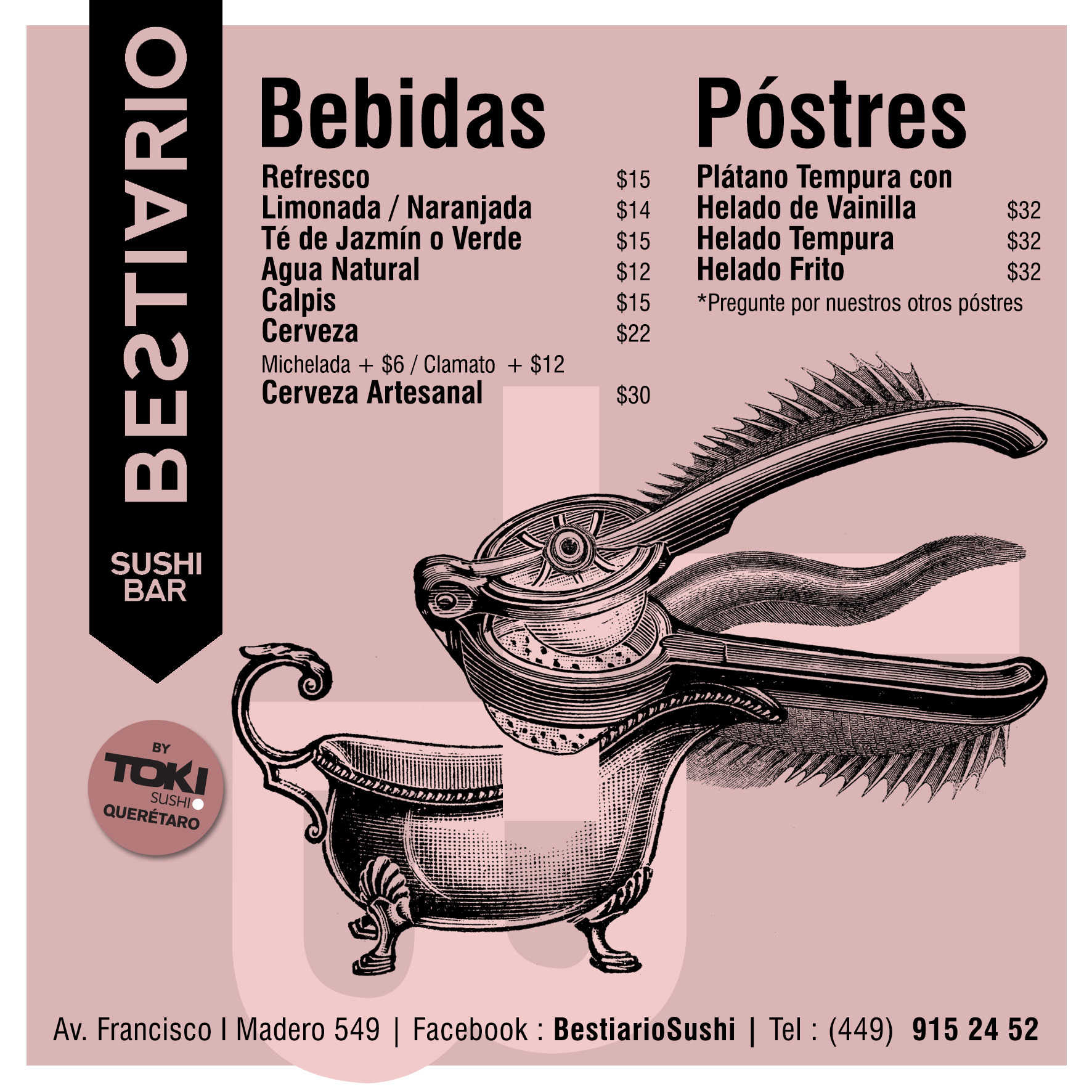
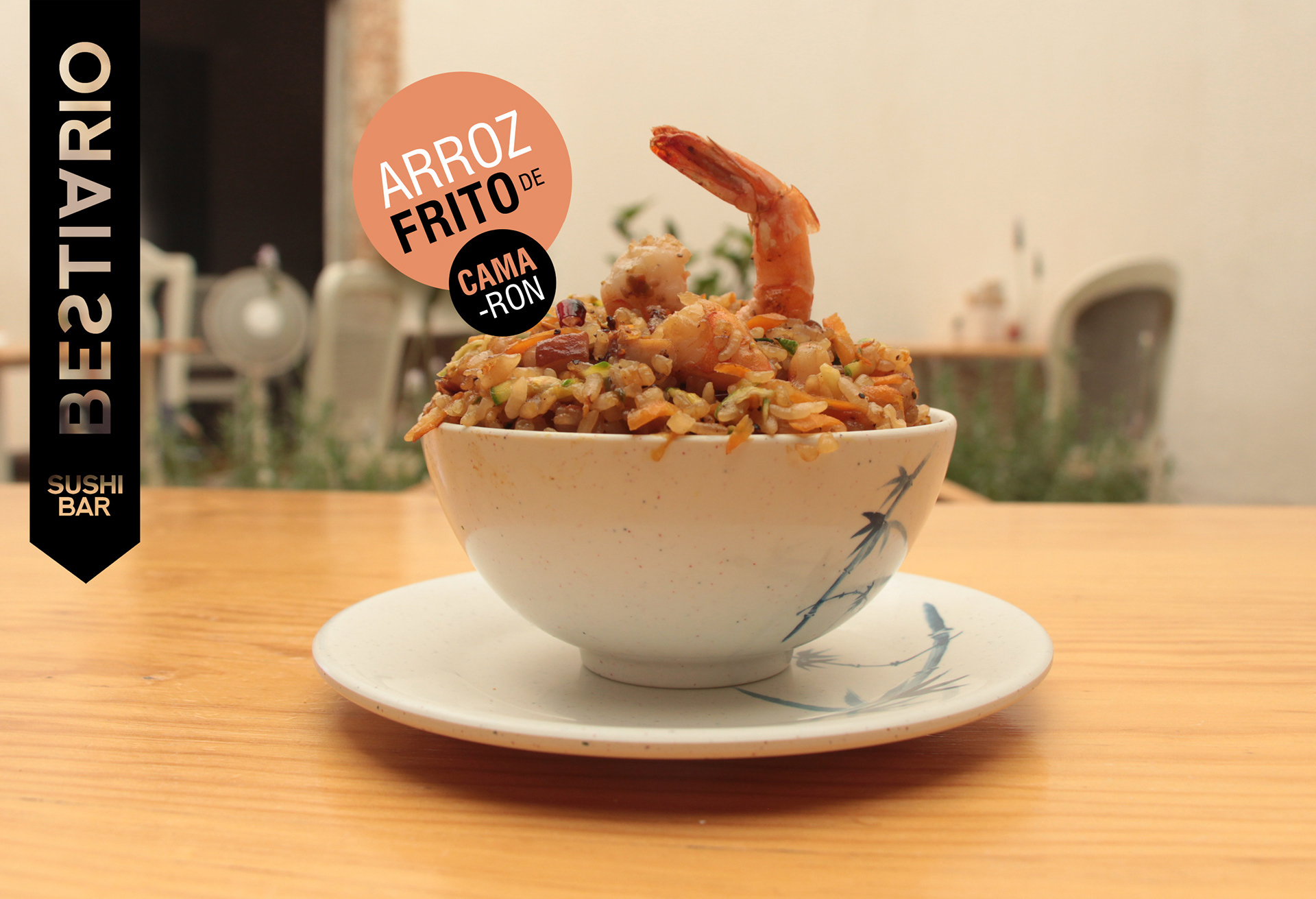
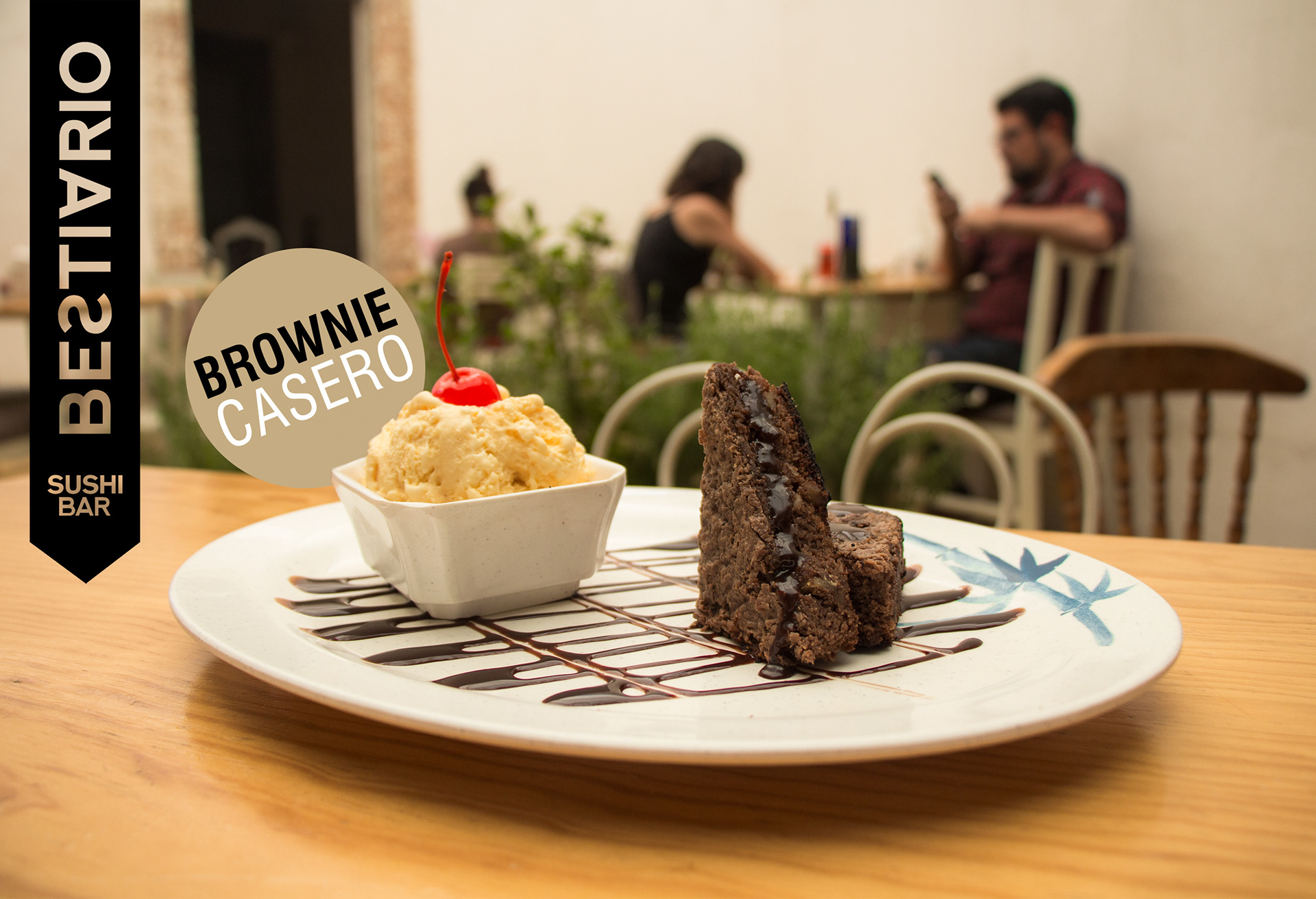
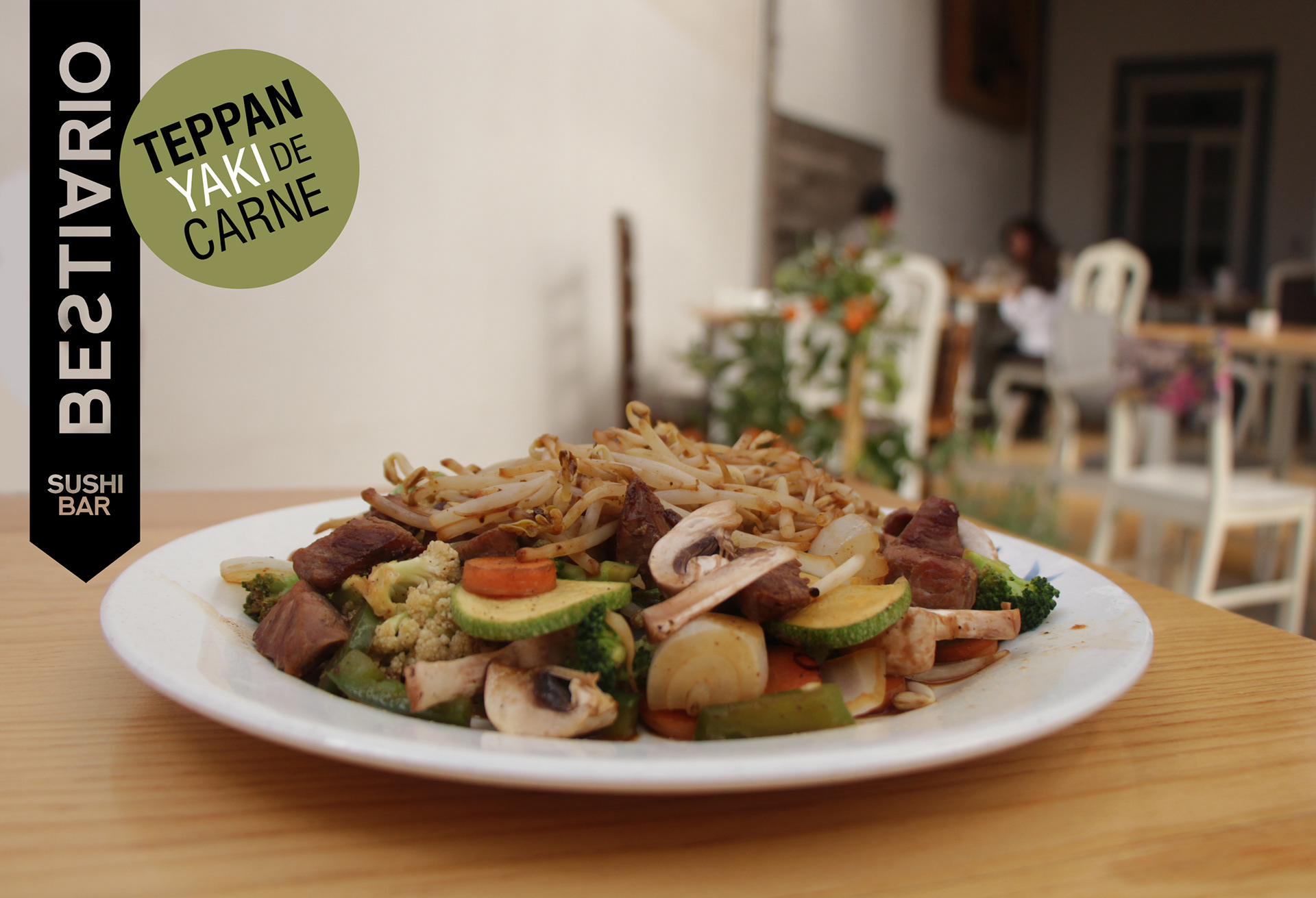
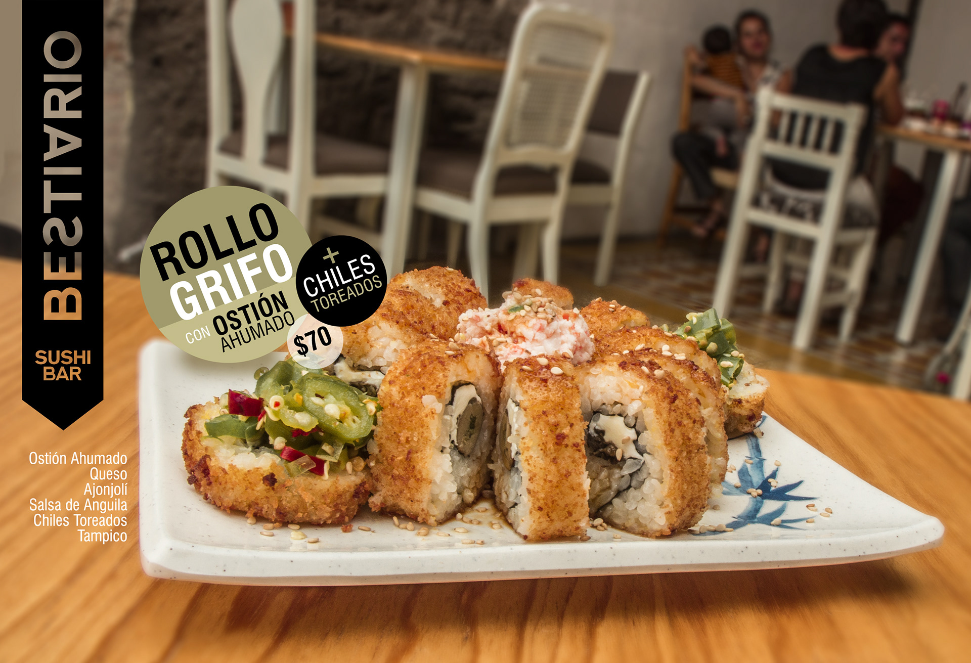
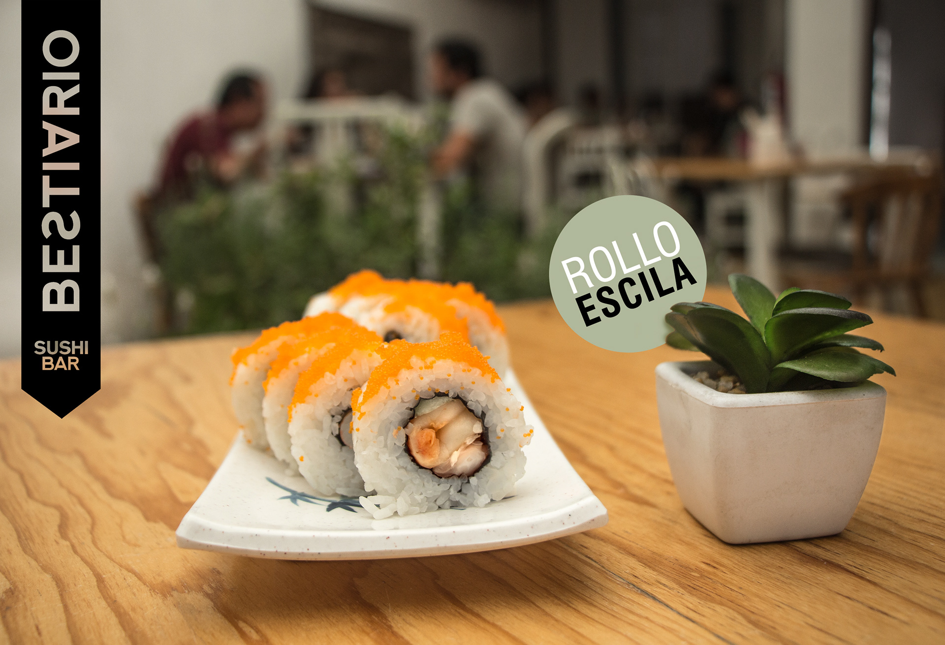
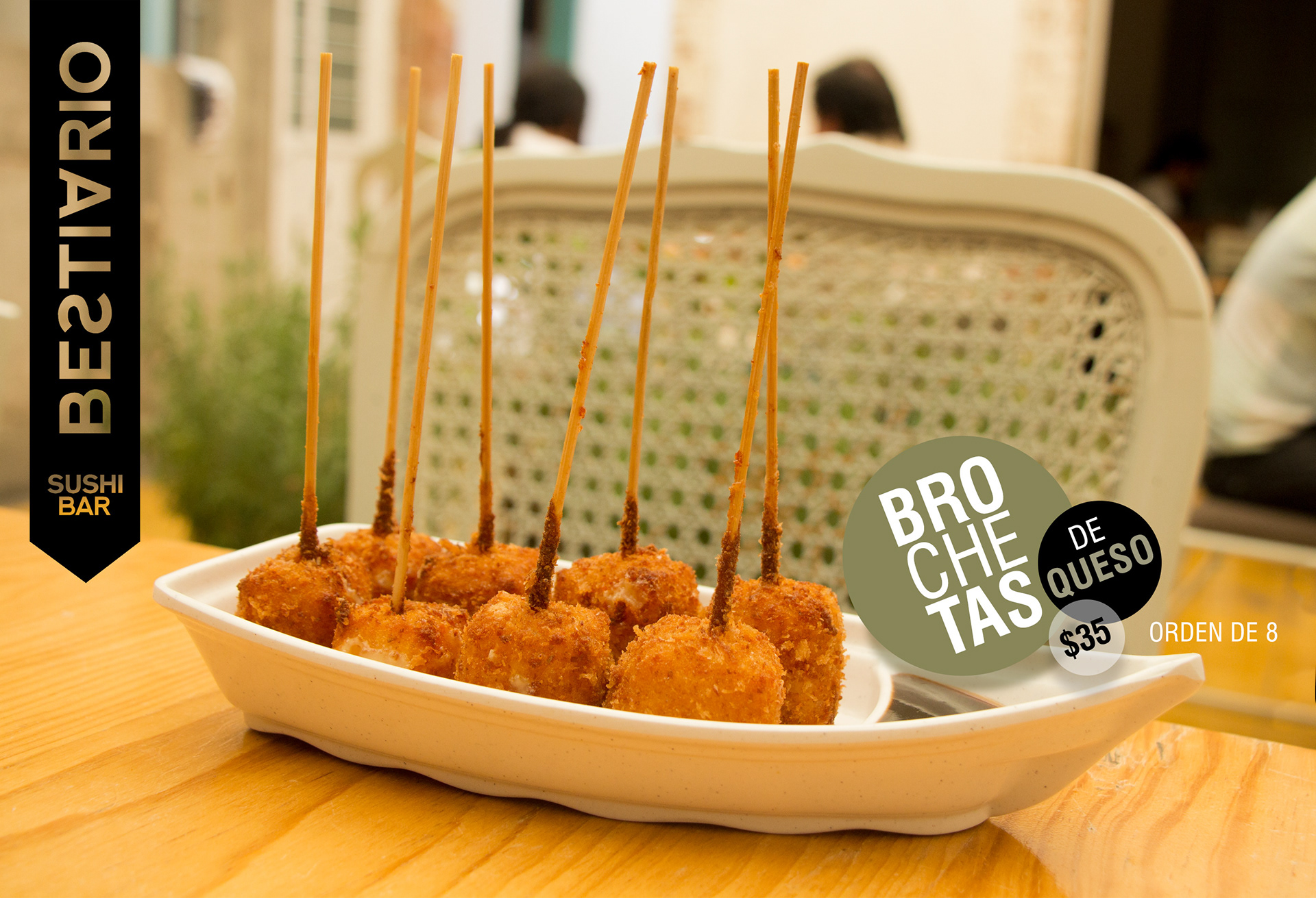
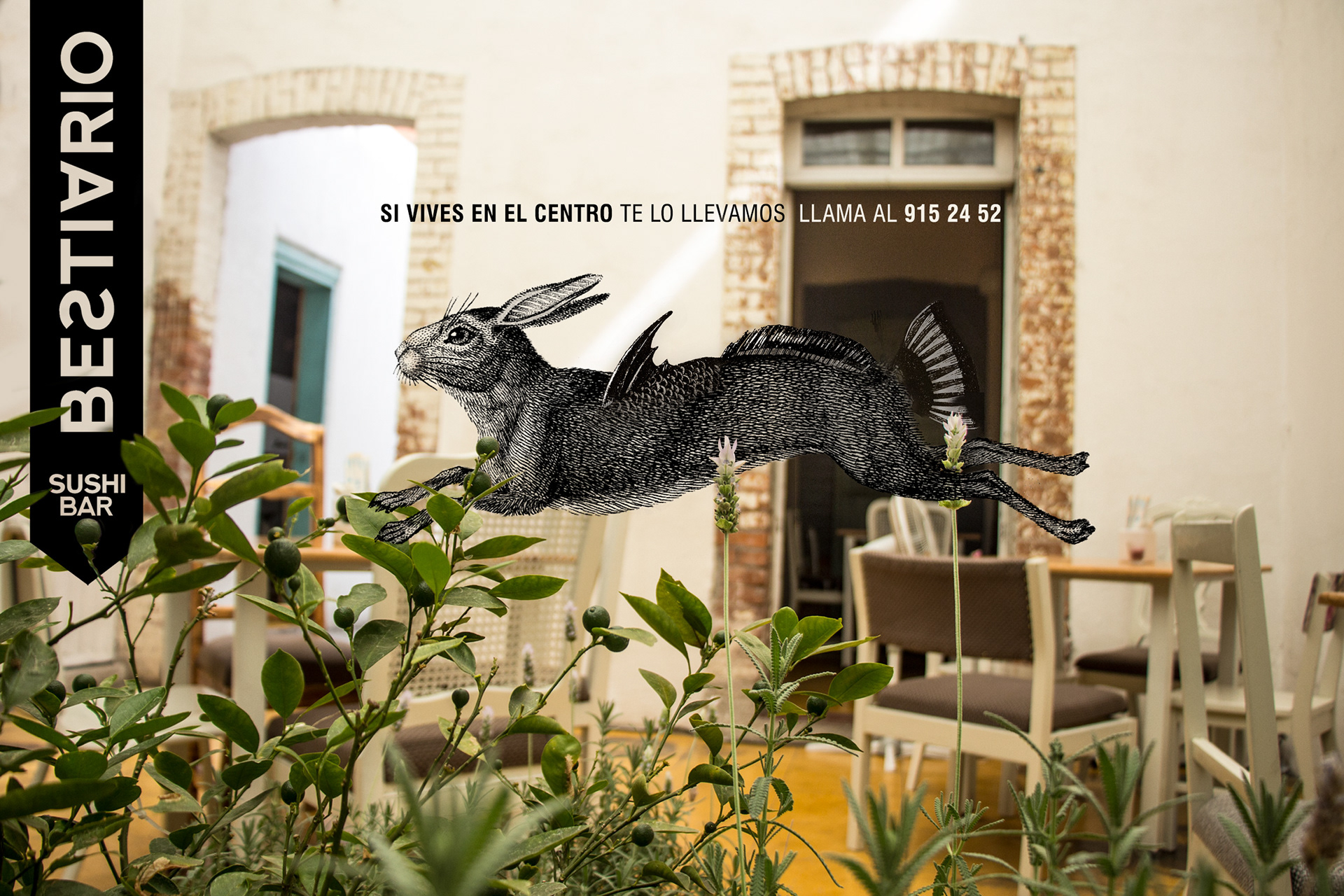
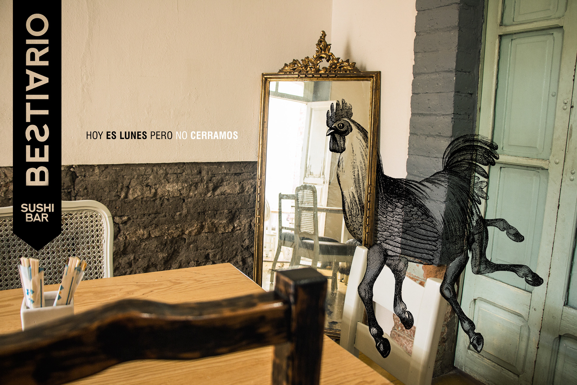
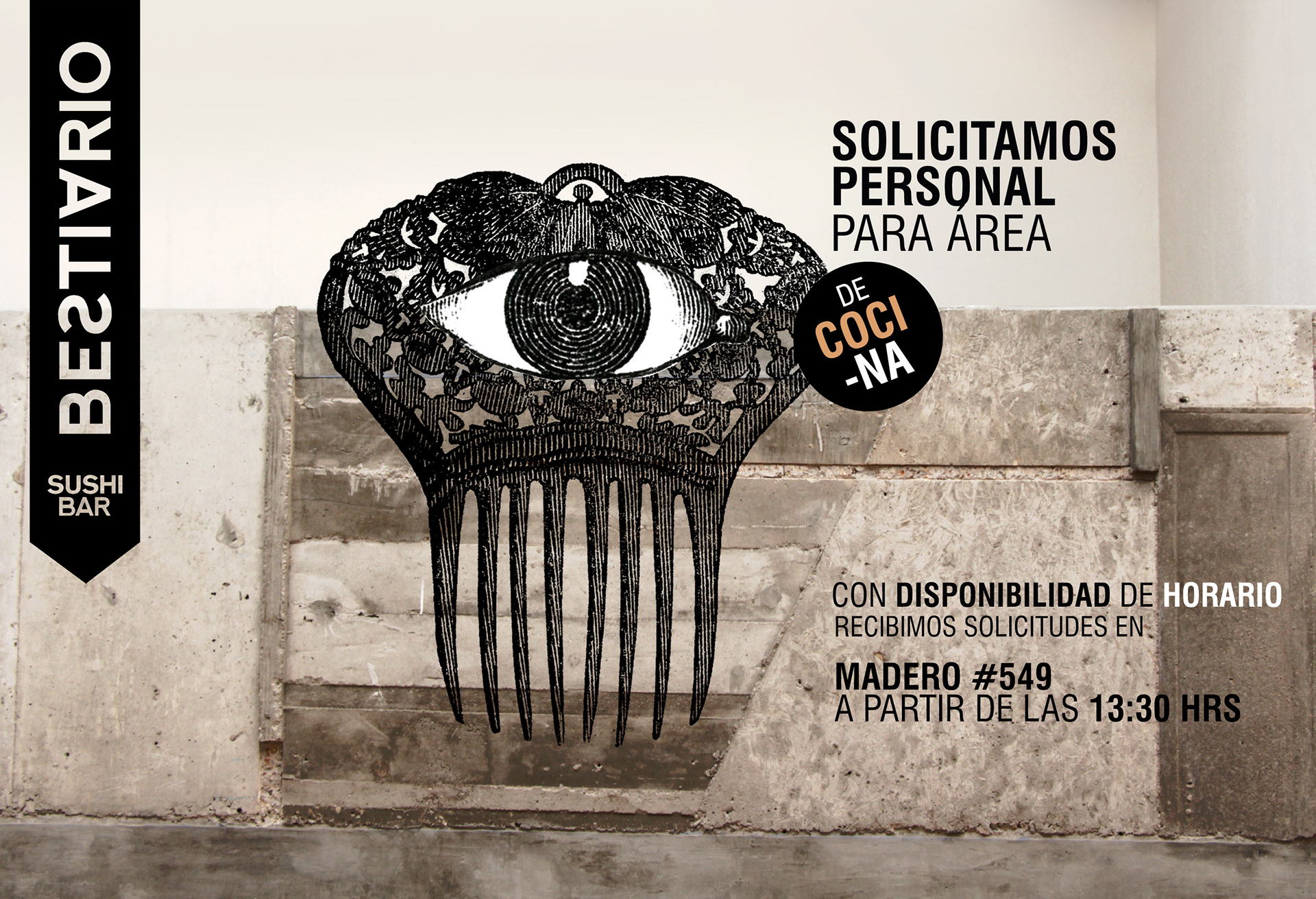
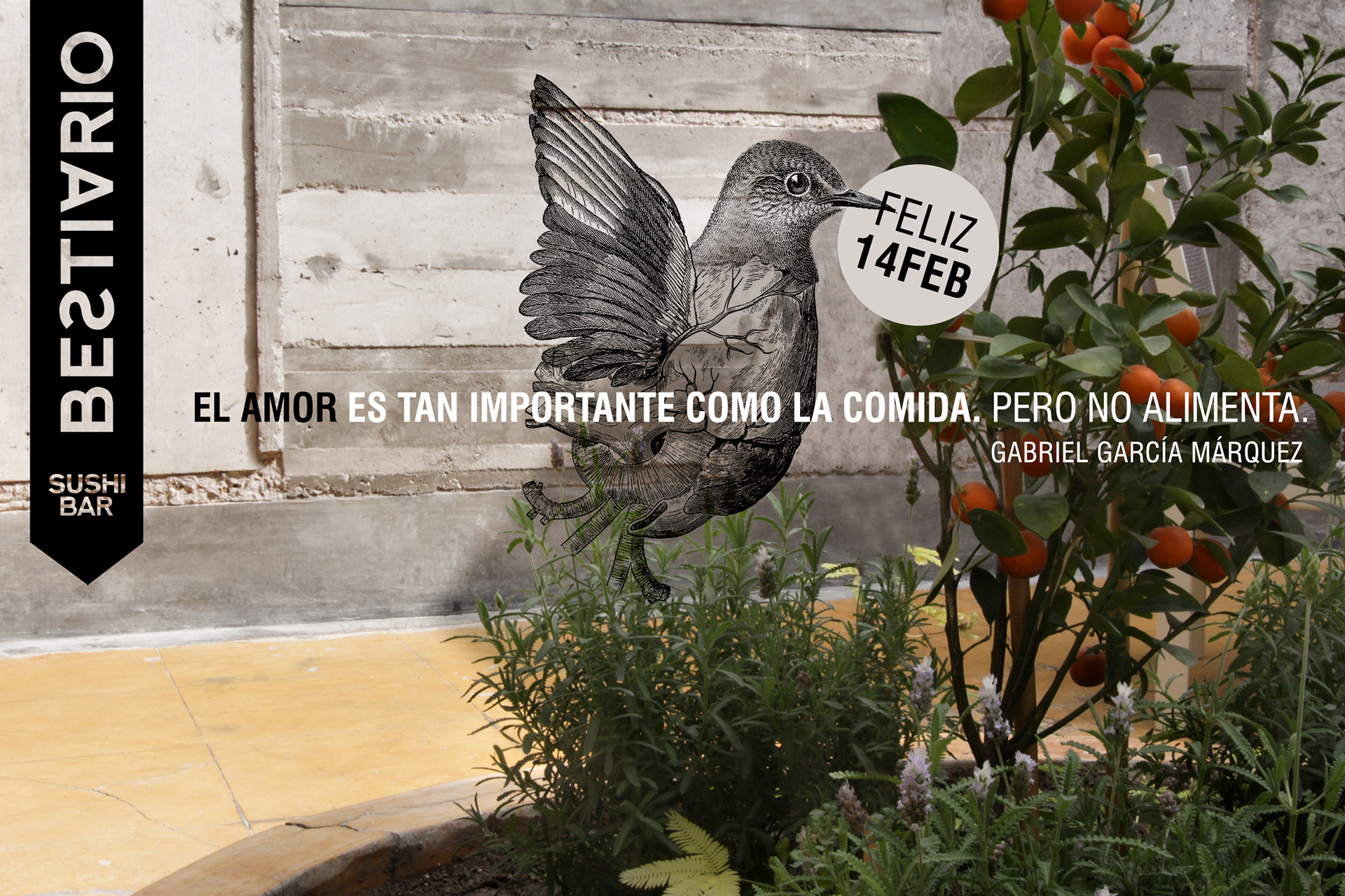
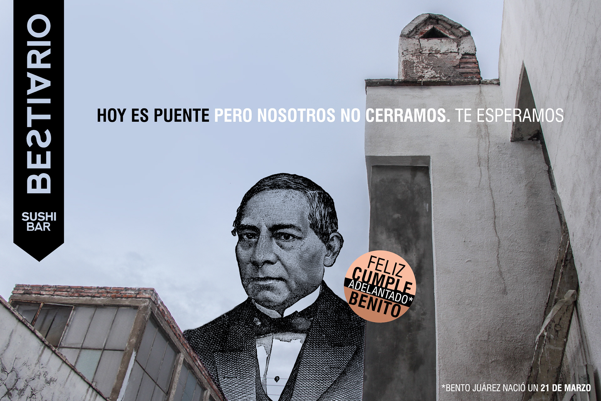
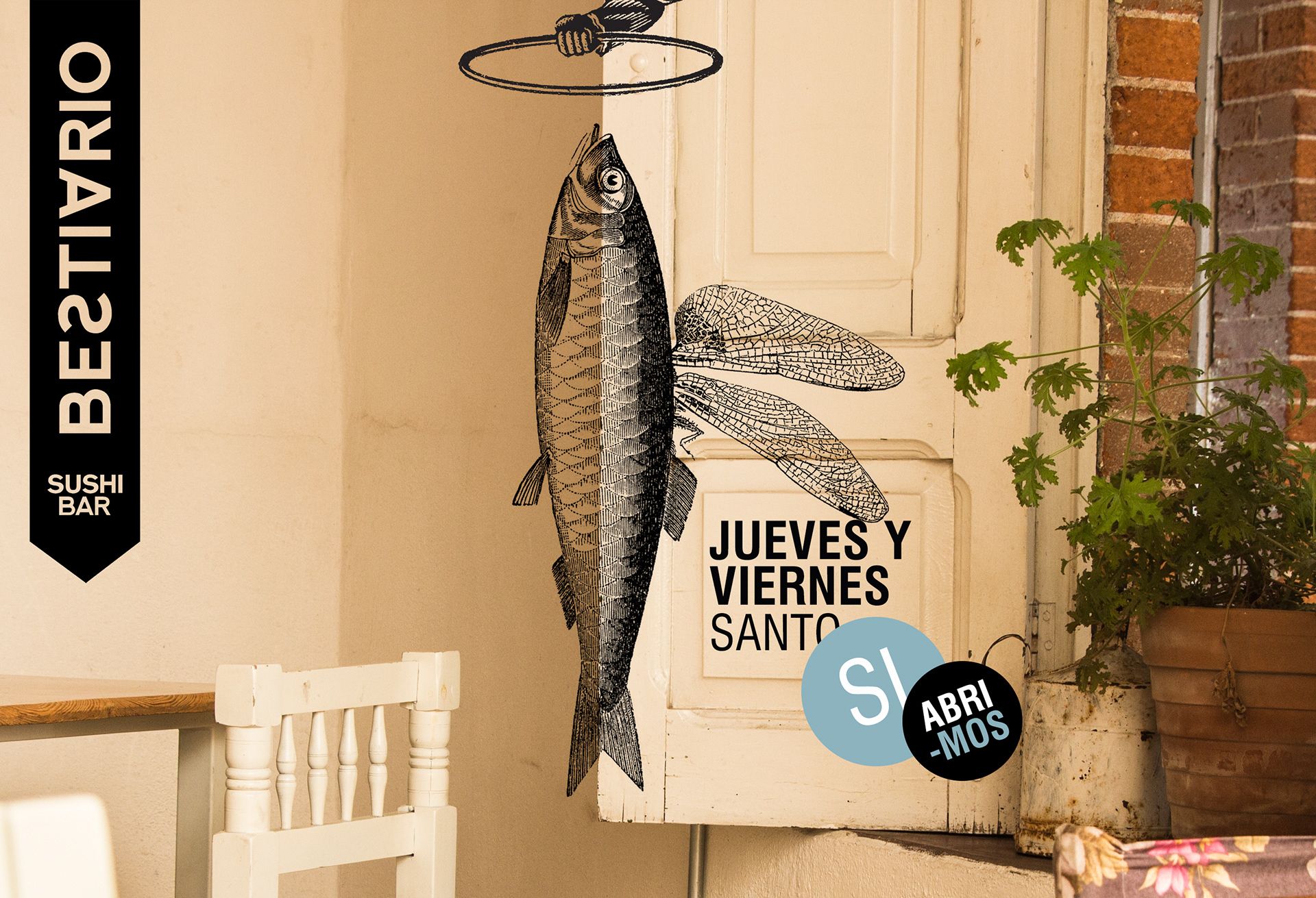
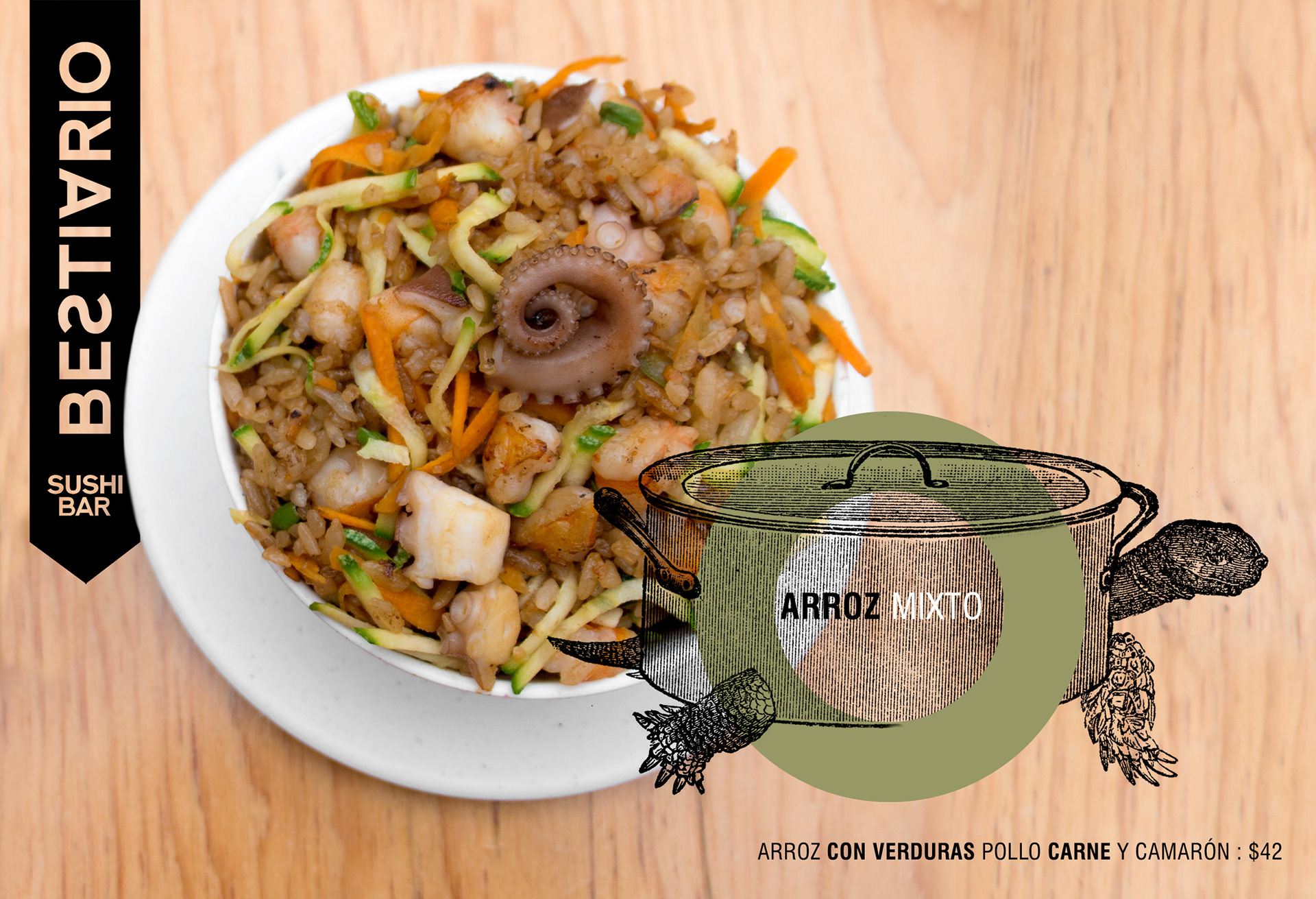
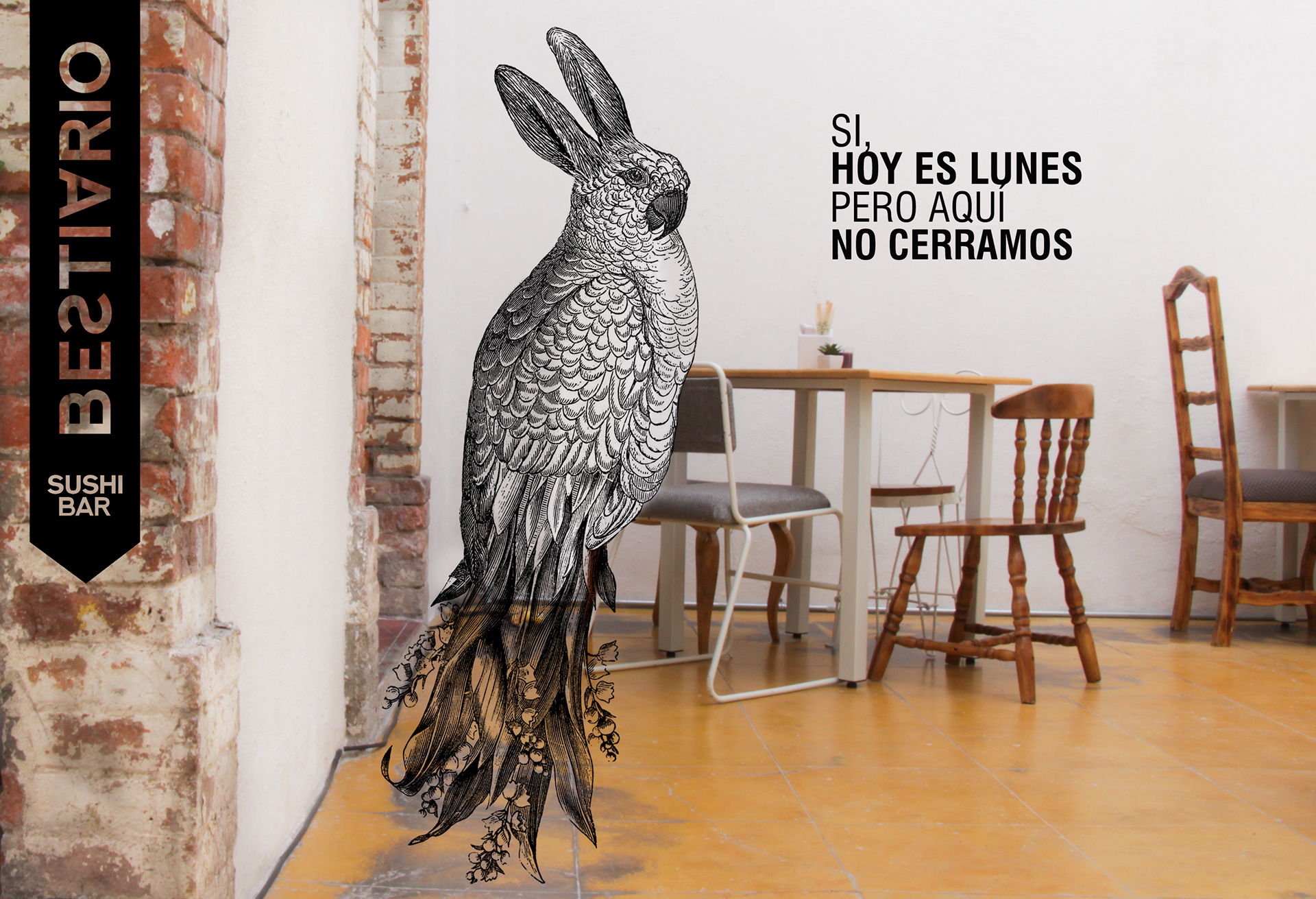
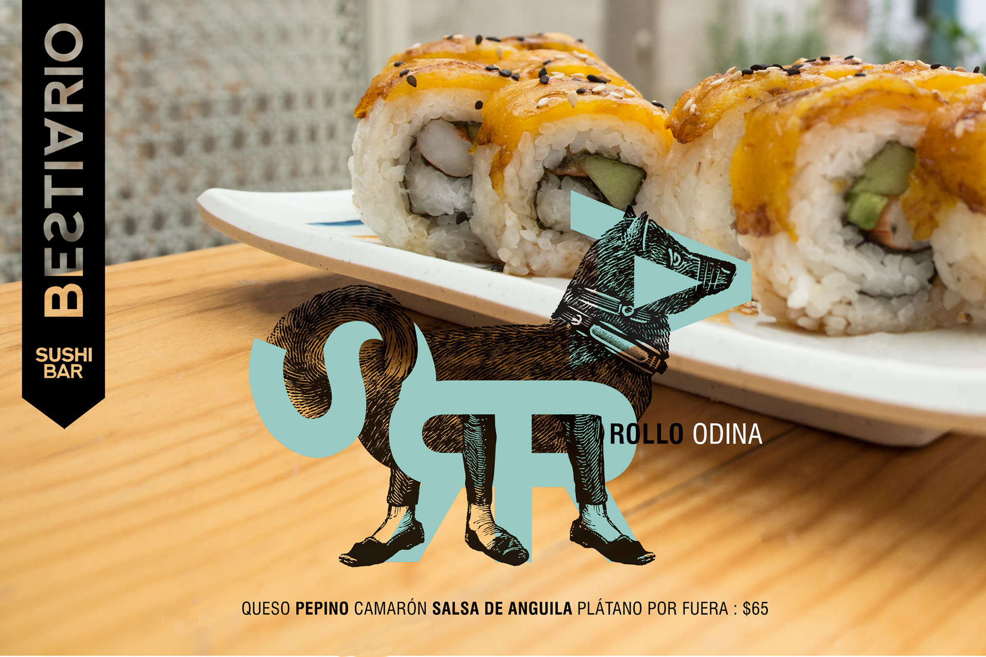
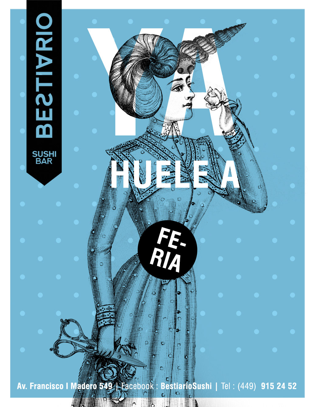
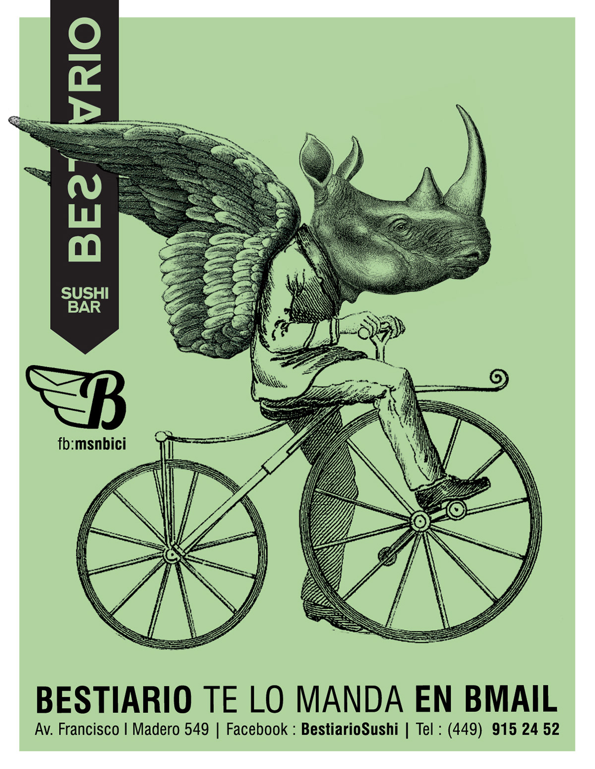
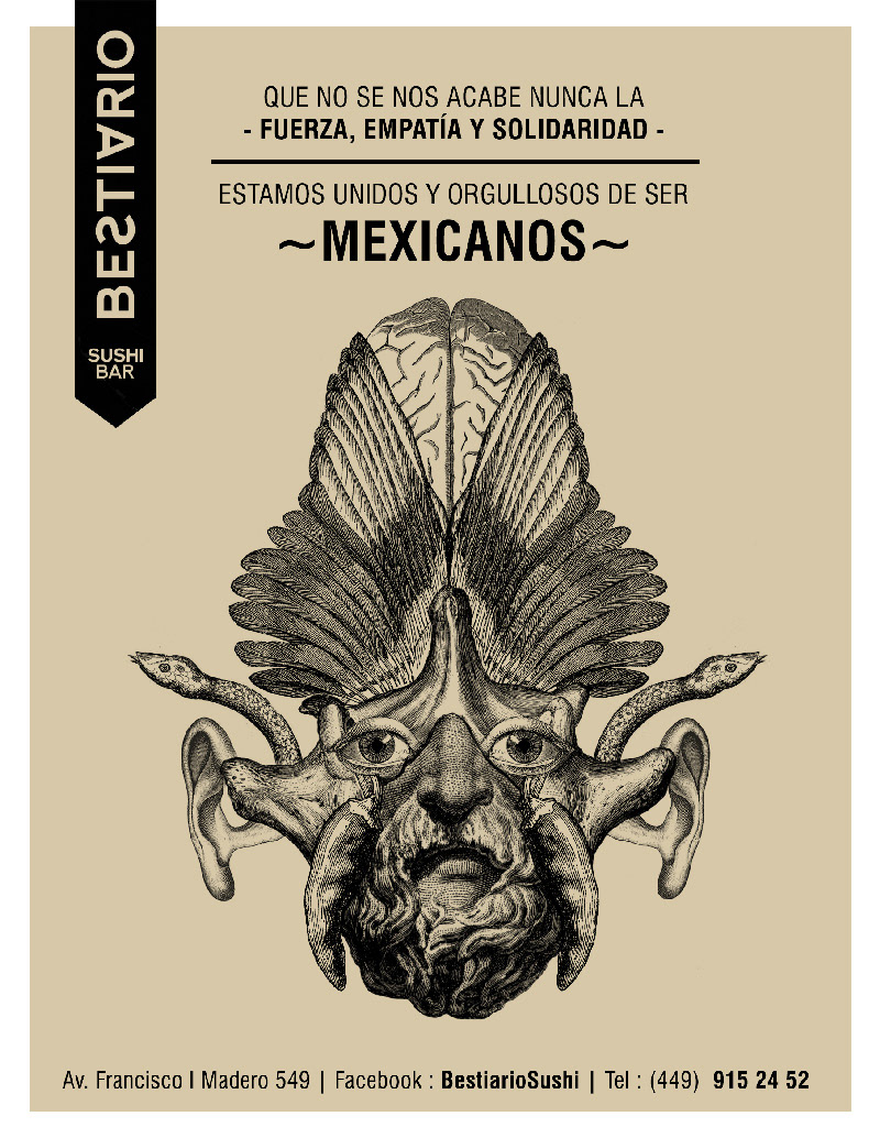
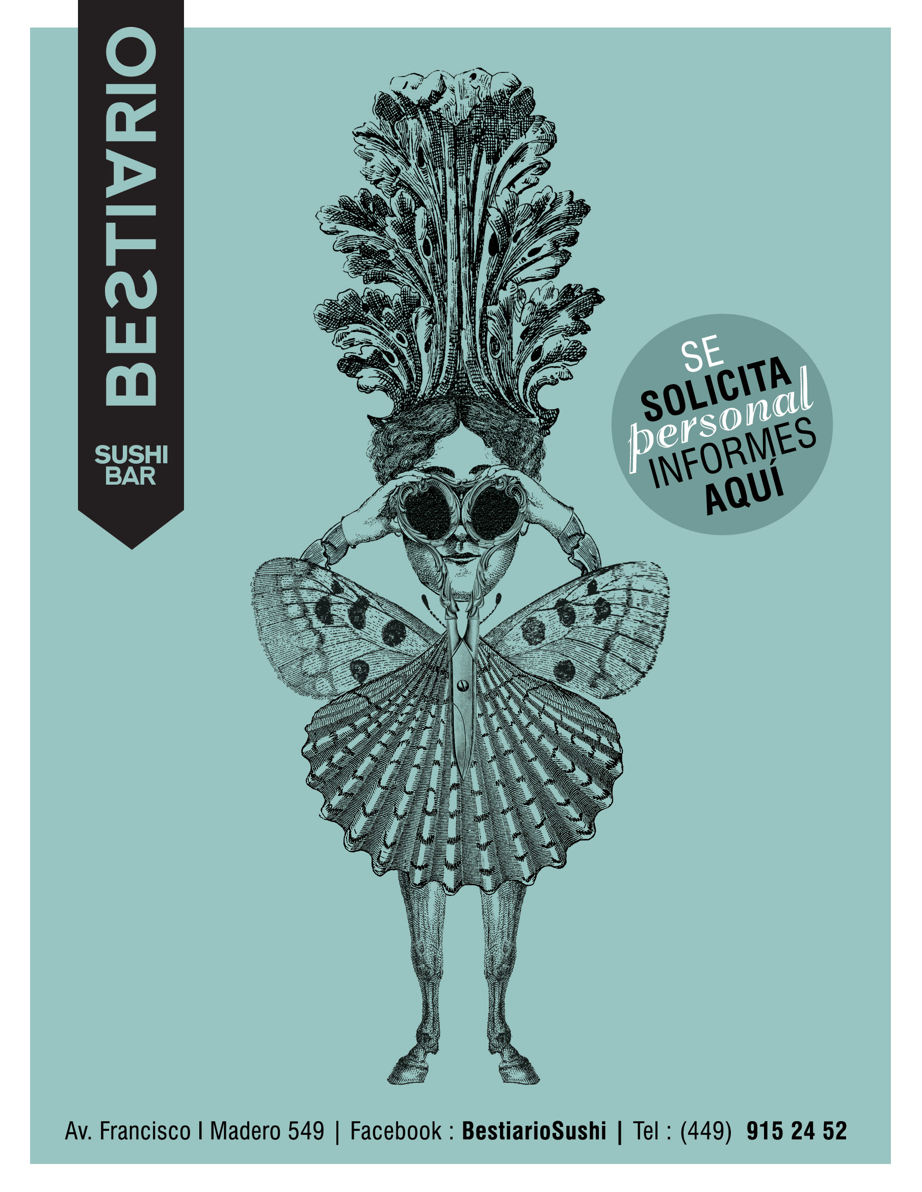
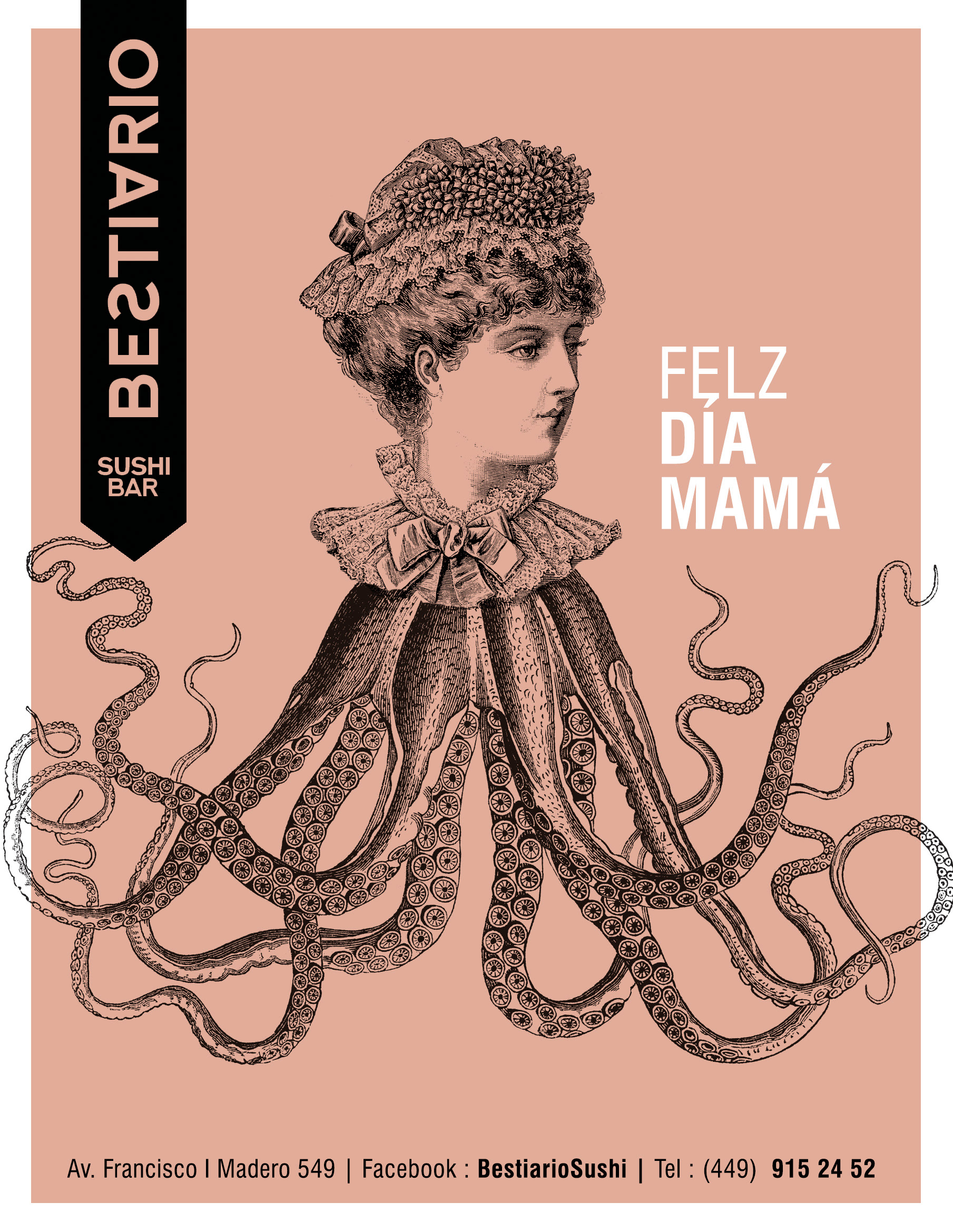
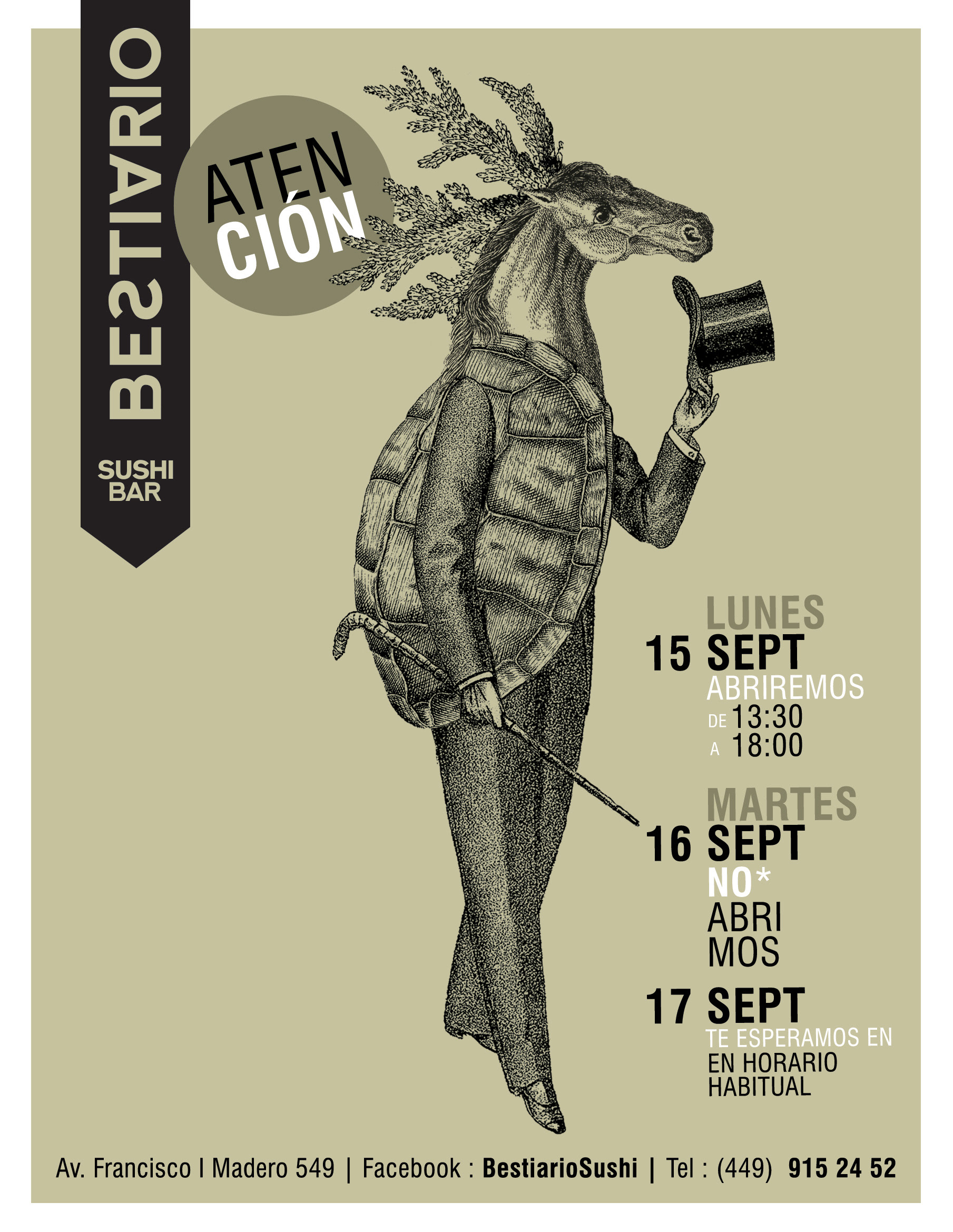
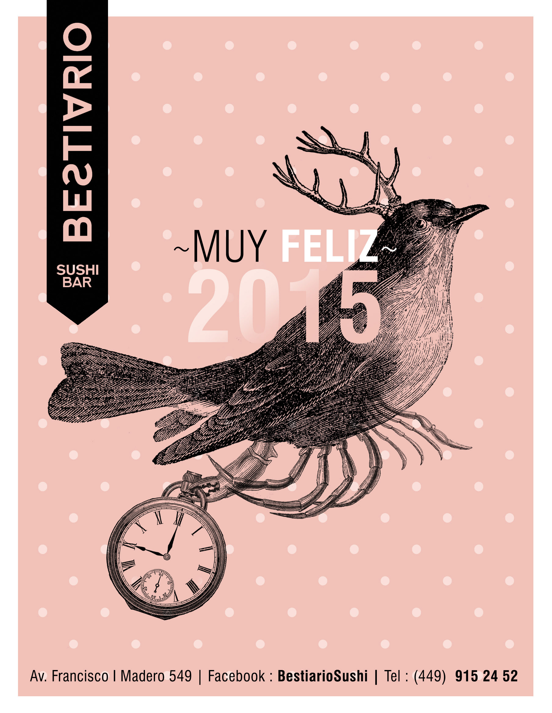
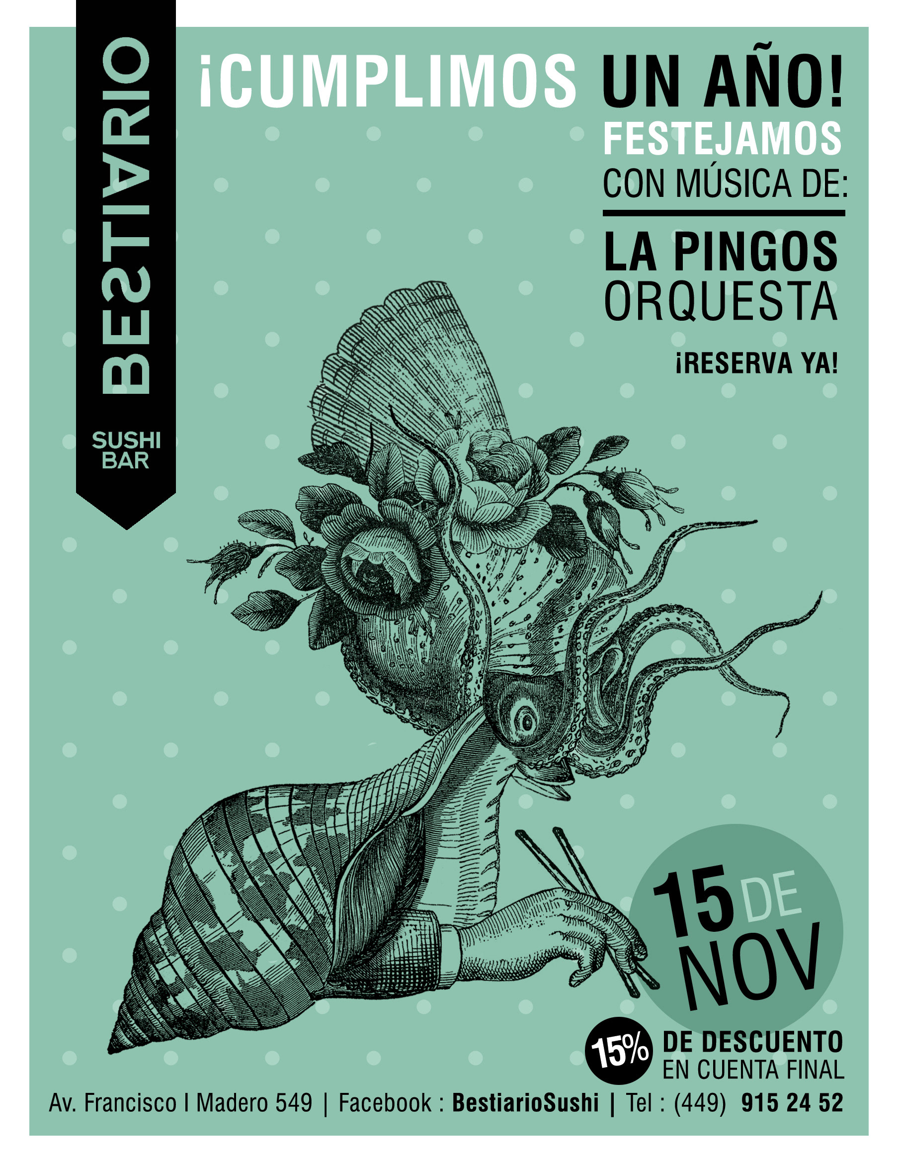
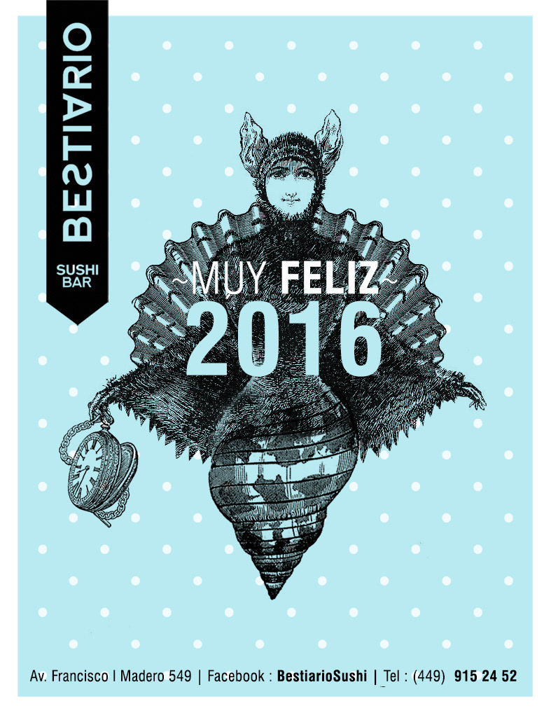
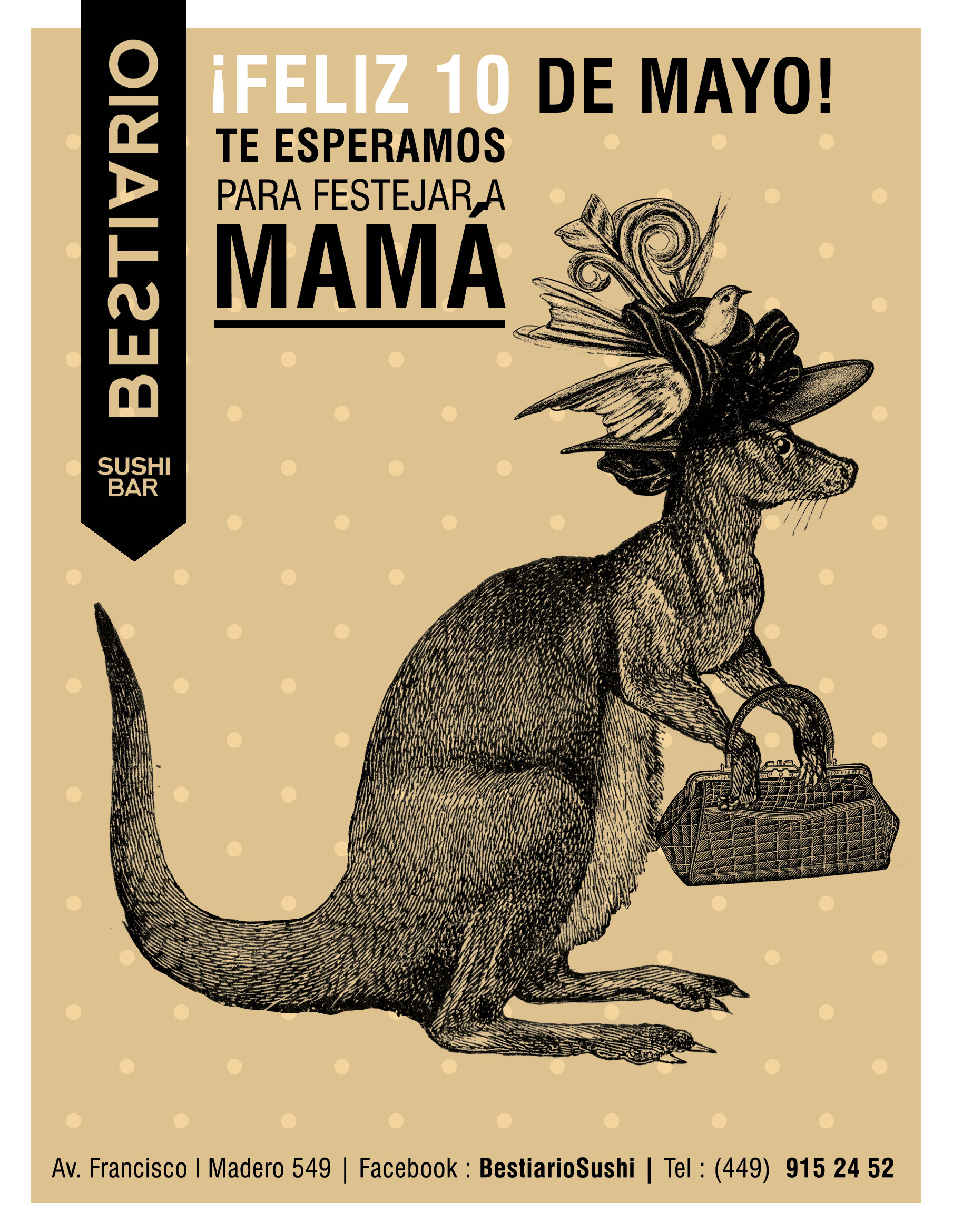
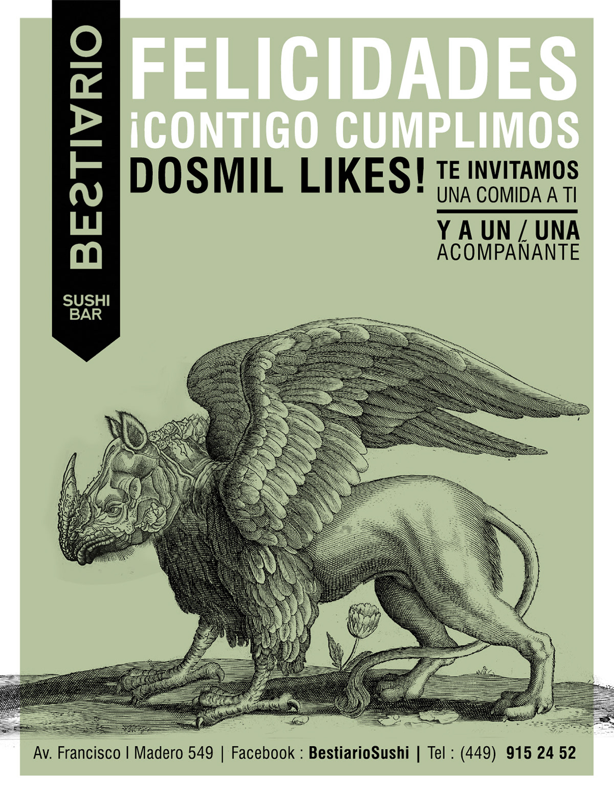
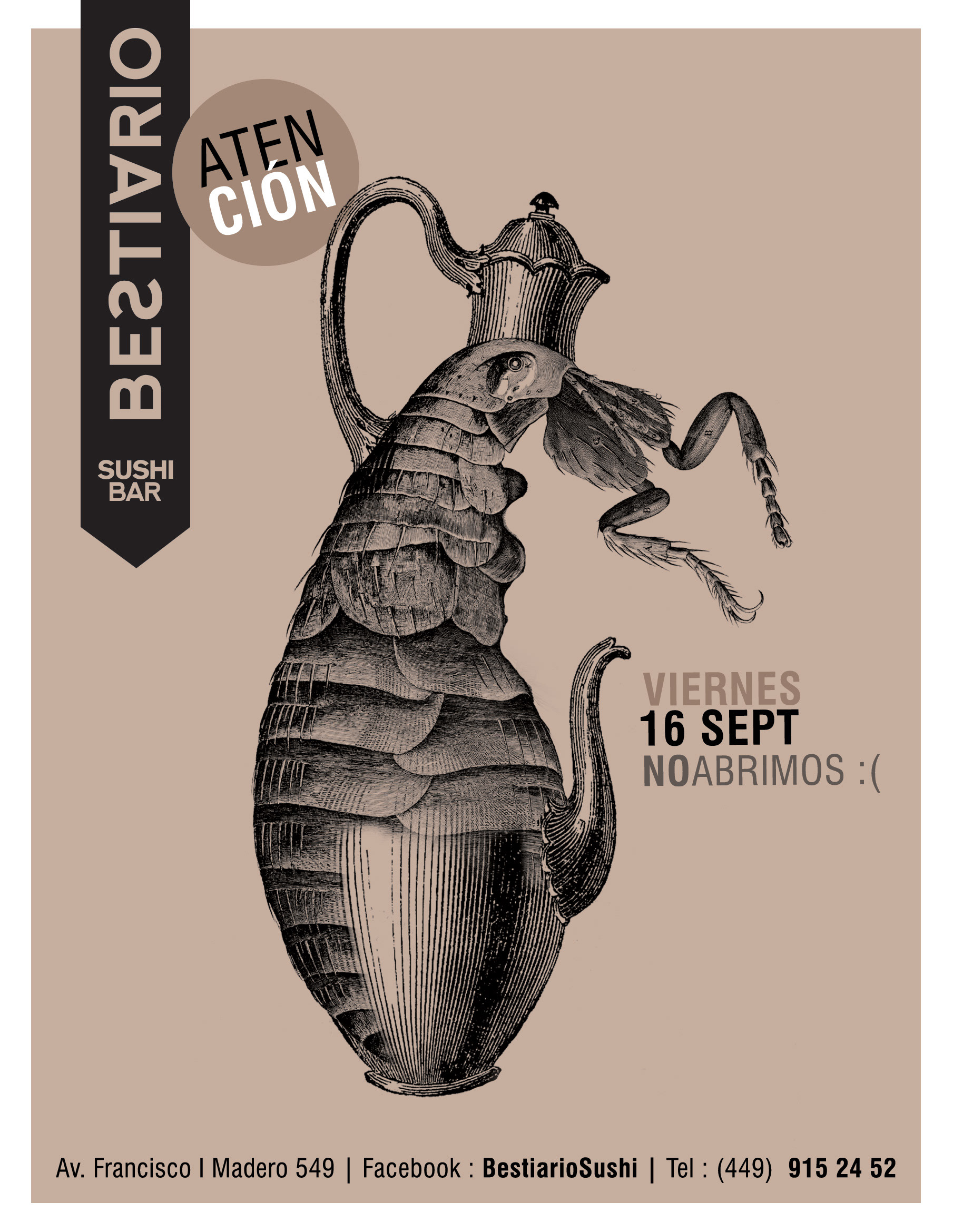
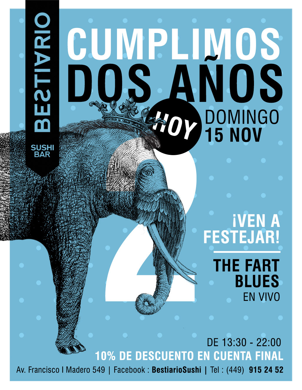
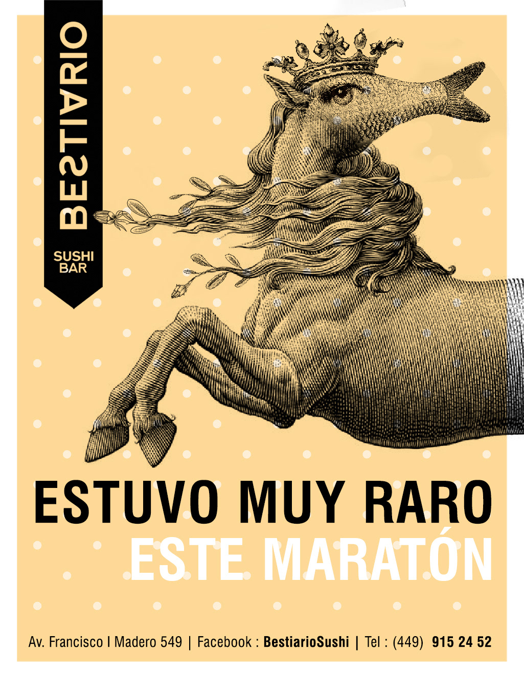
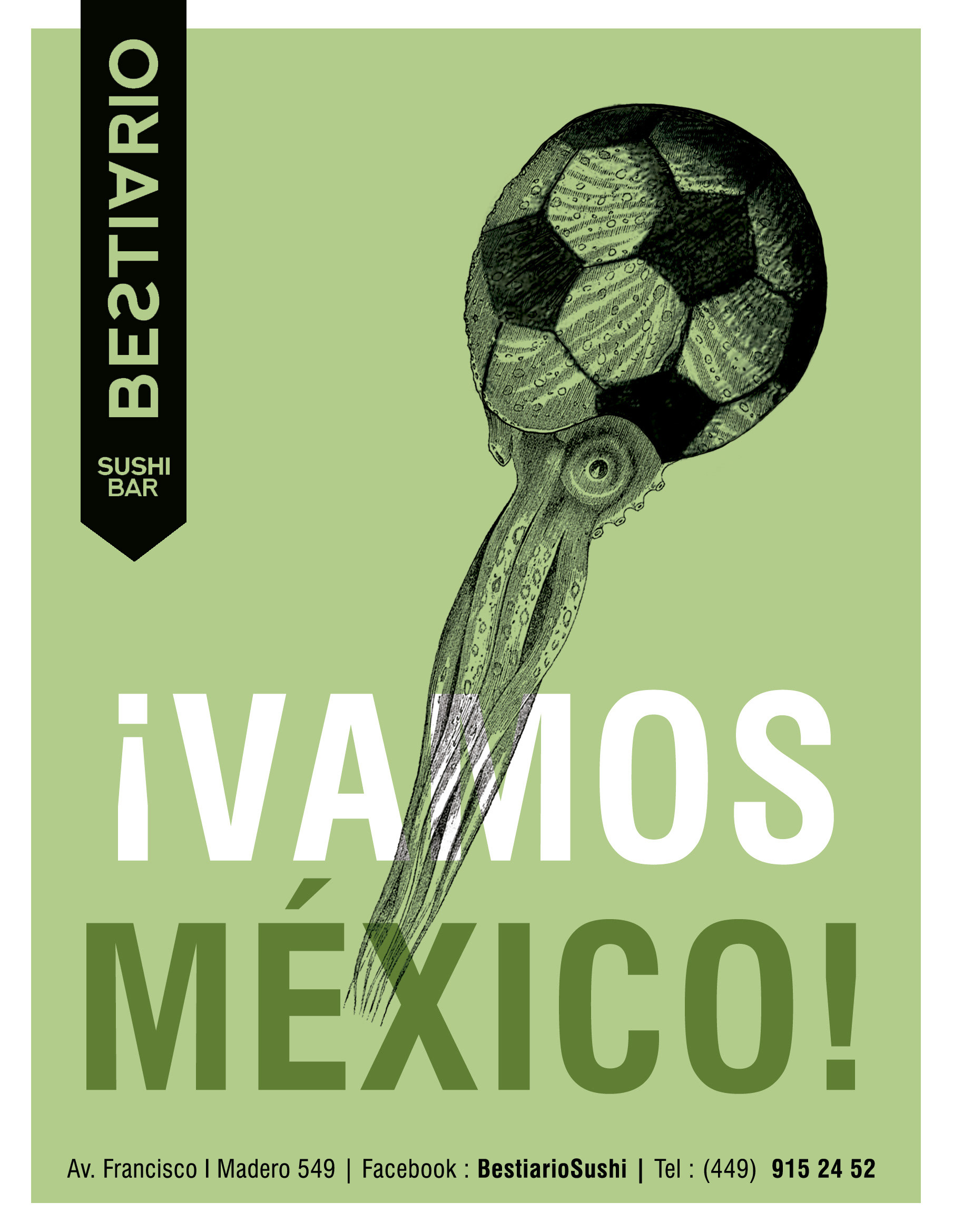
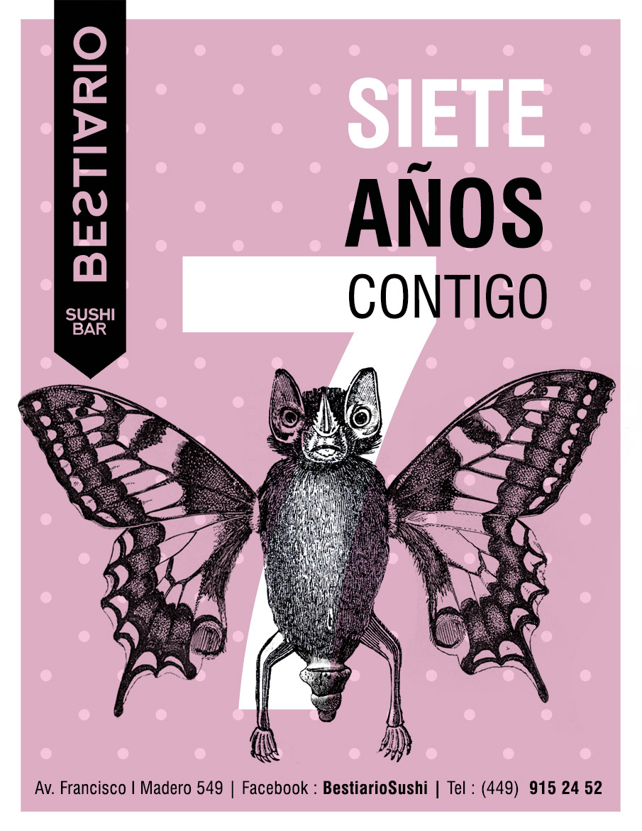
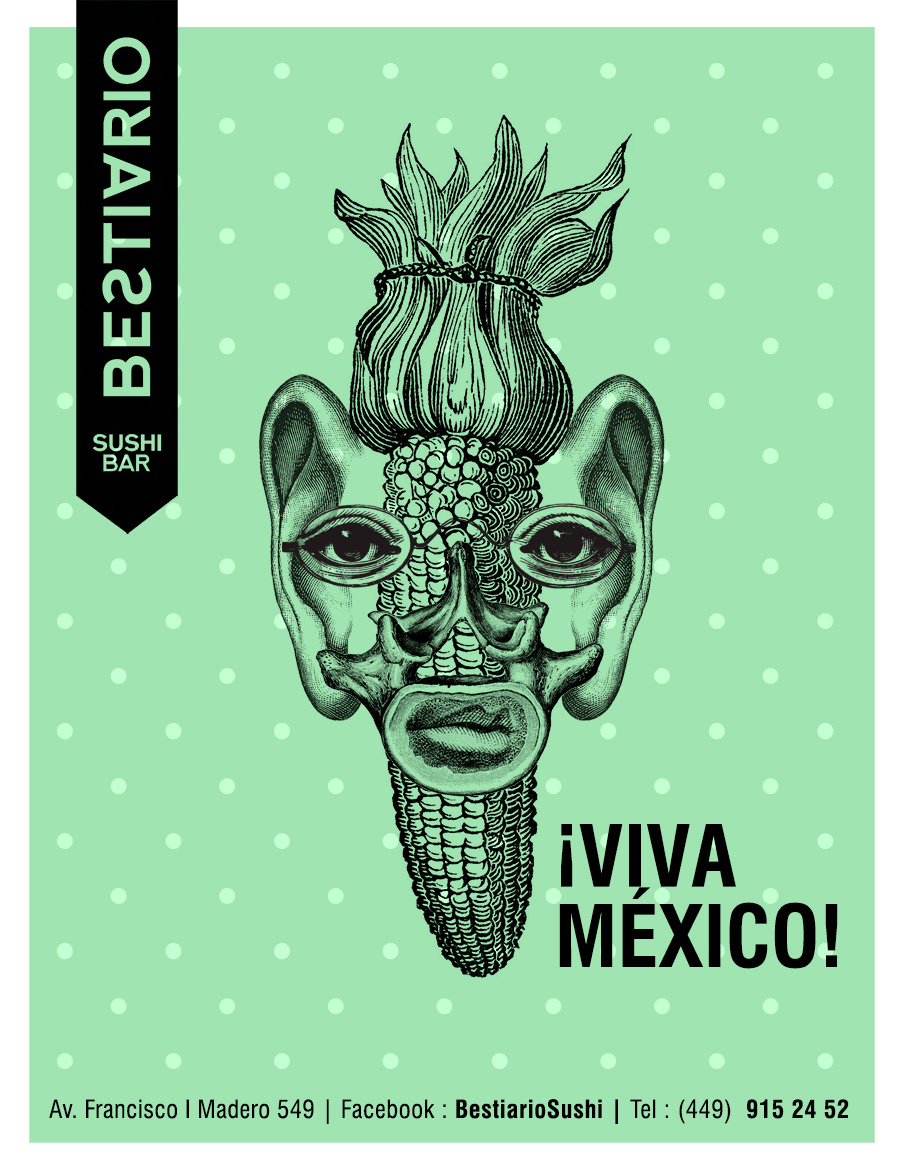
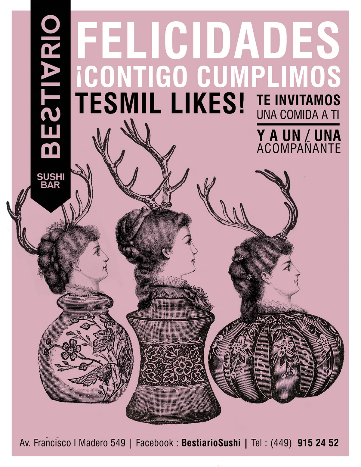
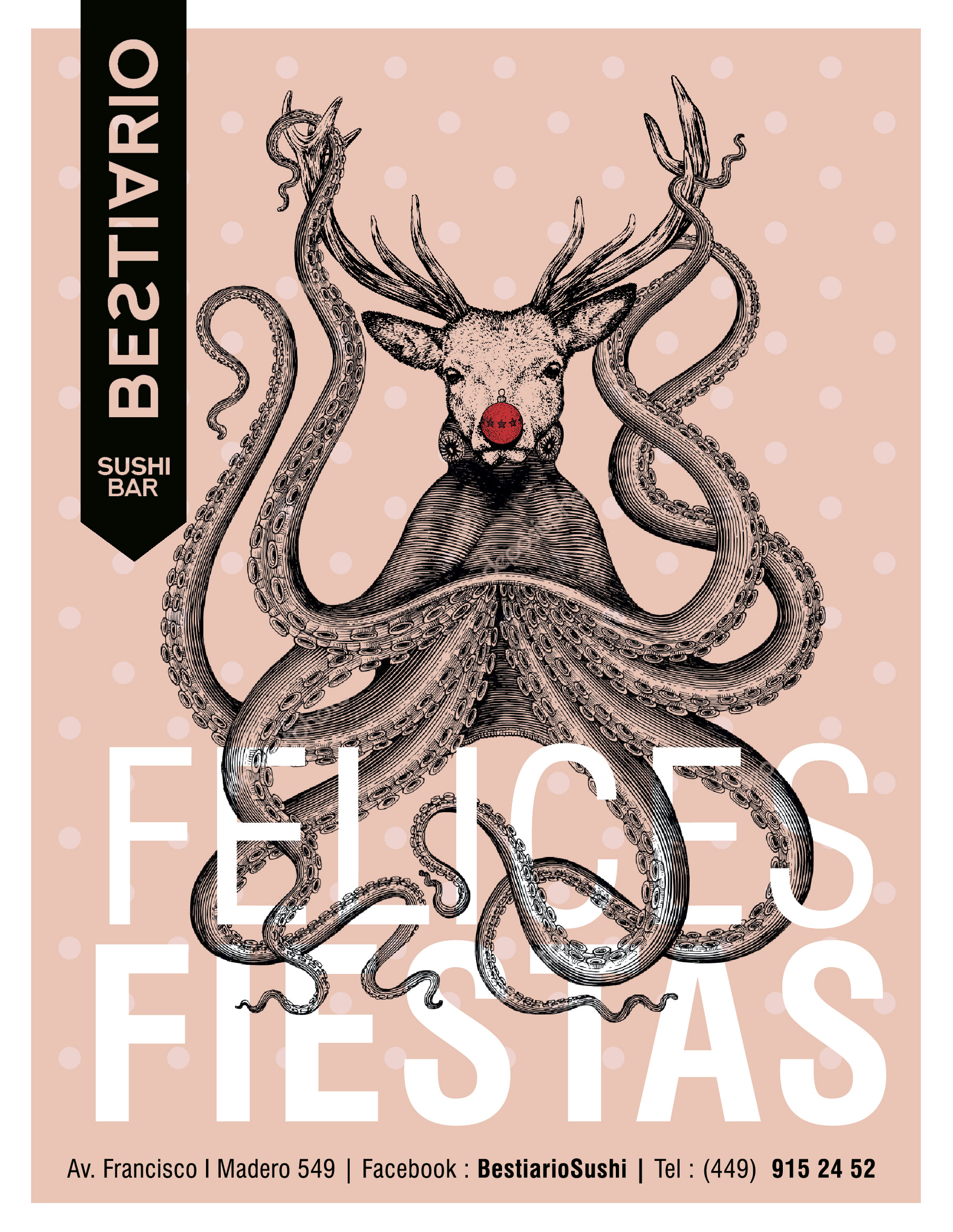
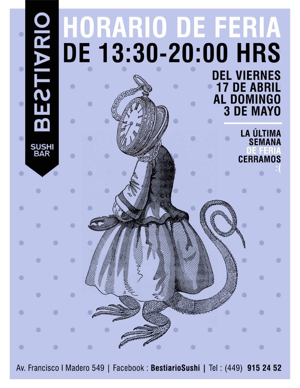
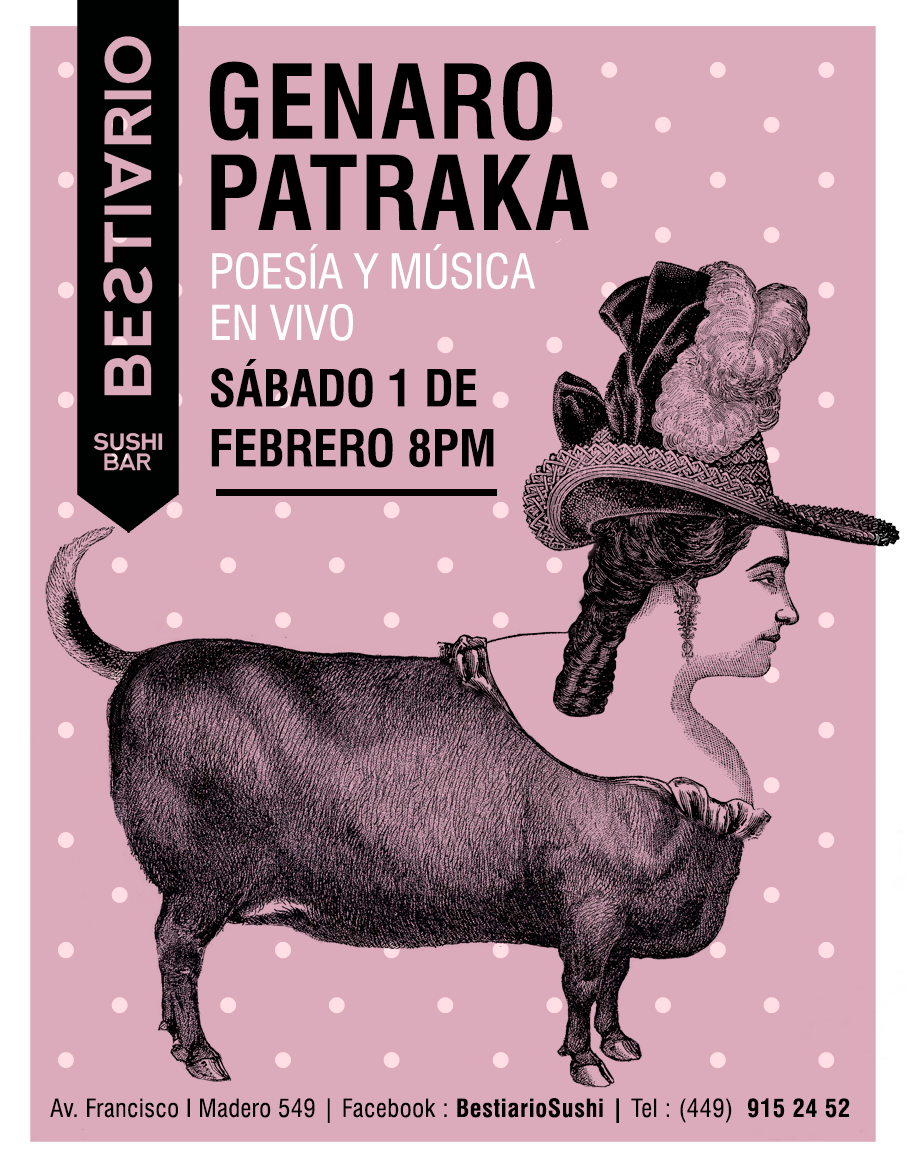
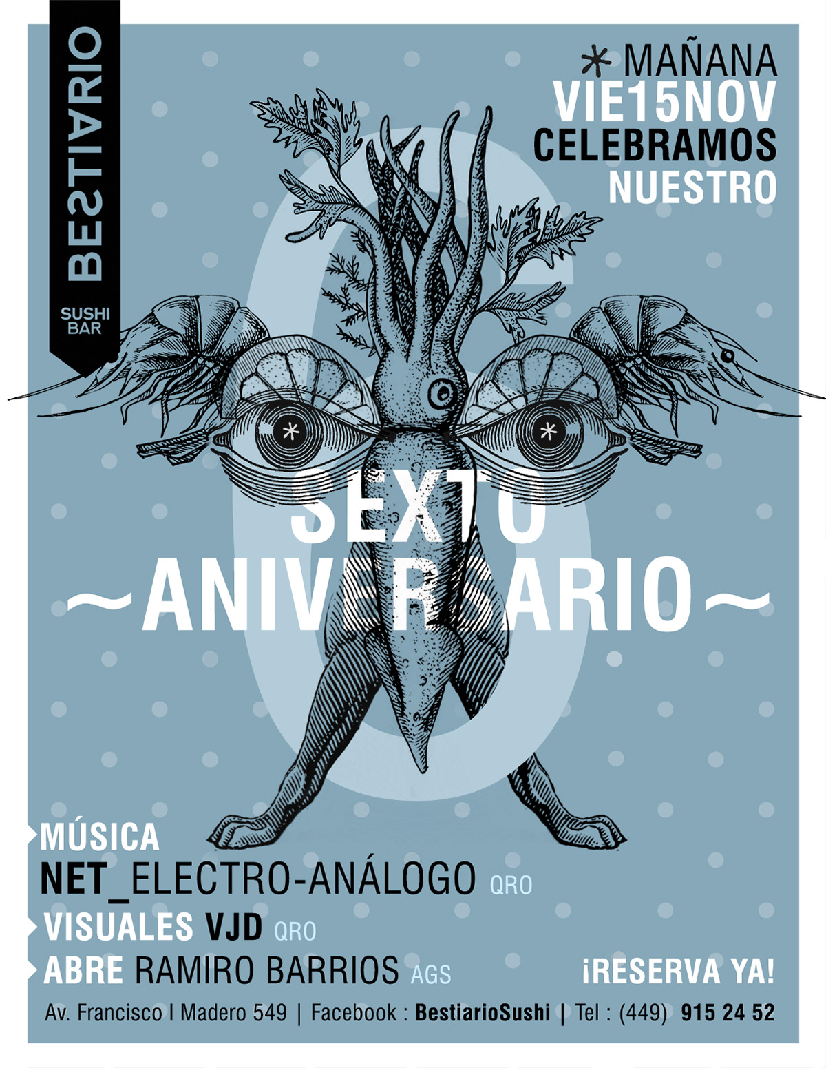
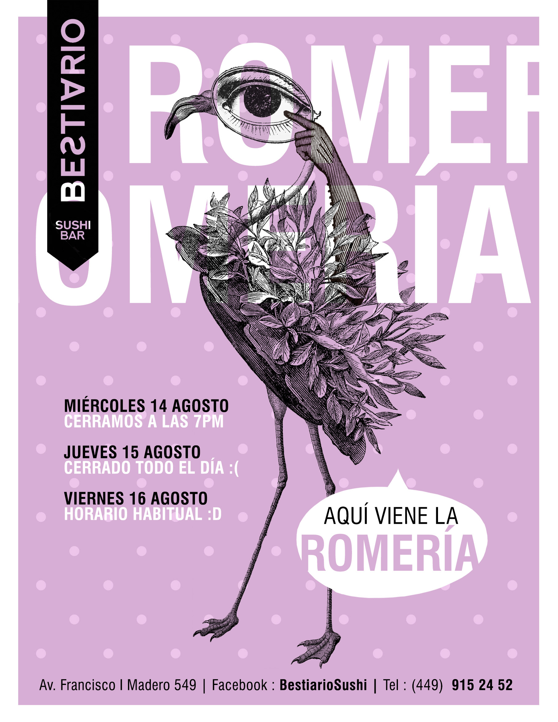
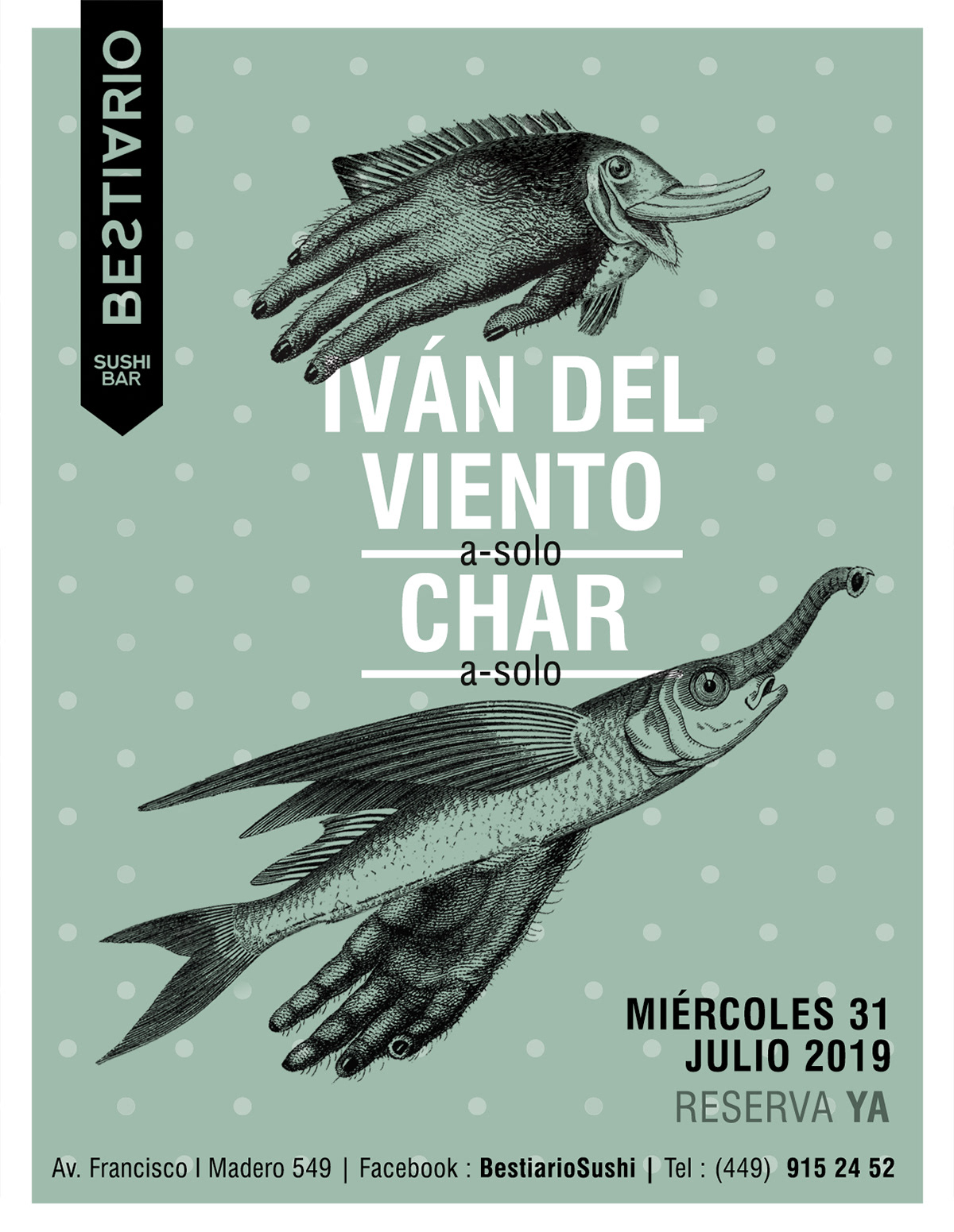
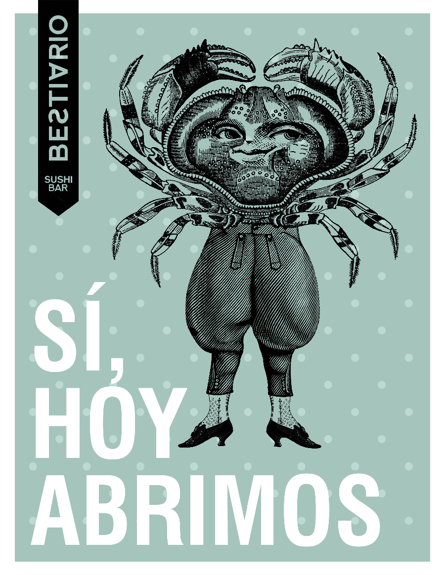
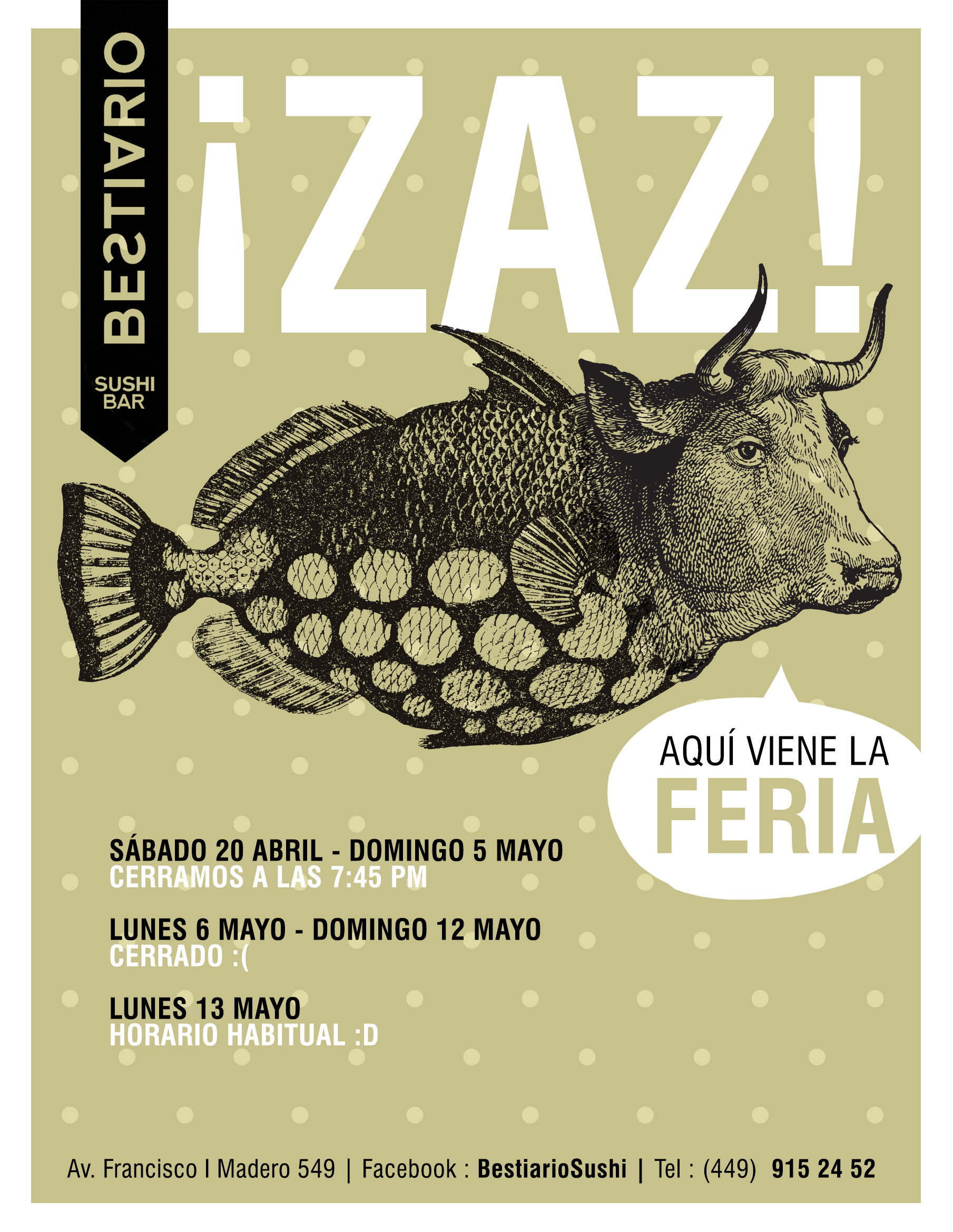
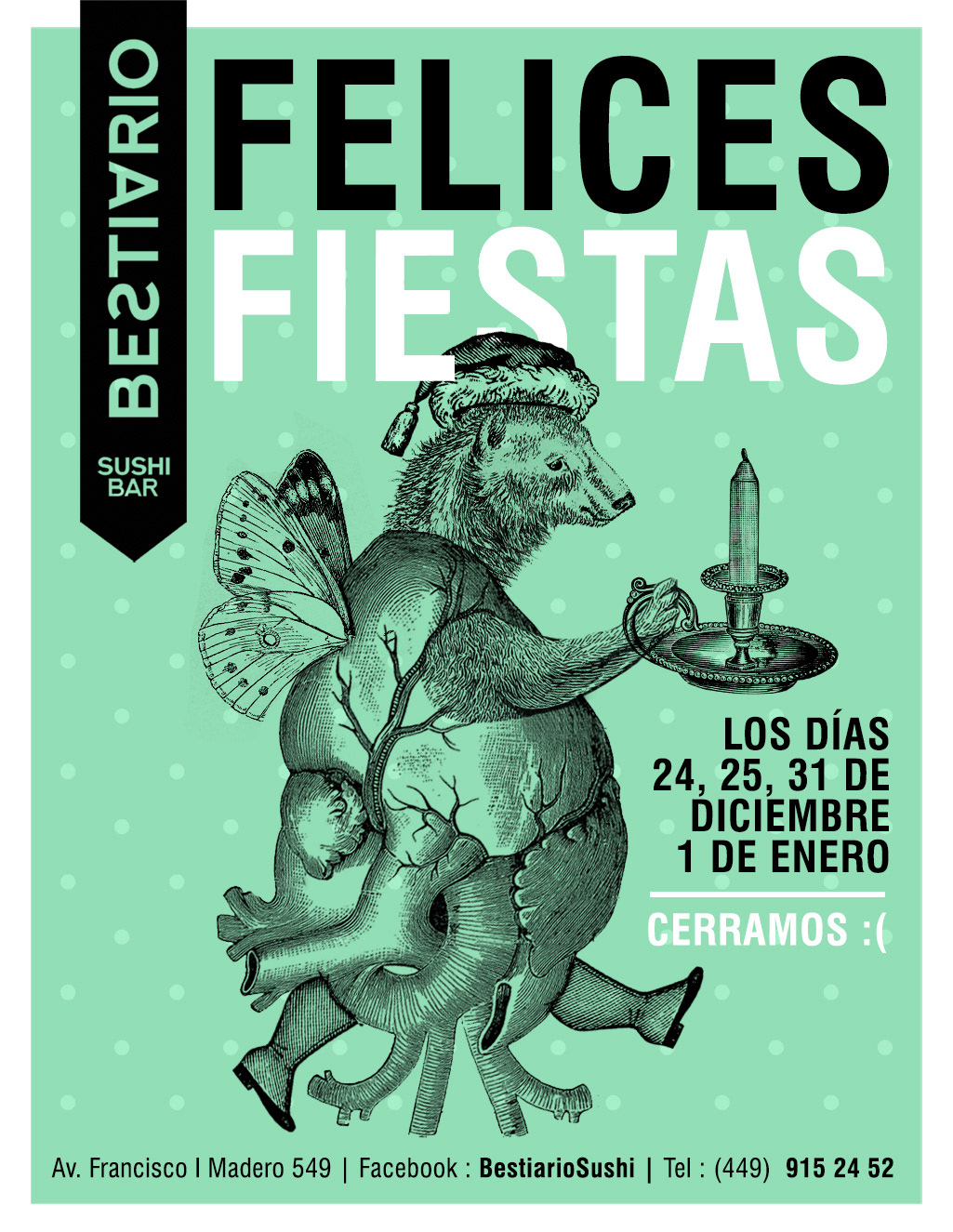
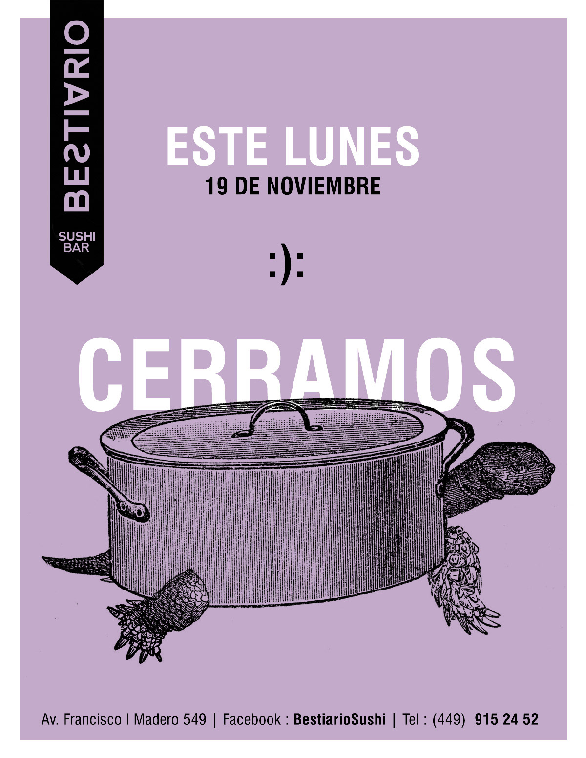
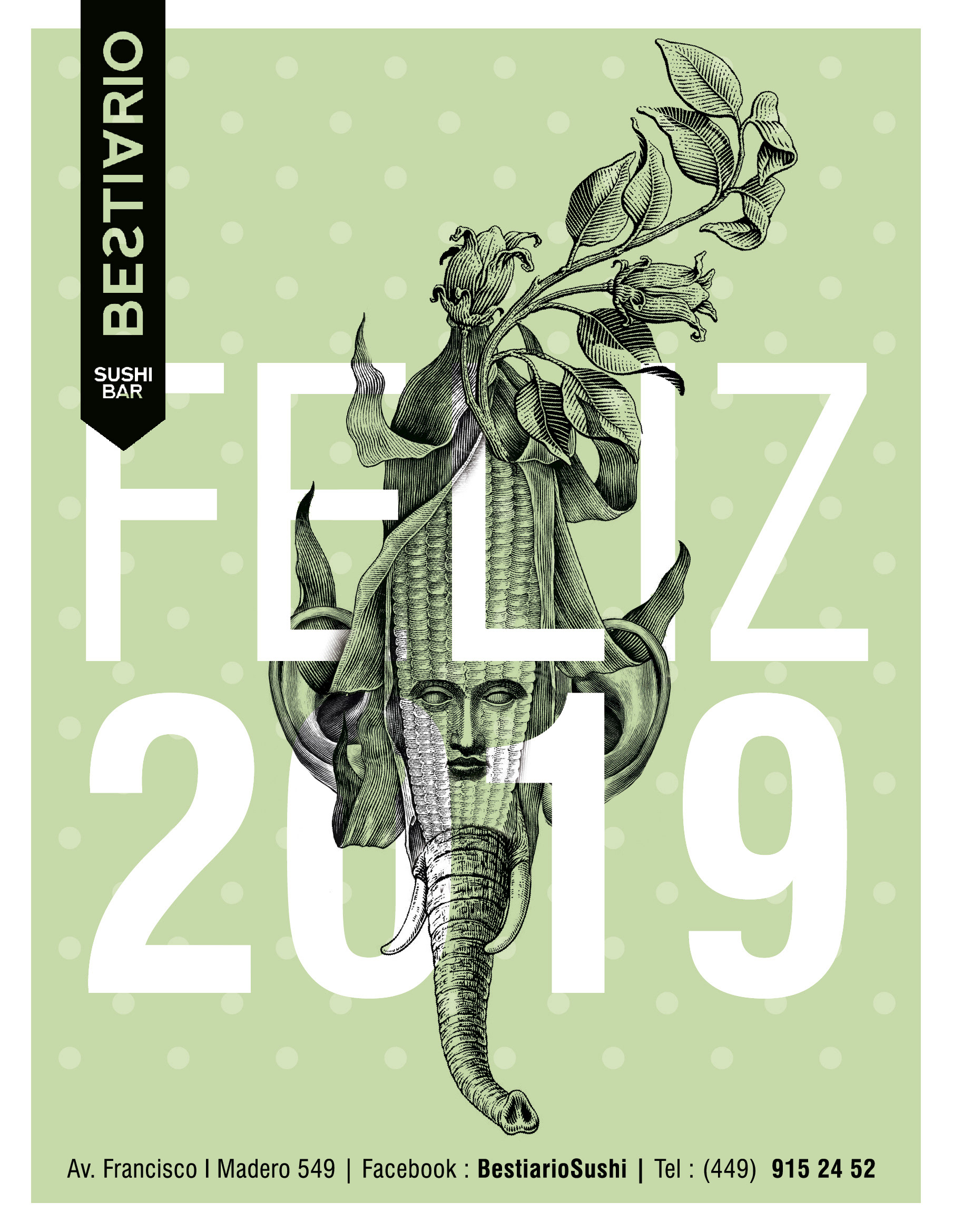
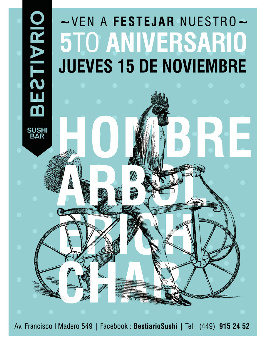
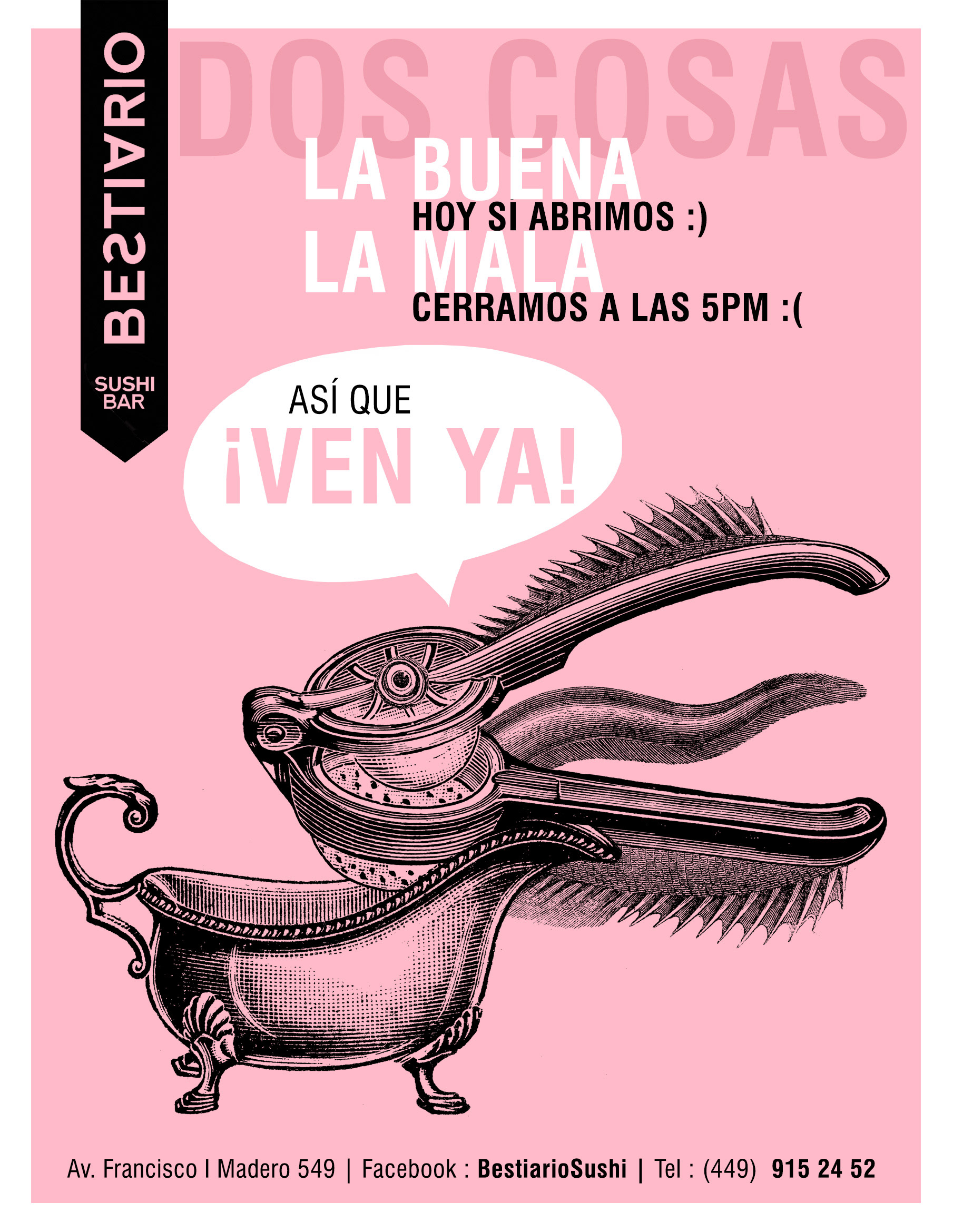
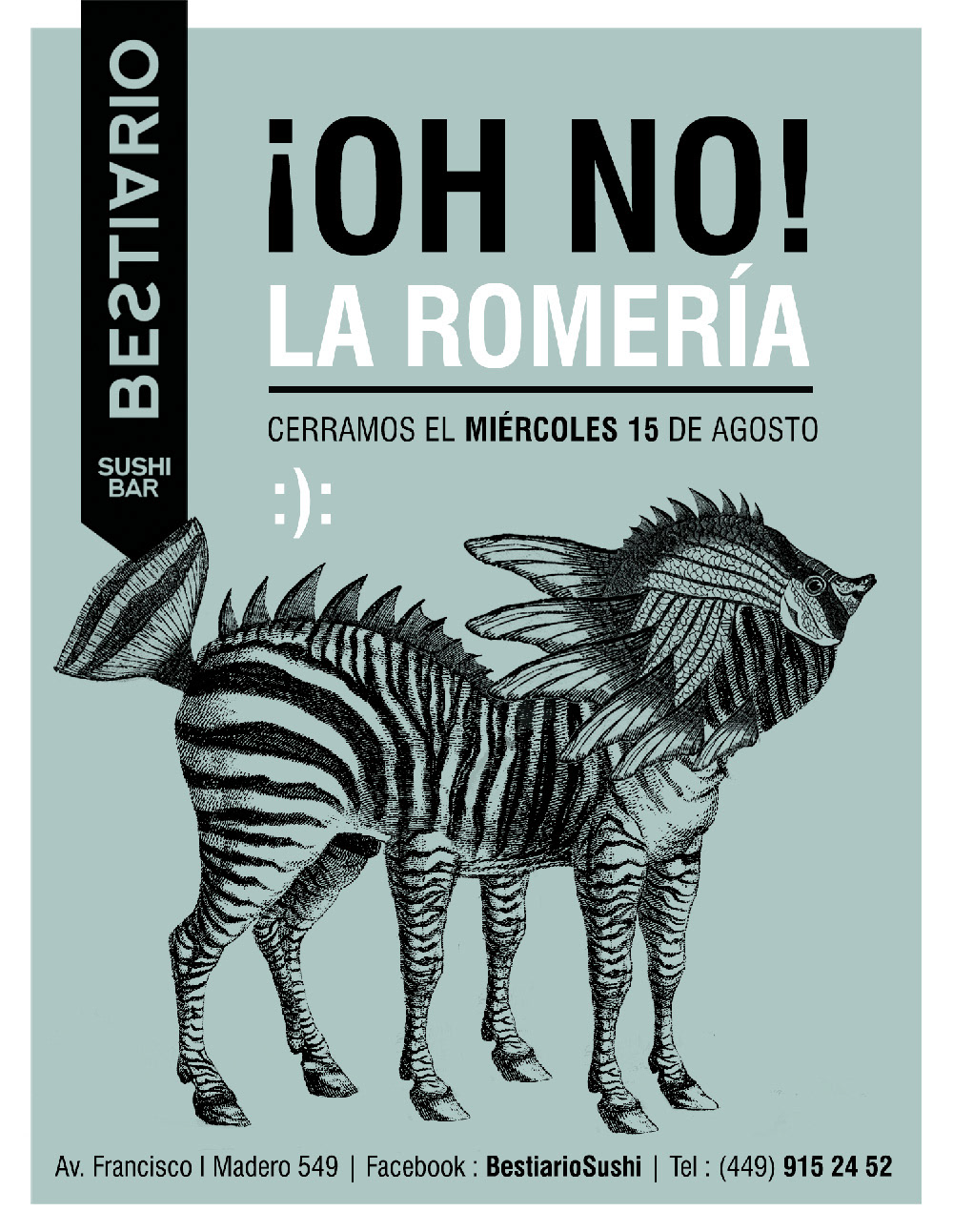
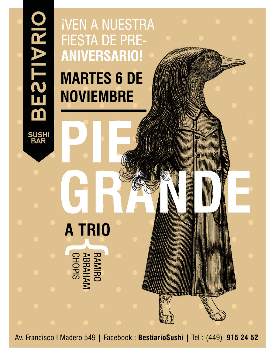
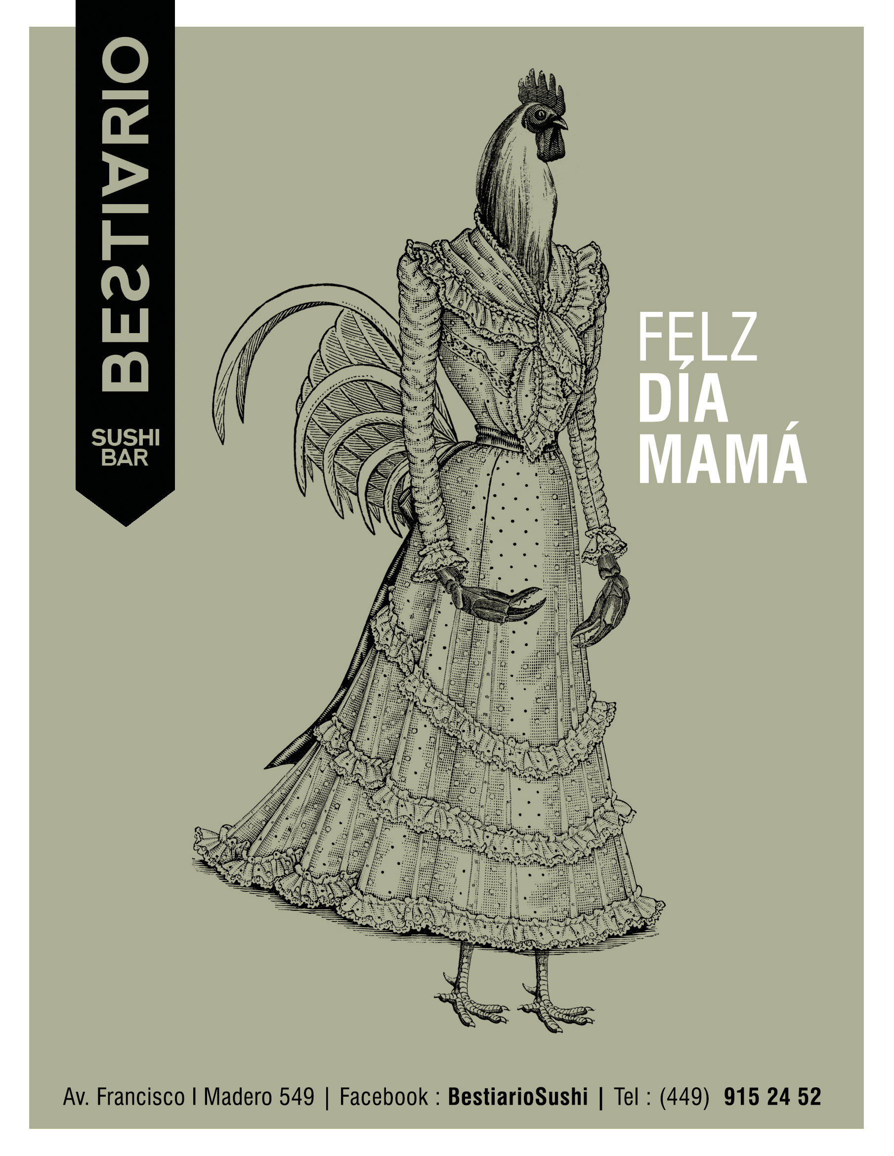
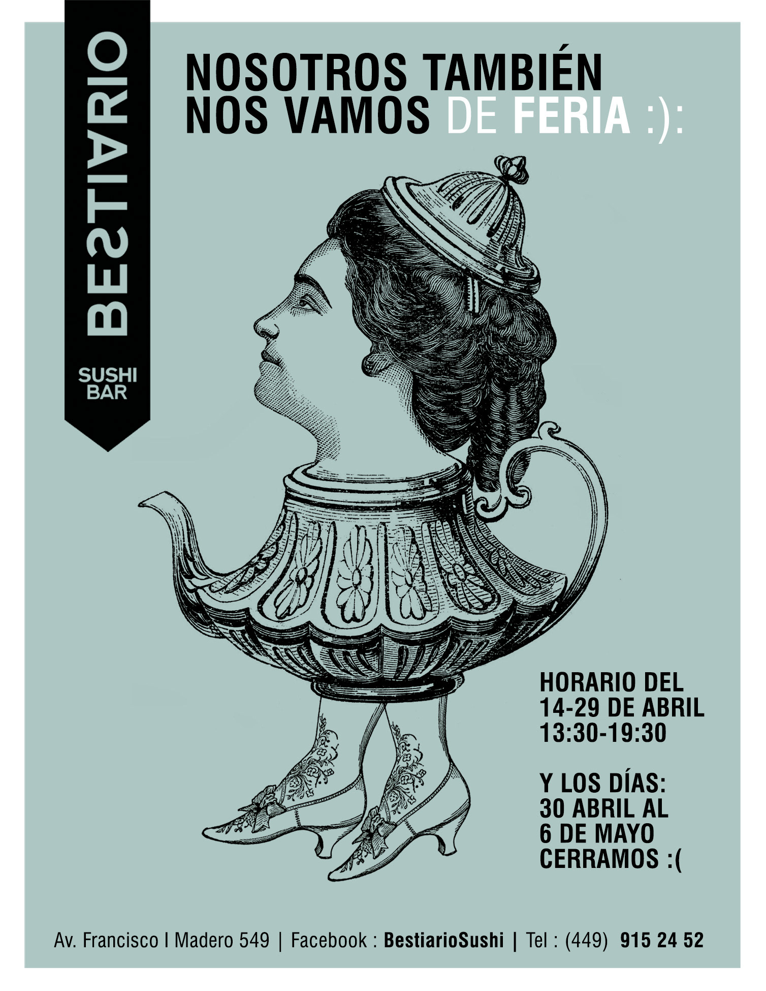
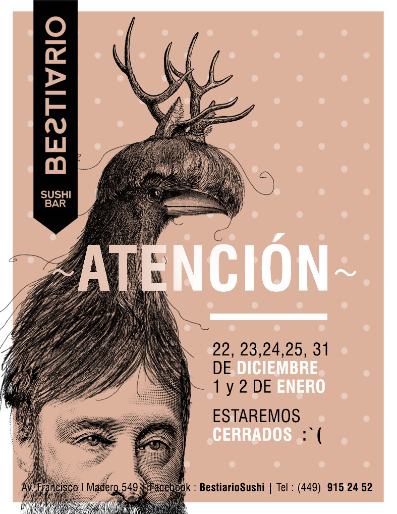
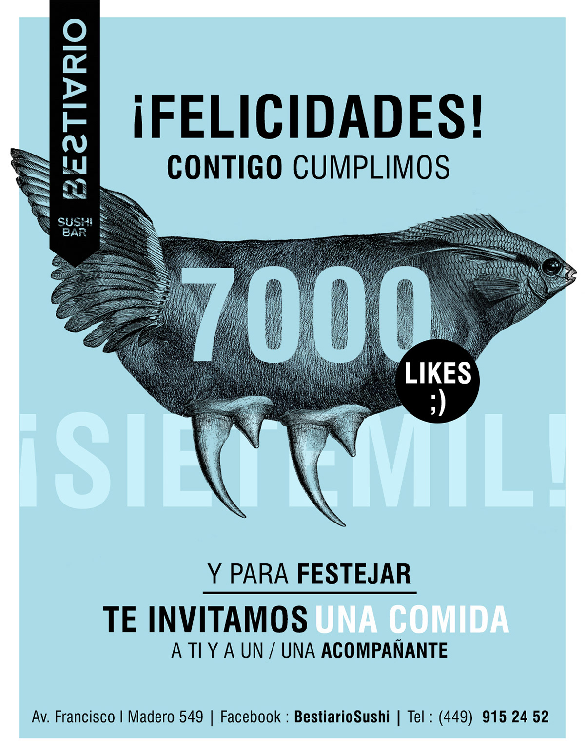
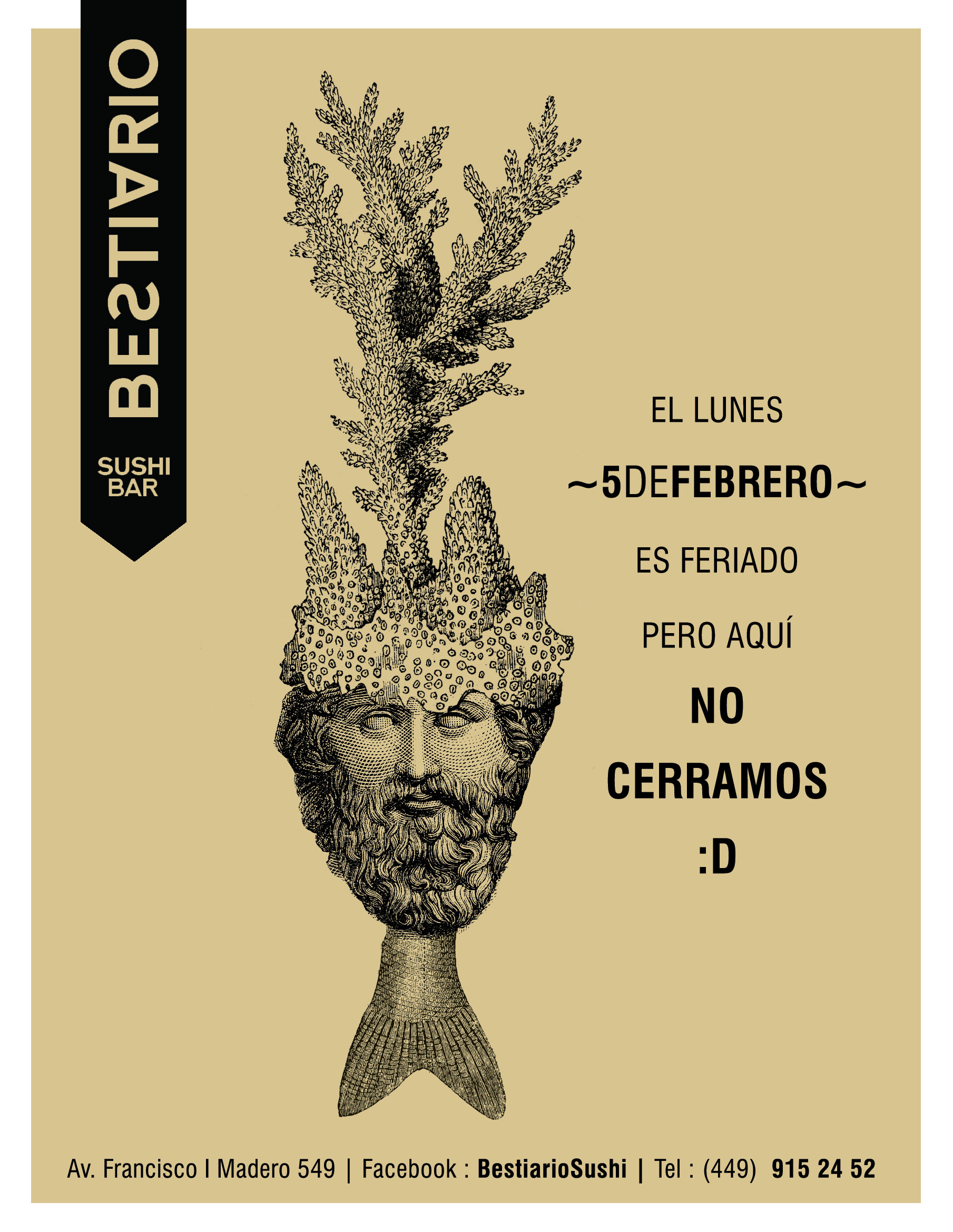
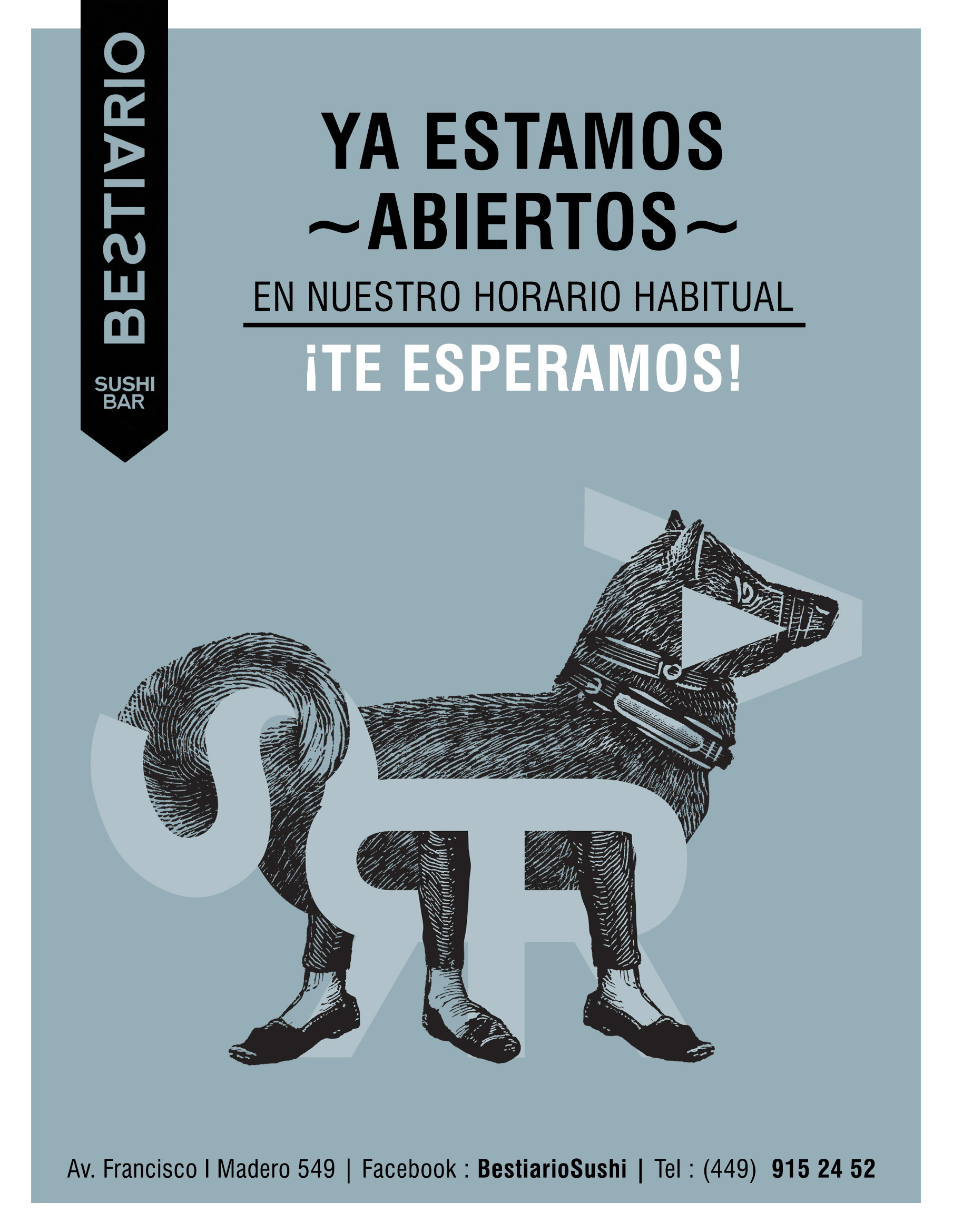
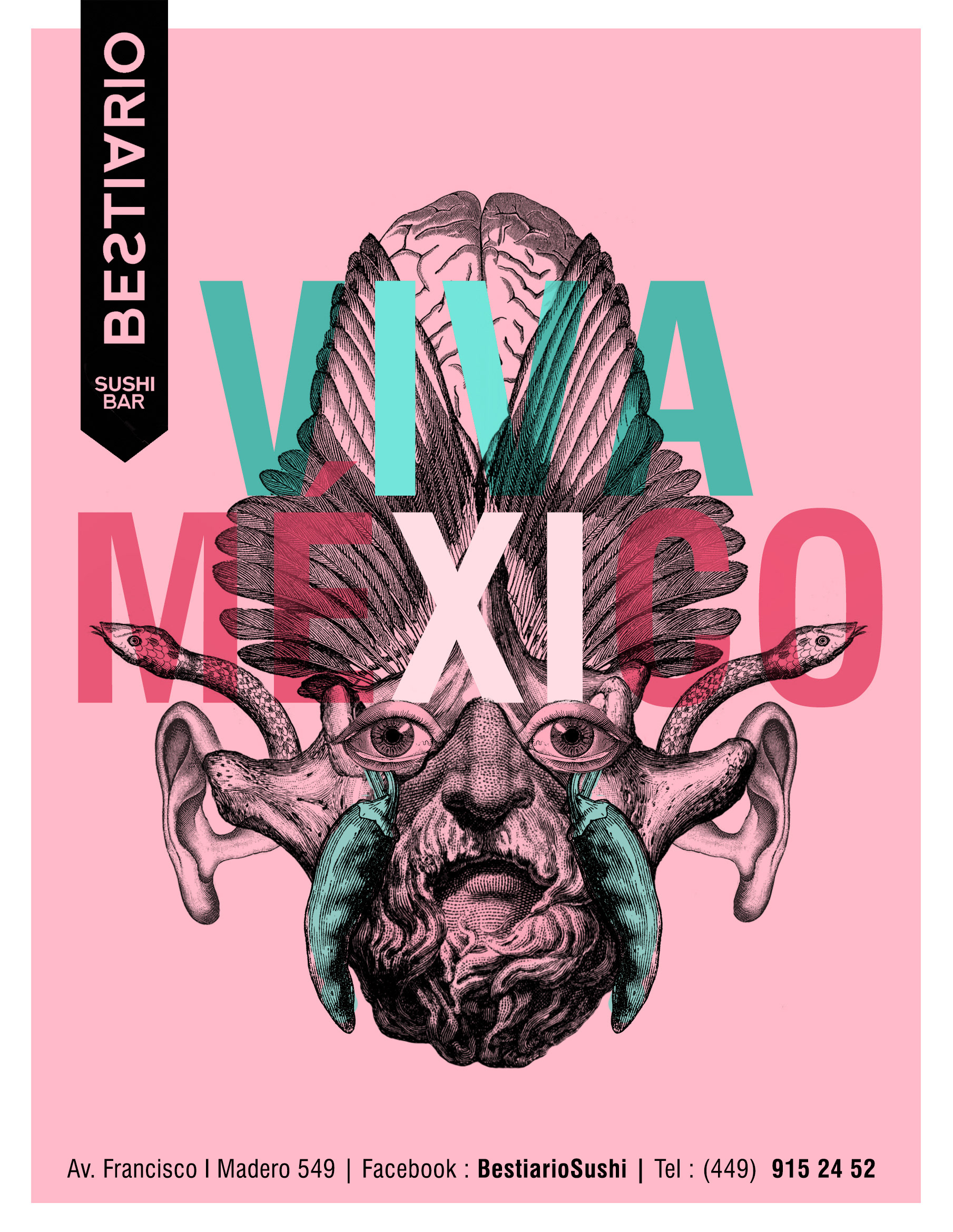
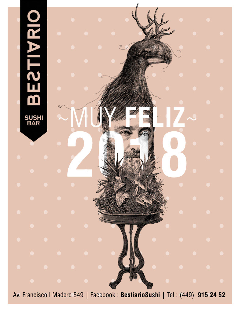
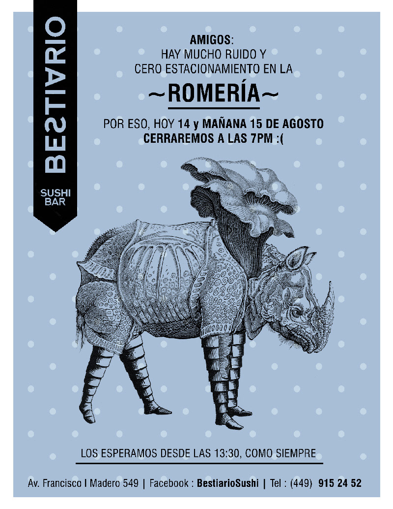
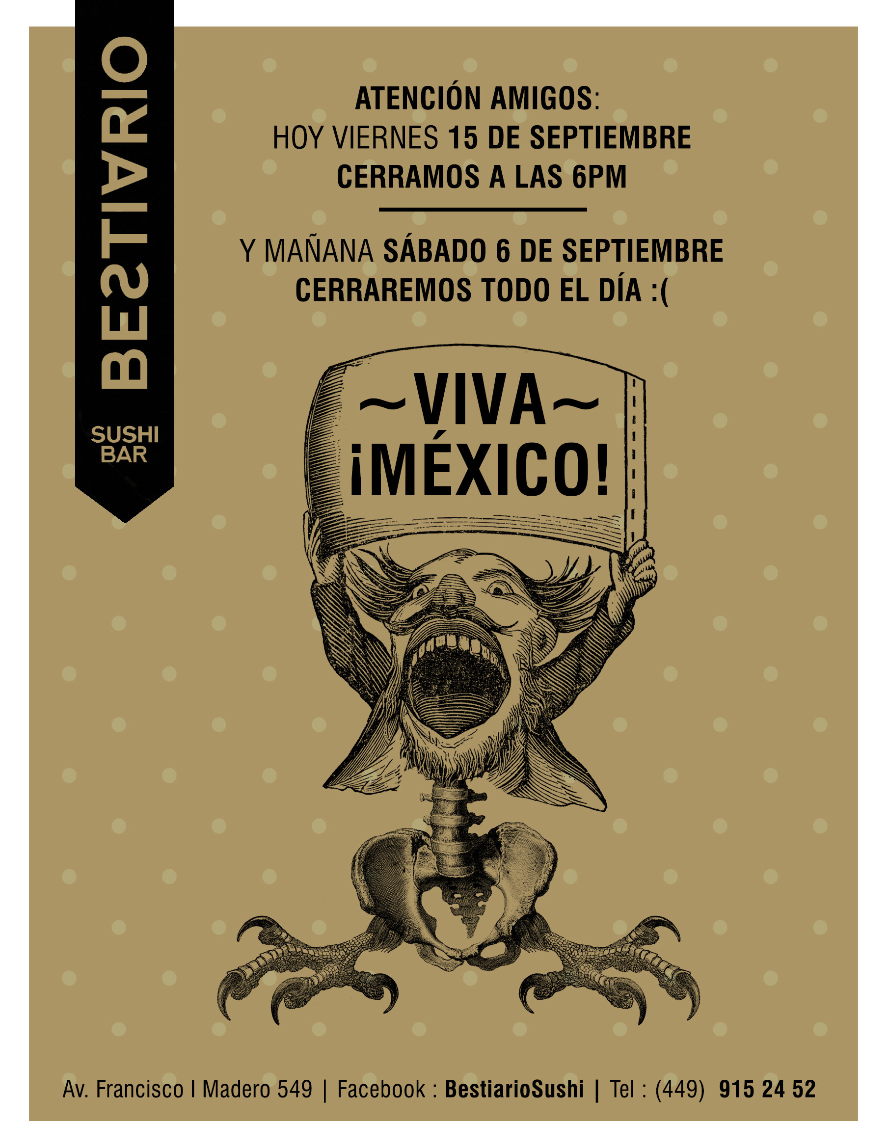
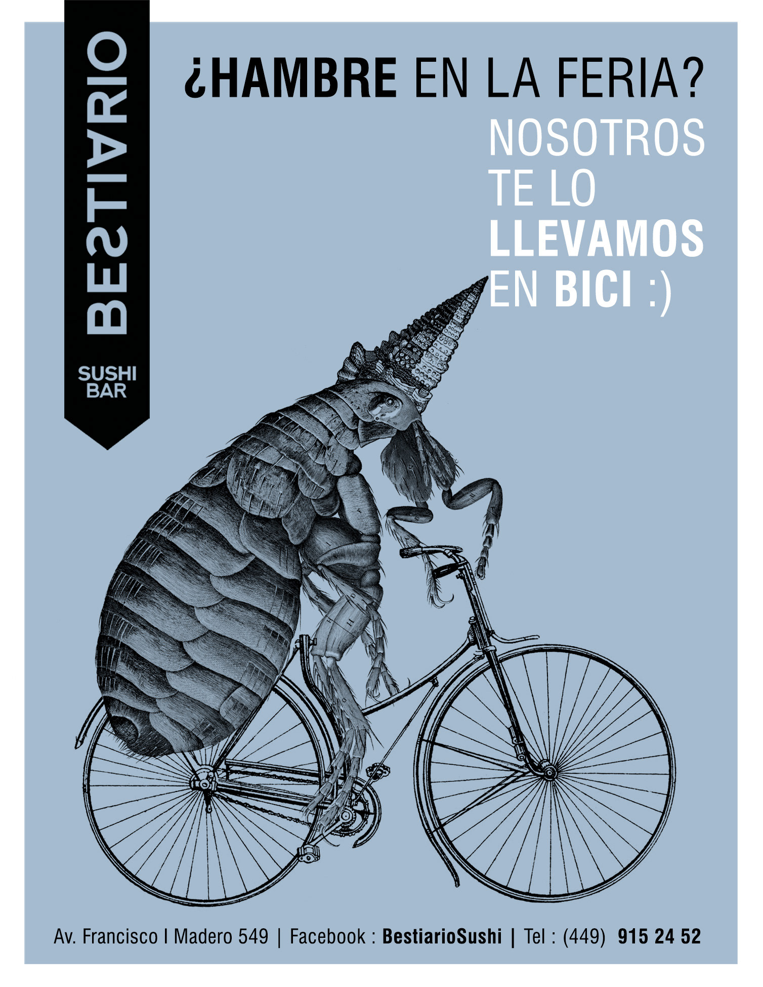
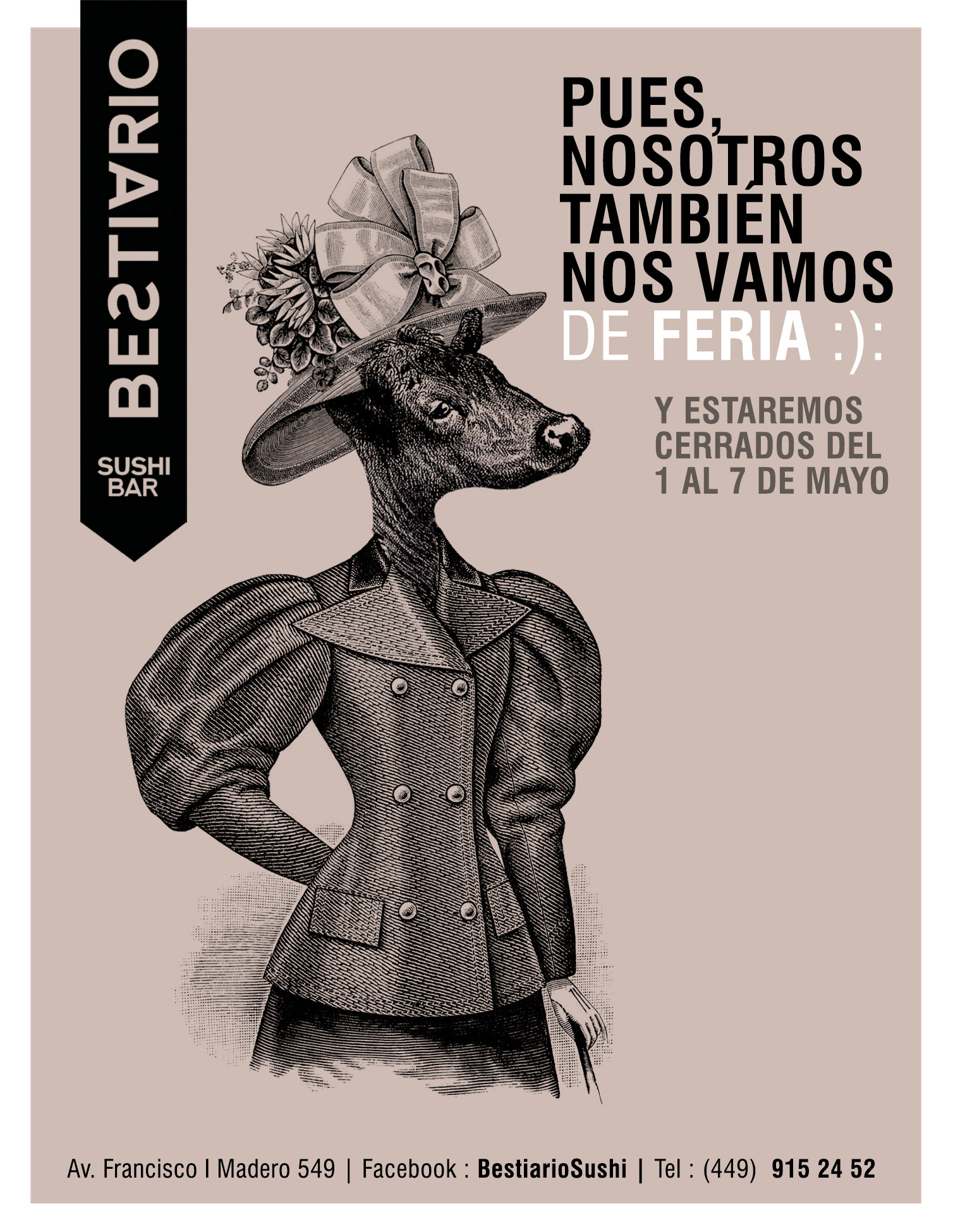
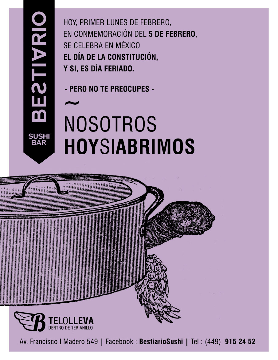
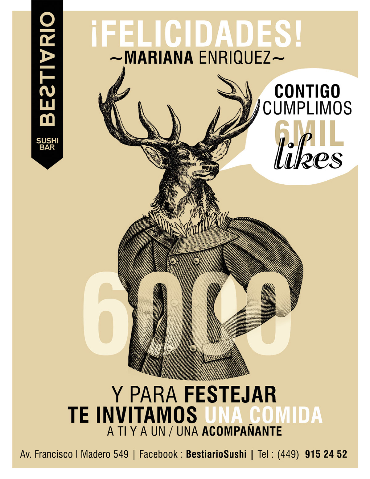
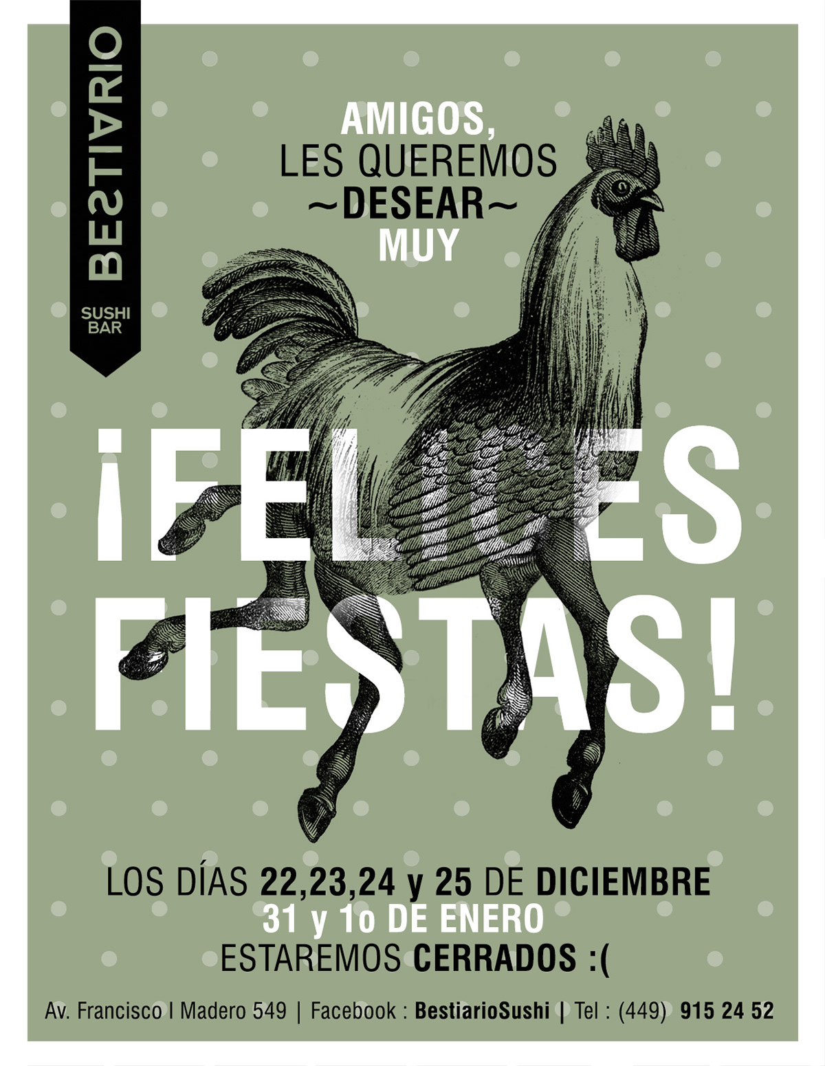
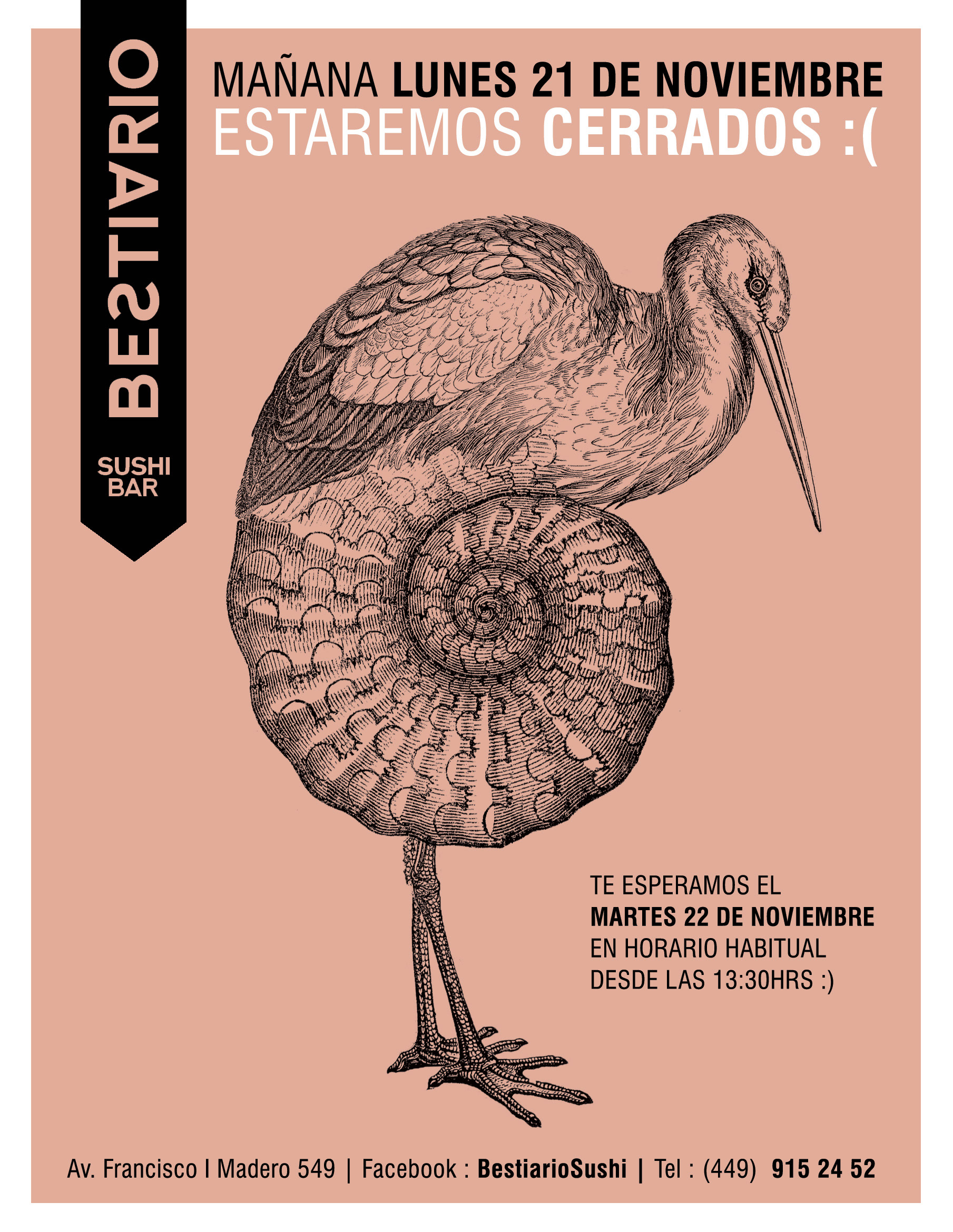
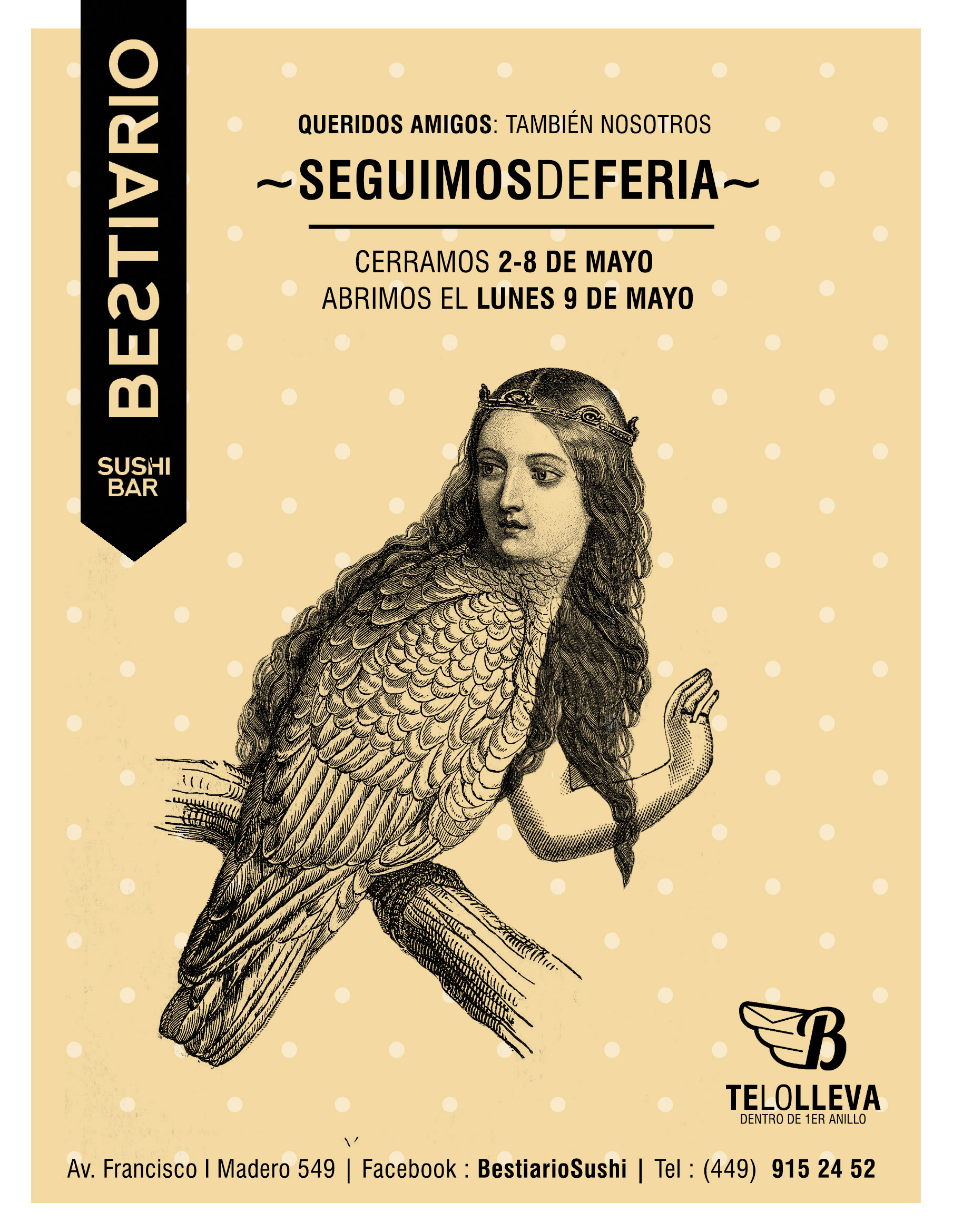
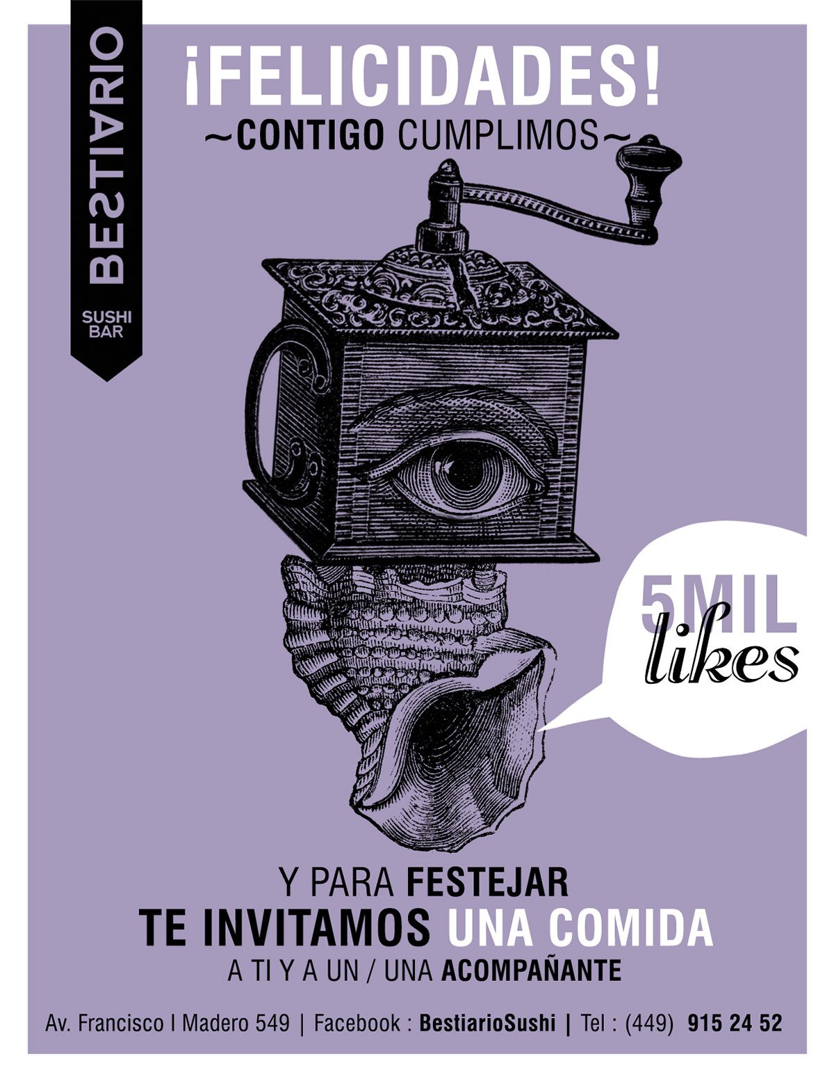
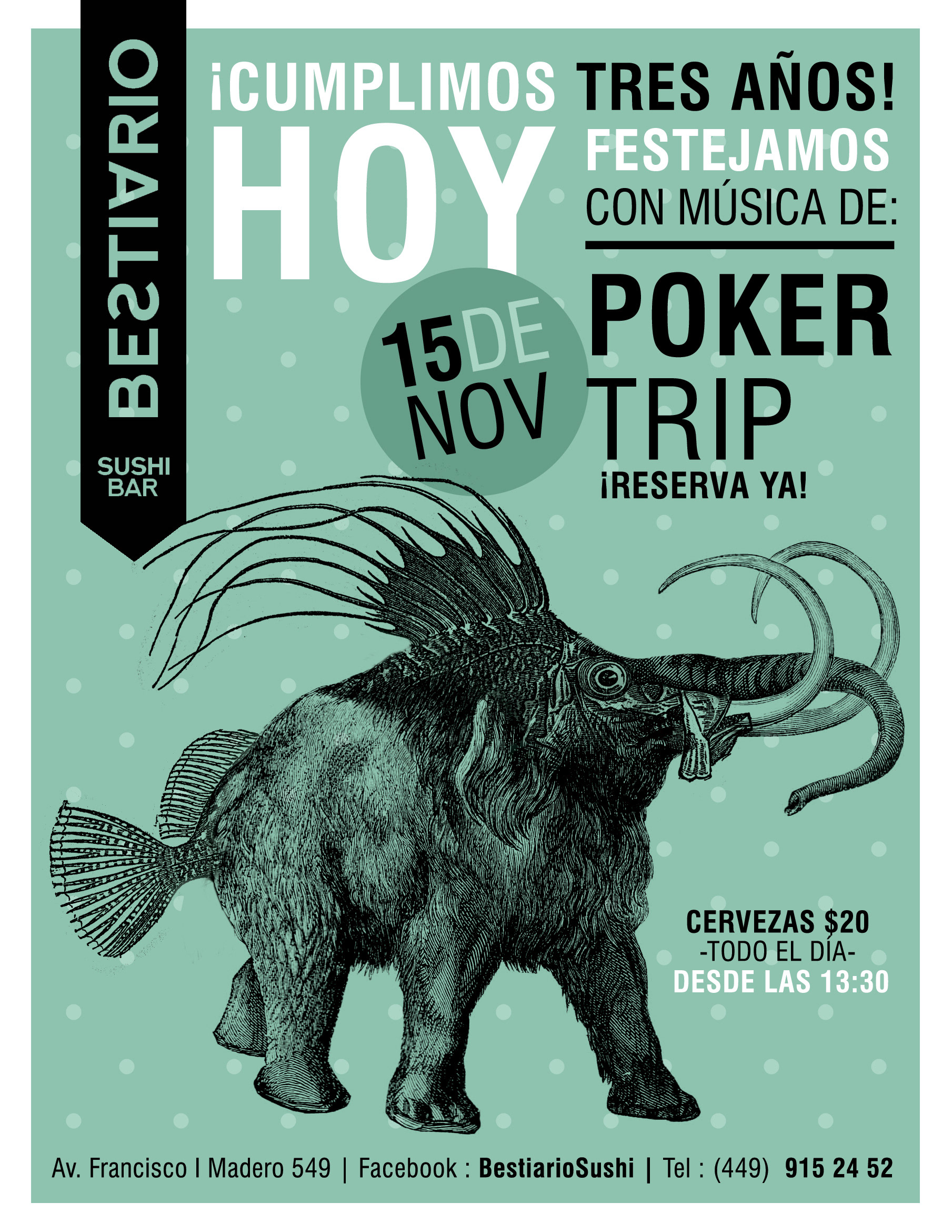
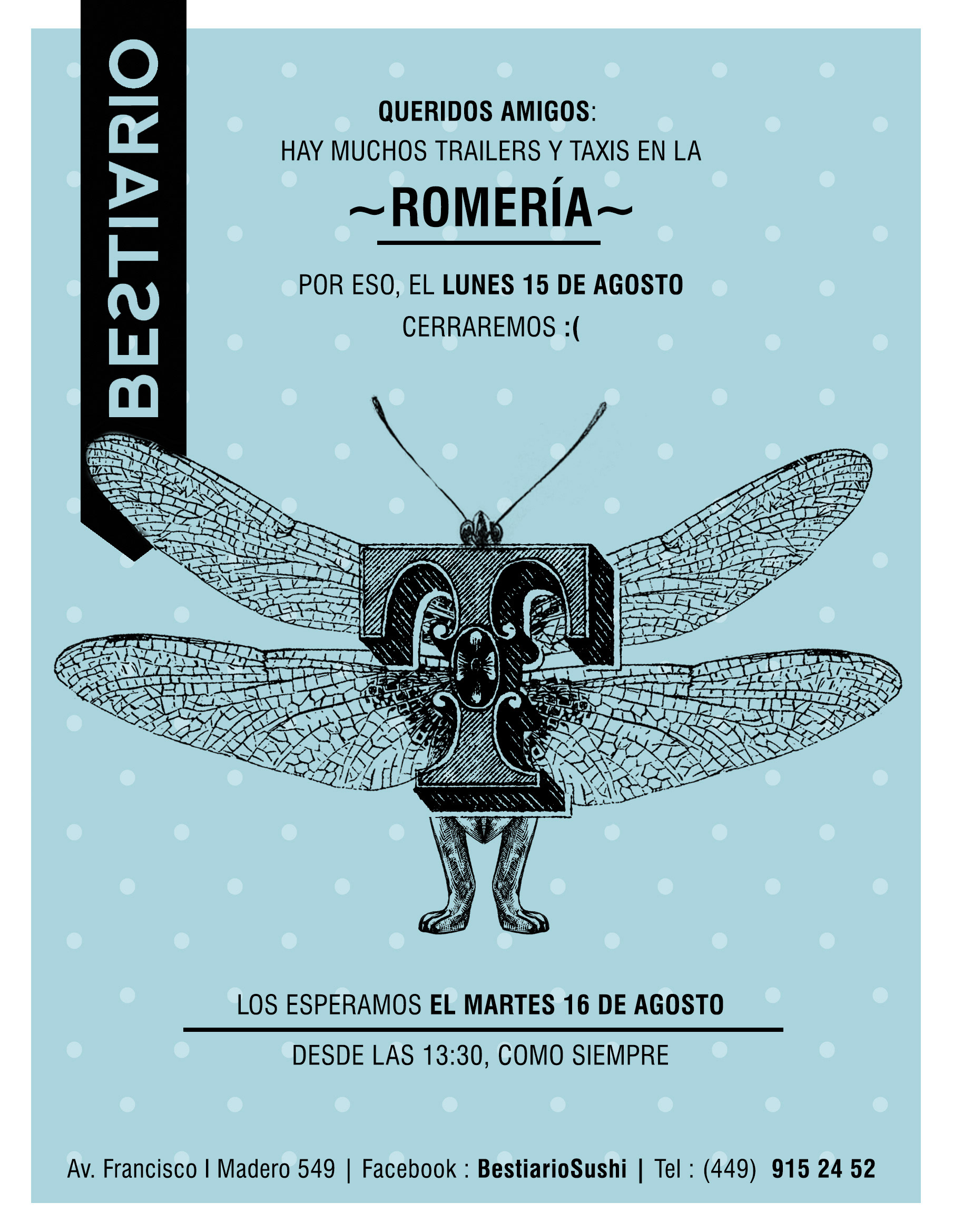
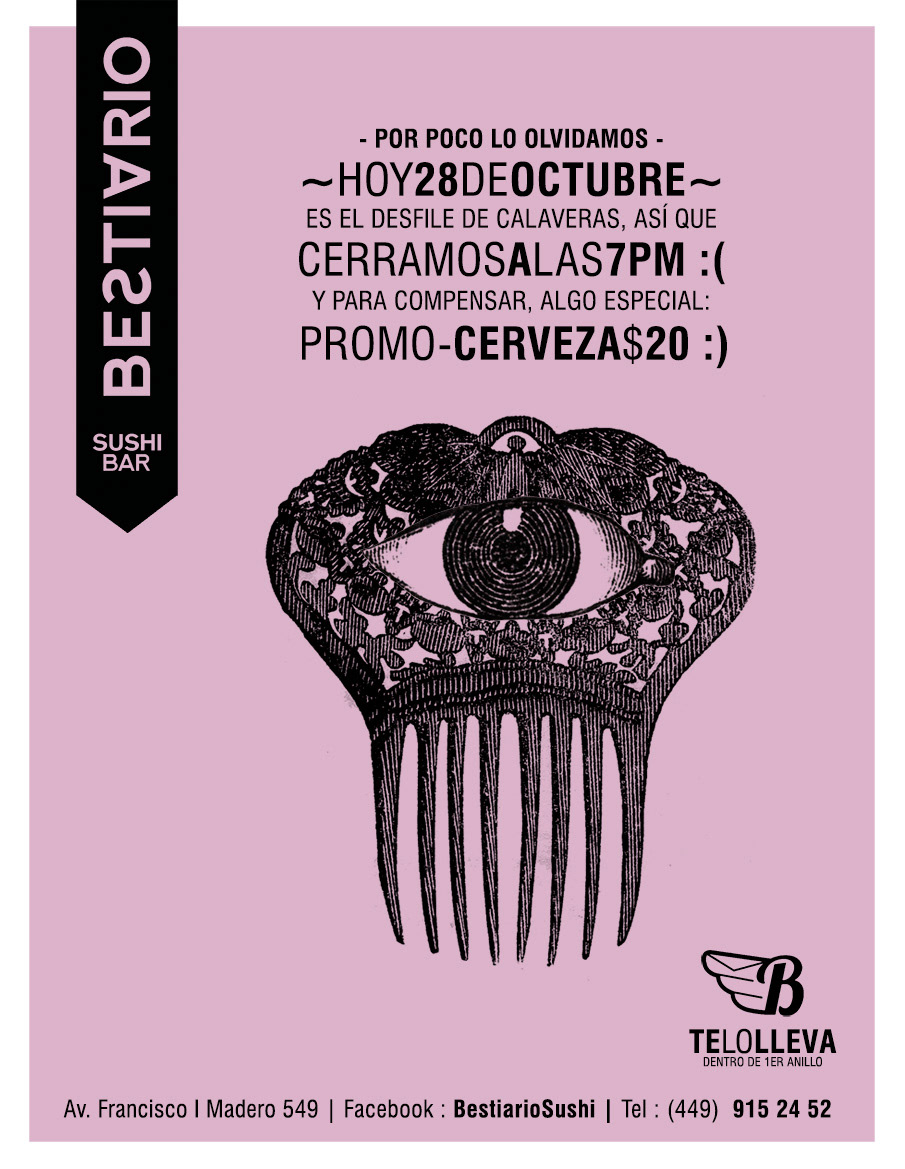
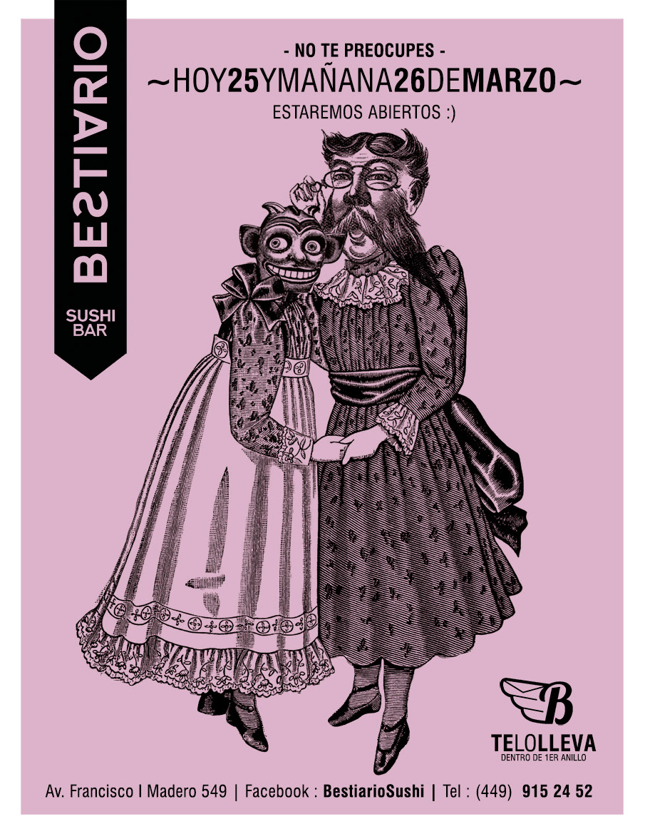
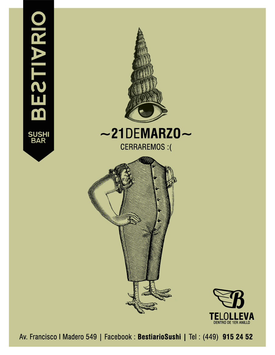
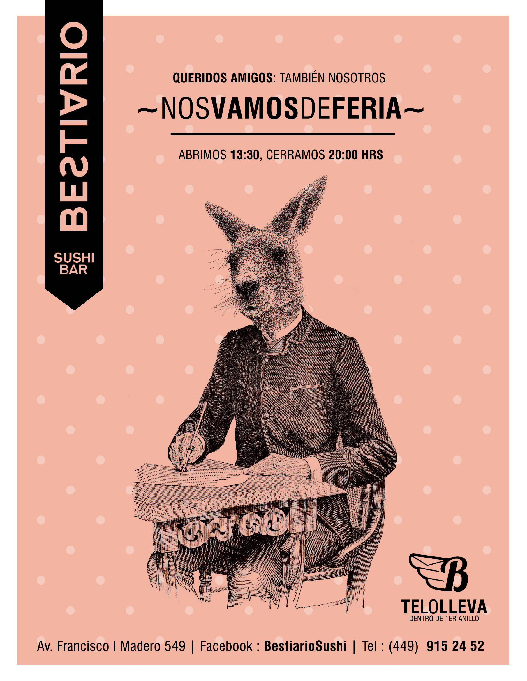
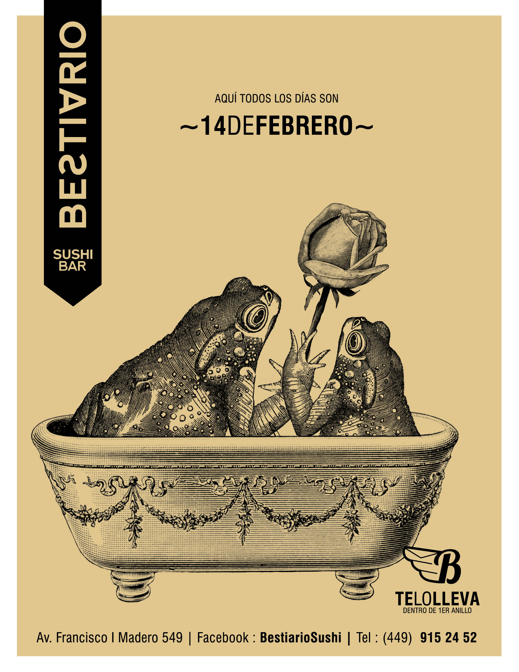
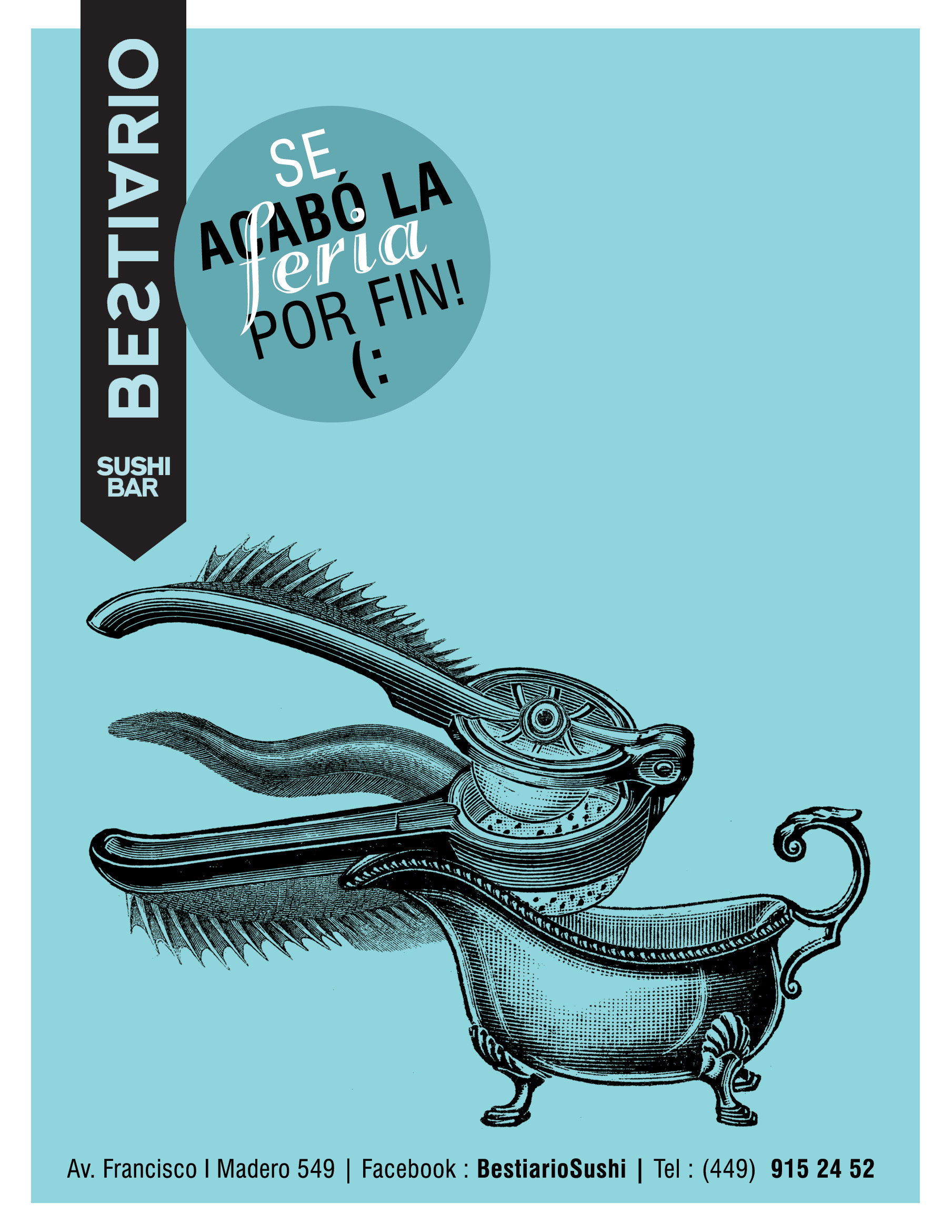
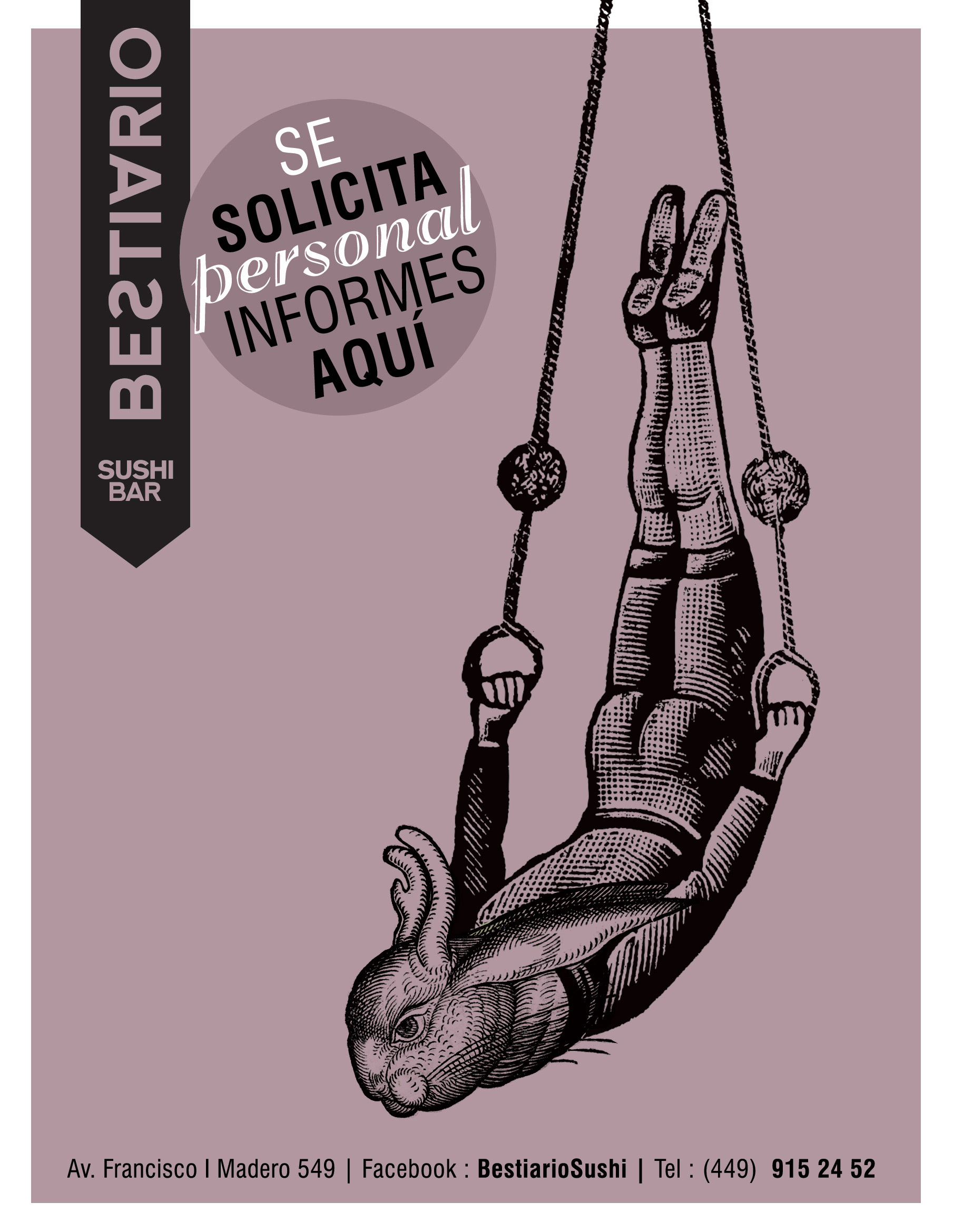
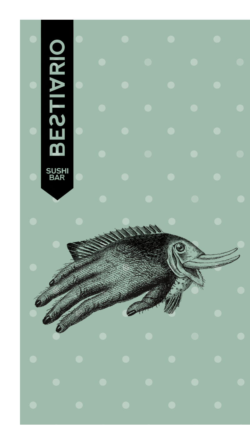
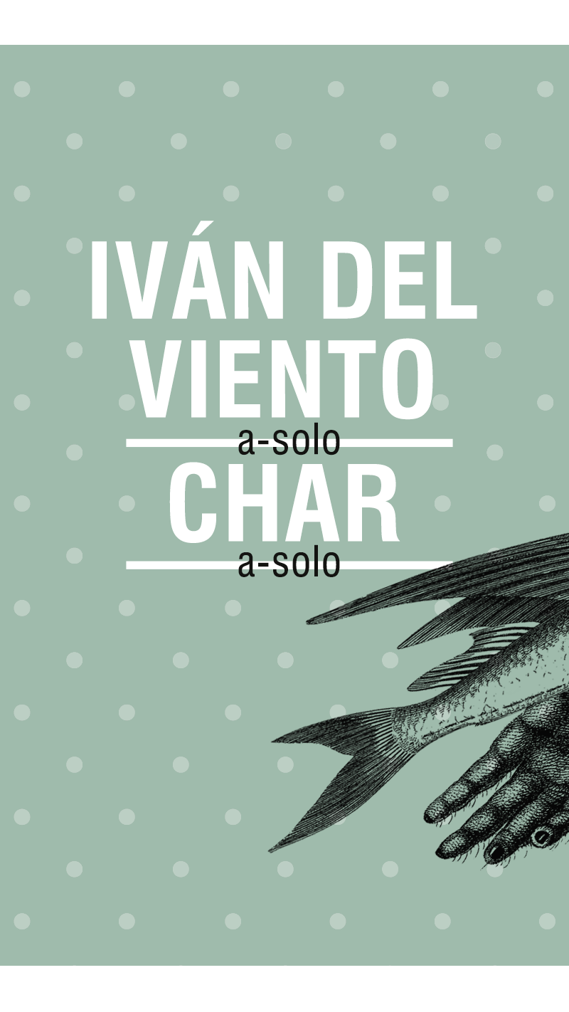
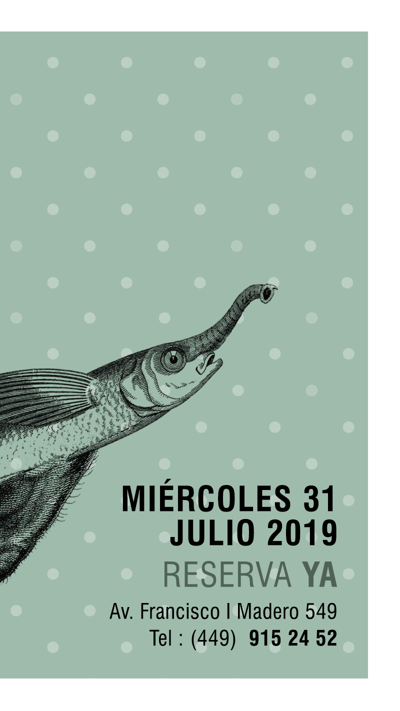
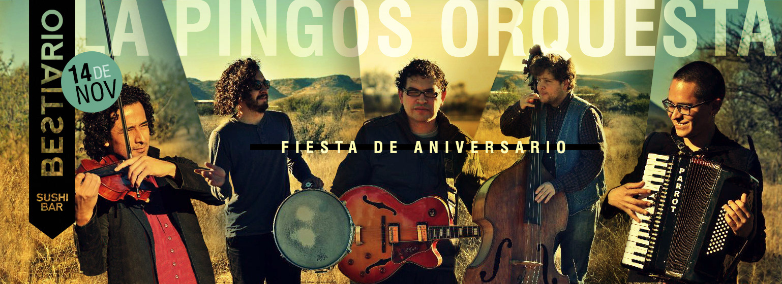
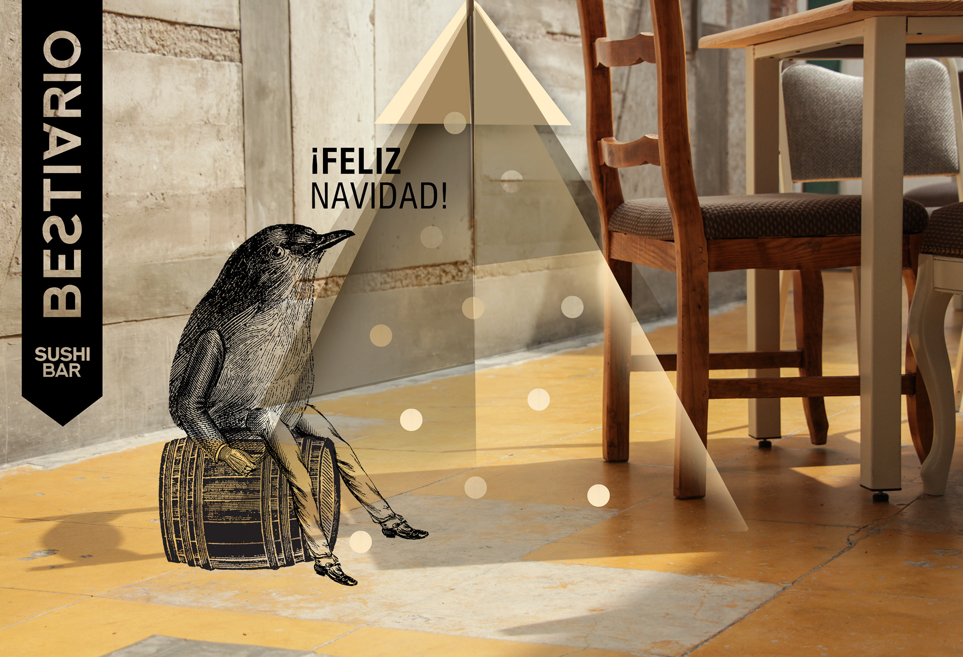
For advertising I use photographs that I have previously taken in the restaurant with natural light. I also do illustrations where I select elements of lithographs from the Victorian era, parts of people, animals, objects and mix them with each other to transform them into new creatures that are part of our "Bestiary".
I use a soft, almost pastel color palette that blends in with the kitschy Victorian era and contrasts with the new illustrations transformed into our beasts.
And snip, snap, snout...
If you liked the history of the process, put a dot below :)
Welcome all comments!
And if you're in Aguascalientes, head over to Bestiario Sushi Bar to enjoy a delicious Mexican roll.

Corporate Identity Creative Process: Bestiario Sushi by liliana.es
