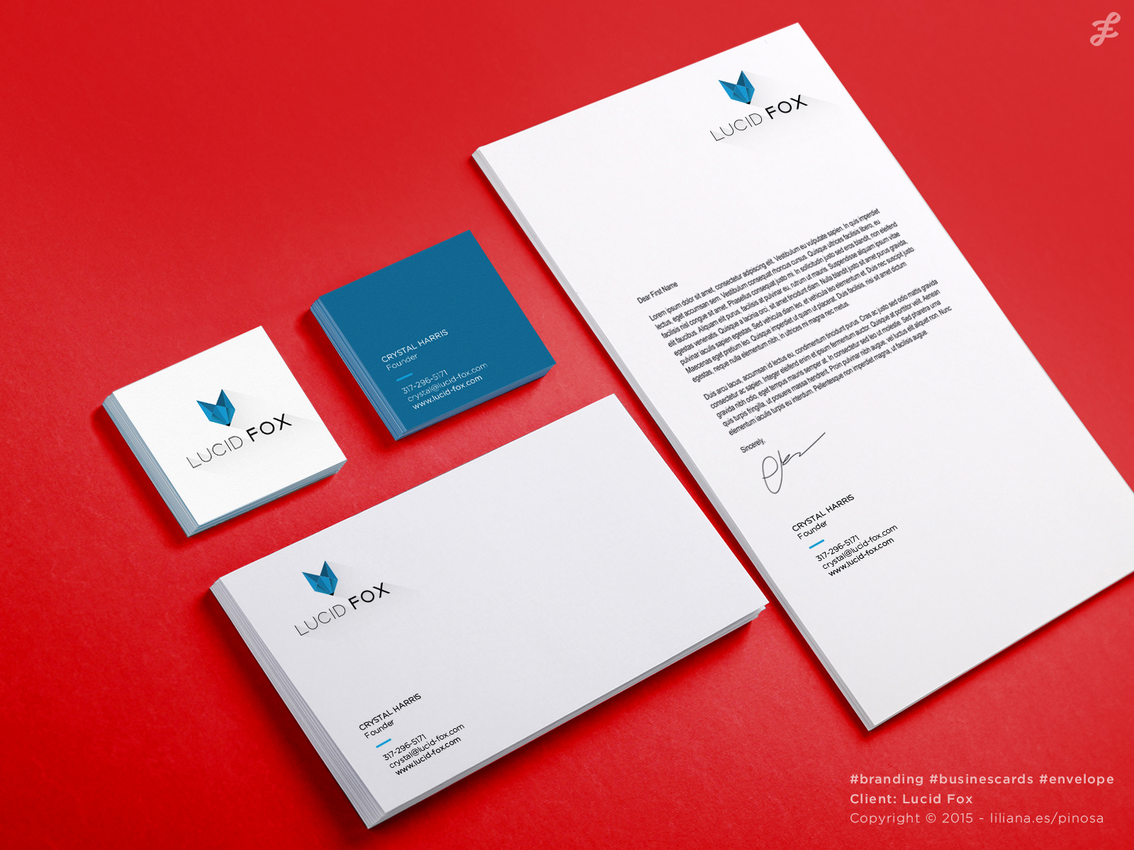
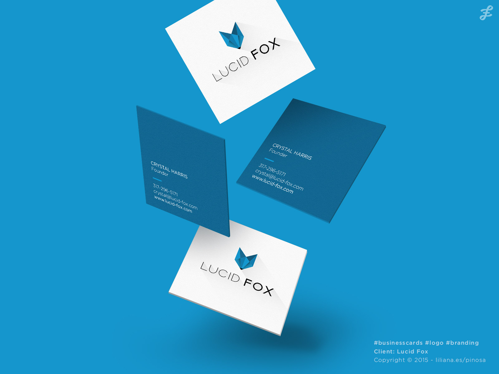
Lucid Fox is a User Interface (UX) consulting agency based in the United States.
The client needed a new logo to formally begin as an independent UX consultant.
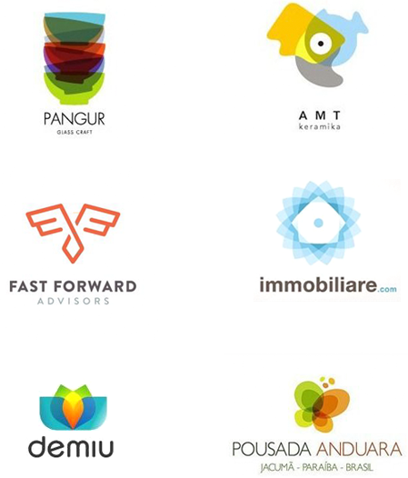
I was given some examples of logos that the client liked and wanted me to use as inspiration.
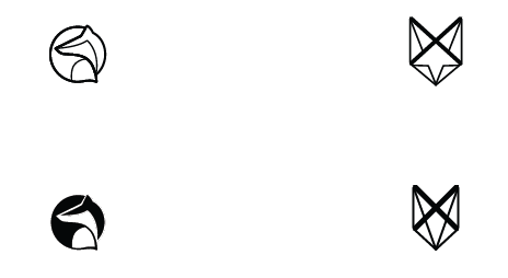
Organic / geometric
Since the client's name is "Lucid Fox" it was natural to use a fox as the main icon in the logo.
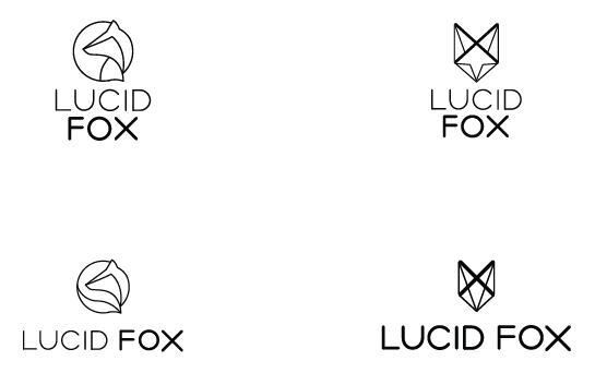
I started with two very simplified ideas. The first a very organic and round with the fox inside a circle with coiled tail, the other inspired by Japanese paper folding "origami", with straight lines, triangles and polygons.
When I am designing logos I most often send the client the first ideas in simple black and white. This is to get the client to focus on the shape and form of the logo without being distracted by color, gradients and shadows. At some point most logos will have to be used as a stamp or in simple black and white, so it is always important that it started out like that.
With the two graphic elements I made some different suggestions where the fox would replace letters in the name of the company.
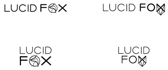
I also suggested traditional logo options where the icon was separate from the typography of the name.
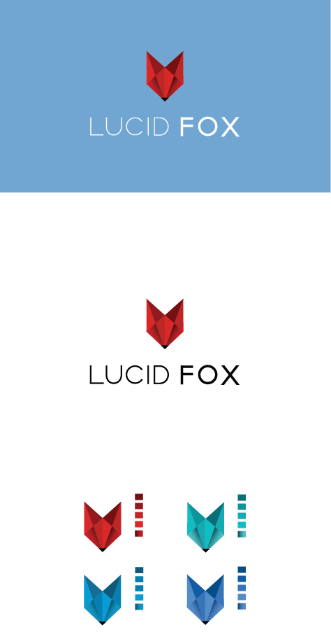
The next step was to start playing with color to help decide between the two options. Also the font was changed, instead of being with oval endings we decided to make them straight.
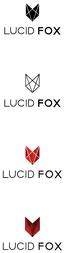
At this point, the client decided to go with the polygonal option.
I designed different variations playing with the angle of the light and the shadows cast.
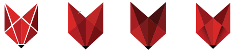
We decided to use a small gradient that simulates the area where the eyes of the fox would be located, as it is the most realistic and will be easier to recognise in a smaller sizes.
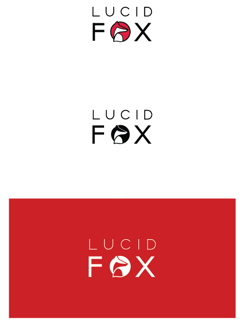
I placed the name of the brand centered below the icon.
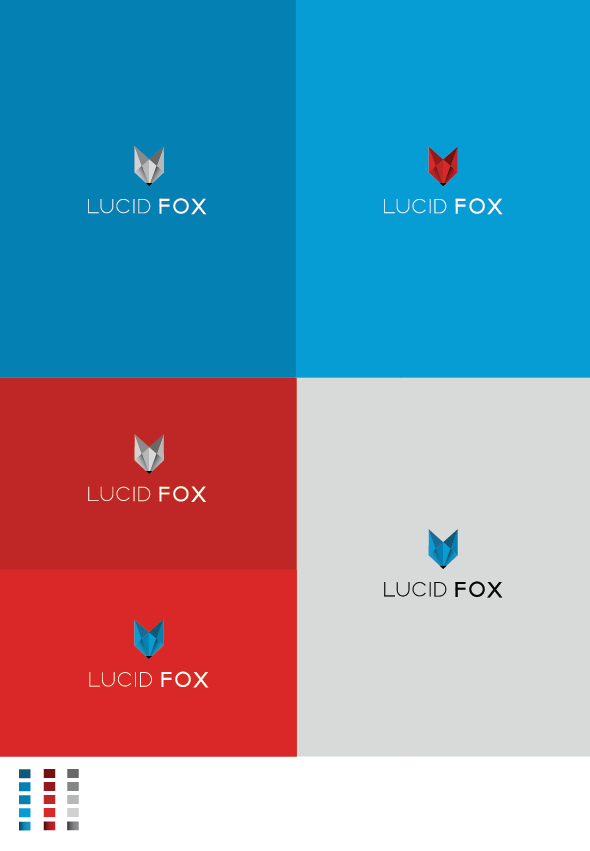
Next I offered the client some different logo and background color options.