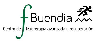
In our first meeting, my client showed me an idea he had for his logo. There was the name of the business, and a description.
There were also some elements as a human body running and a big letter F for Fisioterapia (Physiotherapy).
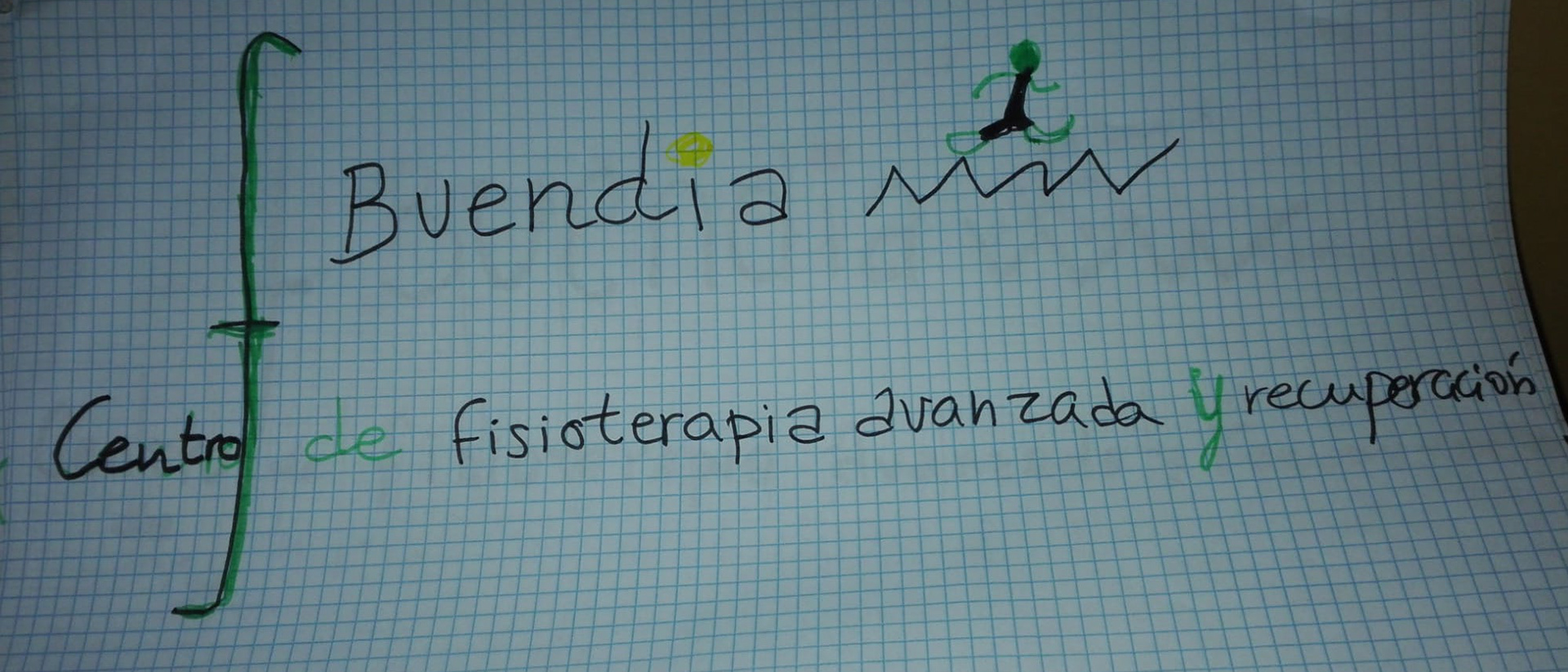
In this meeting we talked about the importance for a logo to be simple; having many elements would be difficult to read and recognise the brand.
After this meeting I did a research for other examples of logos and images that are used for related services. In many of them the spine was there and represented by dots or squares, some of them had a human figure or human parts. The mainly colours used were on a green shade.

The first drafts
The idea was to integrate the letter B with the spine using the fewest elements possible
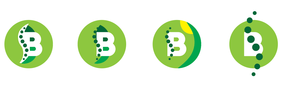
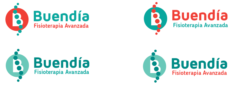
I showed my client these options for the logo including his own idea
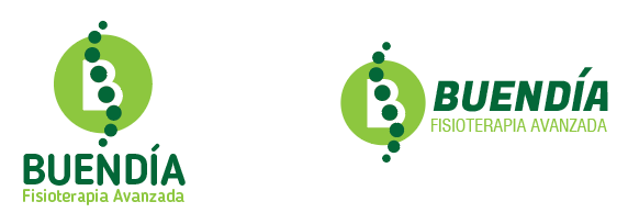
Colour palette / font selection:
We selected the logo, now we tried with different fonts and colours for the brand.
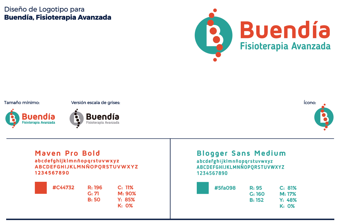
Final Files:
I delivered to my client the final files with the selected fonts, variation of colours, icon and different applications for the logo
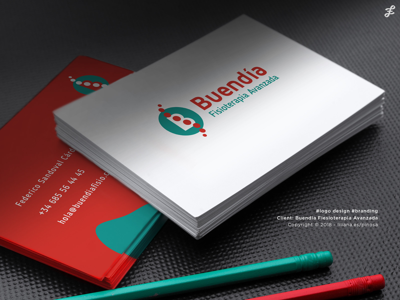
Business Cards
Promotional Banner
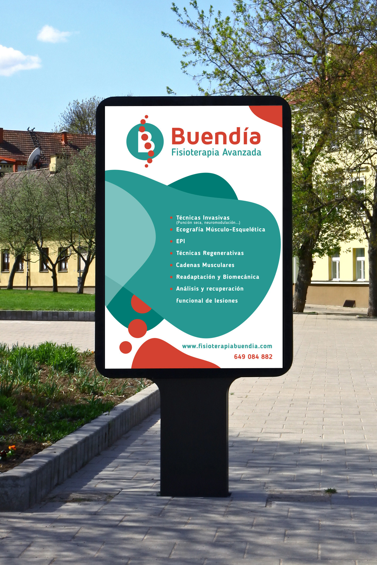
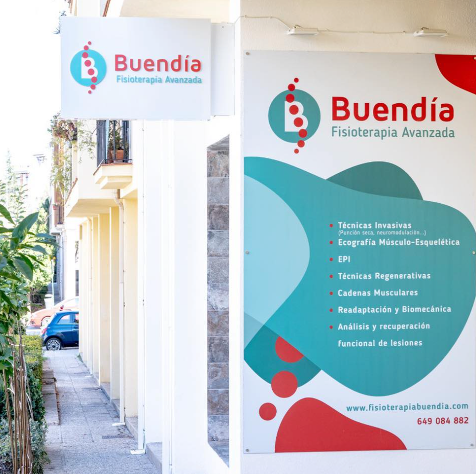
Outdoor advertisement and sign
Do you have a project in mind or do you want to renew the image of your brand?
We need to talk!
¿Tienes un proyecto en mente o quieres renovar la imagen de tu marca?
¡Tenemos que hablar!