
Creating the brand design for Portsuites.dk involved several important steps:
Research and Analysis: We conducted thorough research and analysis to understand the hotel's unique location. We explored the natural beauty of the "Little Belt" area, the surrounding landscapes, and the cultural significance of the region. Additionally, we studied the target audience and current trends in the hospitality industry to ensure our design would be relevant and appealing.
Concept Development: Drawing inspiration from the hotel's coastal location, we explored concepts that conveyed a sense of tranquility, luxury, and a connection to nature. Ideas centered around maritime elements, coastal aesthetics, and Danish design principles emerged as potential directions for the brand.
Visual Identity Creation: Based on the chosen concept, we crafted a visual identity that captured the essence of Portsuites.dk. This included designing a distinctive logo that combined elements like waves, seashells, or other nautical motifs to evoke a sense of seaside elegance. The color palette reflected the serene hues of the coastal environment, incorporating soft blues, sandy neutrals, and hints of seafoam green.
Typography and Imagery: Selecting the right typography was crucial in establishing the brand's personality. We sought a balance between sophistication and approachability, opting for clean, modern fonts that conveyed a sense of luxury. For imagery, we focused on capturing the breathtaking coastal views, the hotel's exquisite interiors, and the tranquil ambiance to entice potential guests.
Collateral Design: To ensure consistency across all touchpoints, we extended the brand identity to various collateral materials. This included designing stationery, brochures, menus, and other branded items that showcased the hotel's attention to detail and commitment to providing an exceptional guest experience.
Digital Presence: We also developed a comprehensive digital strategy to enhance Portsuites.dk's online presence. This involved designing a user-friendly website that showcased the hotel's unique offerings, implemented a seamless booking system, and incorporated captivating visuals to entice visitors. Social media profiles and online marketing campaigns were also developed to expand the hotel's reach and engage with potential guests.
Throughout the brand design process for Portsuites.dk, our goal was to create a visual identity and brand experience that resonated with the hotel's target audience. By capturing the essence of the coastal location, infusing luxury into every detail, and creating a memorable brand presence, we aimed to position Portsuites.dk as the ultimate destination for a deluxe and unforgettable stay by the "Little Belt."
Starting with the client's input
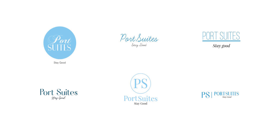
I received some initial ideas from Betina, the director of Portsuites.dk, regarding the logo design. Her ideas primarily revolved around typographic designs with thin lines, and some of them incorporated the hotel's initials. She expressed a preference for a light blue color for the logo.
Keywords
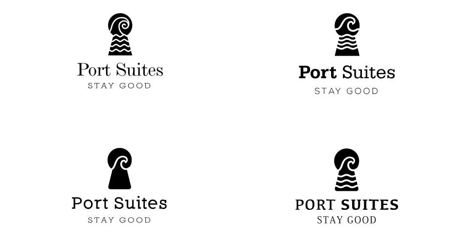
To begin the logo design process for Portsuites.dk, I started by considering some keywords provided by Betina: Water, Home, Keyhole, Door, Room. These keywords helped guide the direction of the design. For the initial options, I chose to work with black and white to prioritize the shape and form of the logo, allowing us to focus on the overall visual impact without the distraction of color.

Trying with the initials
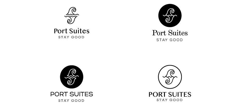
In exploring the logo design with the initials of Portsuites.dk, I made modifications to the wave shape to resemble the letter P. By duplicating and mirroring this shape, it also took on the appearance of the letter S. This approach allowed for a clever incorporation of the initials while maintaining a visual connection to the wave element.

Showing the options to my client
After finalizing the options incorporating the initials and wave elements, I proceeded to add the hotel's name and slogan to the designs. For the keyhole + waves options, I opted for clear serif fonts to enhance the overall visual appeal. I shared these designs with Betina to gather her feedback and input.
My client's input
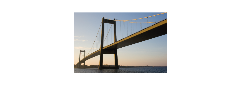
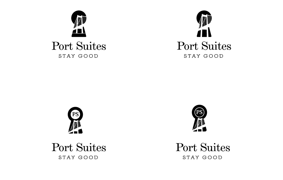
Upon receiving feedback from my client, Betina, she expressed a preference for the option featuring the keyhole with the wave inside. She also suggested incorporating the initials "PS" inside a circle. Additionally, Betina had a new idea to include a symbol of the town, which is a bridge called "Lillebælt" or "Little Belt" in Danish, inside the keyhole design. This new element would add a unique and meaningful touch to the logo.

The bridge
After receiving a photo of the "Lillebælt" bridge from Betina, I traced the image to explore how it could be incorporated into the logo design. I created several options featuring the bridge within the keyhole and shared them with Betina for her consideration. This allowed us to visualize how the bridge would look in the context of the logo and provided an opportunity to further refine the design based on her feedback.

Standing
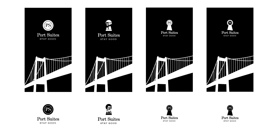
Considering the intricacies of the bridge's details and the challenges it poses when incorporated directly into the small keyhole, I explored alternative options where the bridge becomes a supporting graphic element rather than an integral part of the logo. By doing so, the bridge can still play a significant role in the brand identity while allowing for a clearer and more recognizable logo design. These new options provide flexibility and a balance between showcasing the bridge's significance and maintaining a cohesive and visually appealing logo.
Help to decide
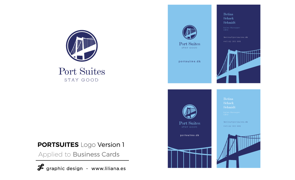
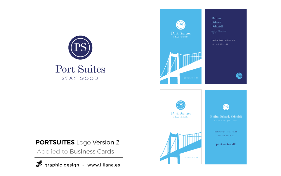
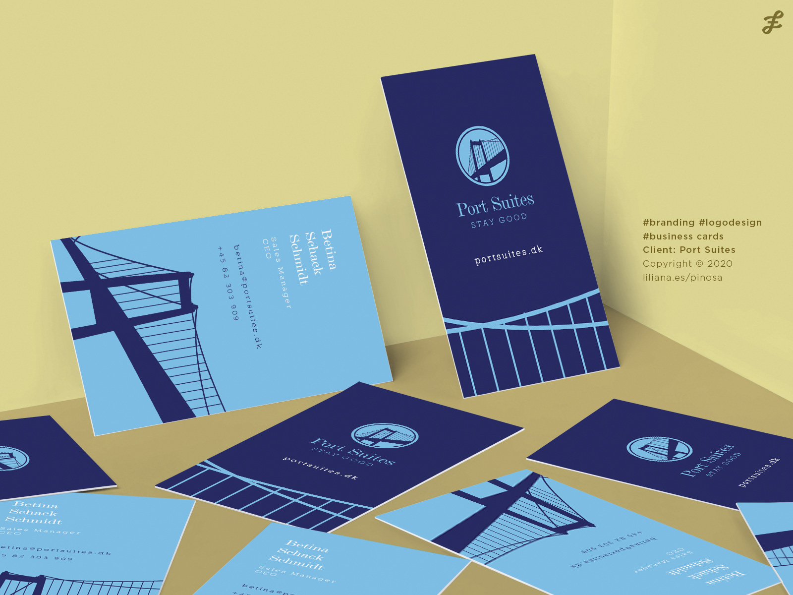
Taking Betina's positive feedback into account, I proceeded to design two options for business cards, which are an integral part of the Brand Identity Design package I offer. As we now have a clearer idea of the logo's shape and overall design, introducing color at this stage helps to bring the logo to life and aids in the decision-making process. Seeing the logo applied to a tangible item like a business card allows for a more realistic evaluation of the options and facilitates the final color selection.
Delivery
After careful consideration, Betina has made the decision to use the option where the bridge plays an essential role in the logo, serving as both a prominent element and a complementary graphic. This choice highlights the significance of the bridge as a symbol of the town and creates a strong visual connection to the hotel's location. By integrating the bridge in this manner, the logo embodies the unique identity and charm of Portsuites.dk, establishing a distinct and memorable brand presence.
Would you like to talk about your project?
¿Te gustaría hablar sobre ese proyecto que tienes en mente?