CLIENT BRIEF
The client contacted me to design the logo of the company that was about to start called PREDICTIVA that offers a set of products related to Business Intelligence and Analytics.
He sent me a fairly clear brief by email where he informed me about the characteristics of his future company. Its objective would be to solve business problems through Big Data analysis. He wanted a logo that had a clean, minimalist concept, that reflected quality, experience.
He also gave me some examples that could serve as inspiration:


010101
For the first draft I selected some graphics related to the concepts of Prediction and Big Data.
The first idea I had was to use the numbers 0 and 1 that represent the binary system, IT world (Information Technology), analytics, etc. I put them together to form a letter P and experimented with removing a part of the 0 to emphasise the concept of "Prediction."

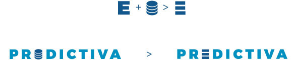
CYLINDER AND BIG DATA
I also made some proposals using the fractional cylinder that represents the world of Big Data and databases. I chose a bold sans serif typeface and interchanged it with the letter "i" using a different tone to balance the weight and better distinguish the letters of the icon.


While working on this proposal, I decided to simplify it to make it the letter E instead of I.
CLOSURE LAW
I replicated the same idea to the other letters remembering my classes in the uni and the law in Gestalt called "law of closure". Our eye tends to close open items and finish unfinished ones. So if there is an unfinished letter, our brain will try to close the lines and "predict" the meaning even when the letters are not as they should be.
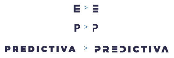
I made some adjustments so that the reflected C became the D and helped the symmetry in the logo. The idea was to unify the letters as much as possible.

In a very similar proposal I closed part of the E thinking that maybe I was removing too many elements from the letters.
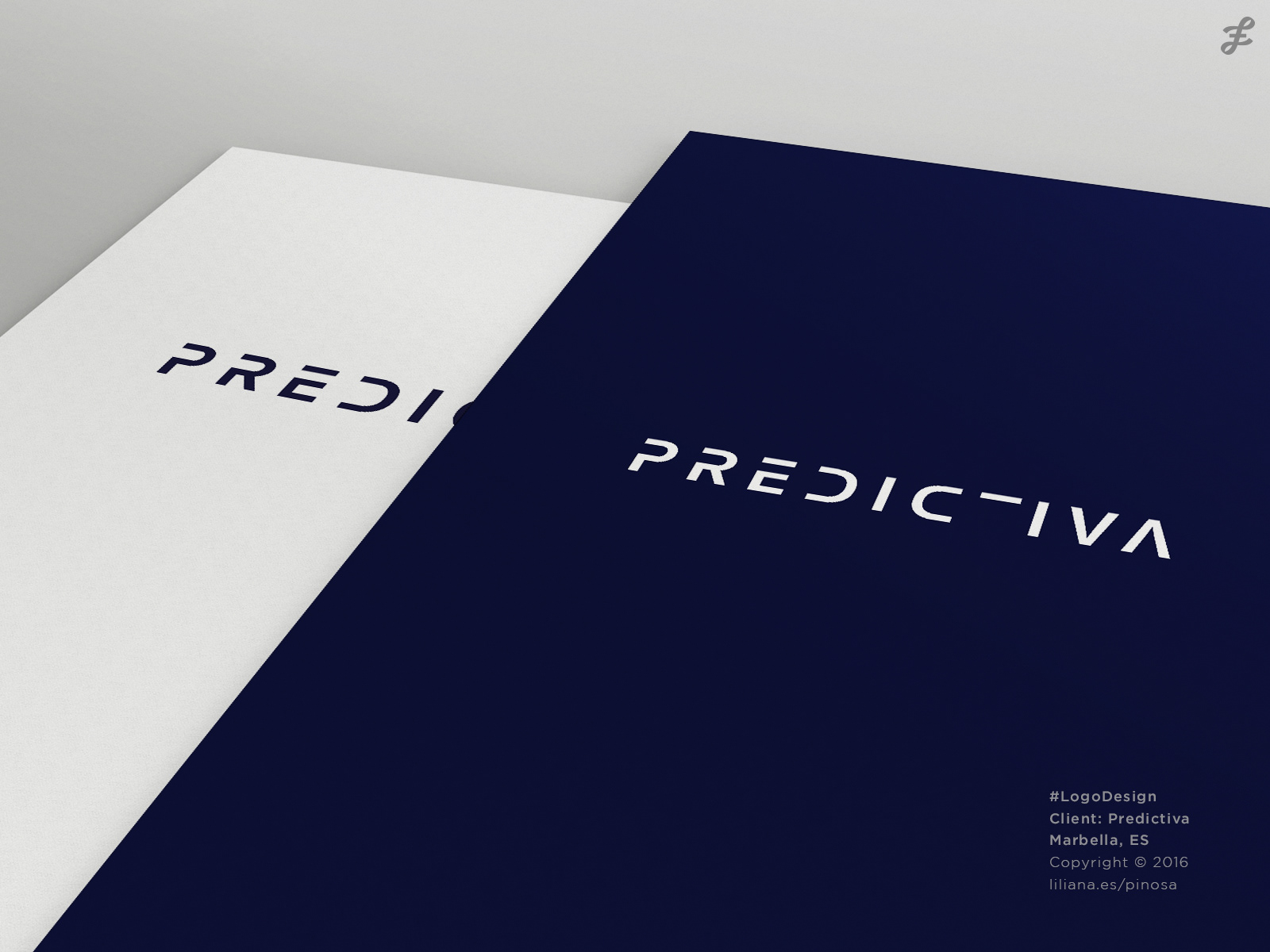
At this point I was very excited about the idea of making the typography even more abstract and going one step further to reinforce the meaning of the name. So I also removed the Stem of "T" leaving only the Bar of this letter.
In my opinion, removing the Stem from the "T" is the key element when thinking about the meaning of the word PREDICTIVA. In fact, whether or not to use the axis of the T makes a huge difference.
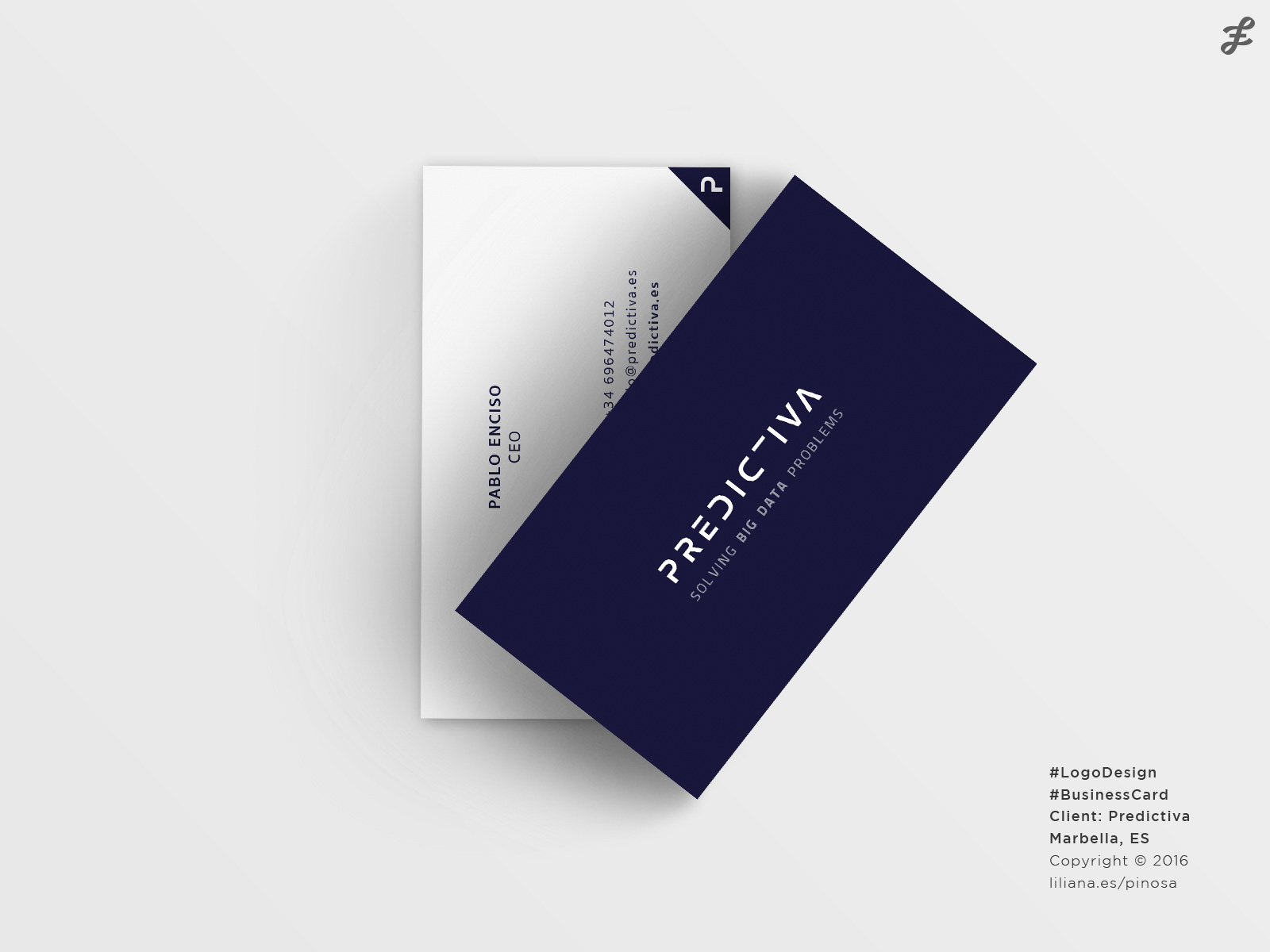
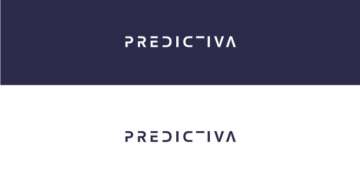
Fortunately, it was the proposal that my client chose and we decided to use the proposed colors, negative as the main version, and we added the slogan "Solving Big Data Problems".