Valentina is from Mexico, living in Granada, Spain, just like me! She reached out to me because she had an exciting project in mind: opening a Mezcalería in Granada. She needed help with creating a logo, menu, visual identity, and overall concept for her new venture.
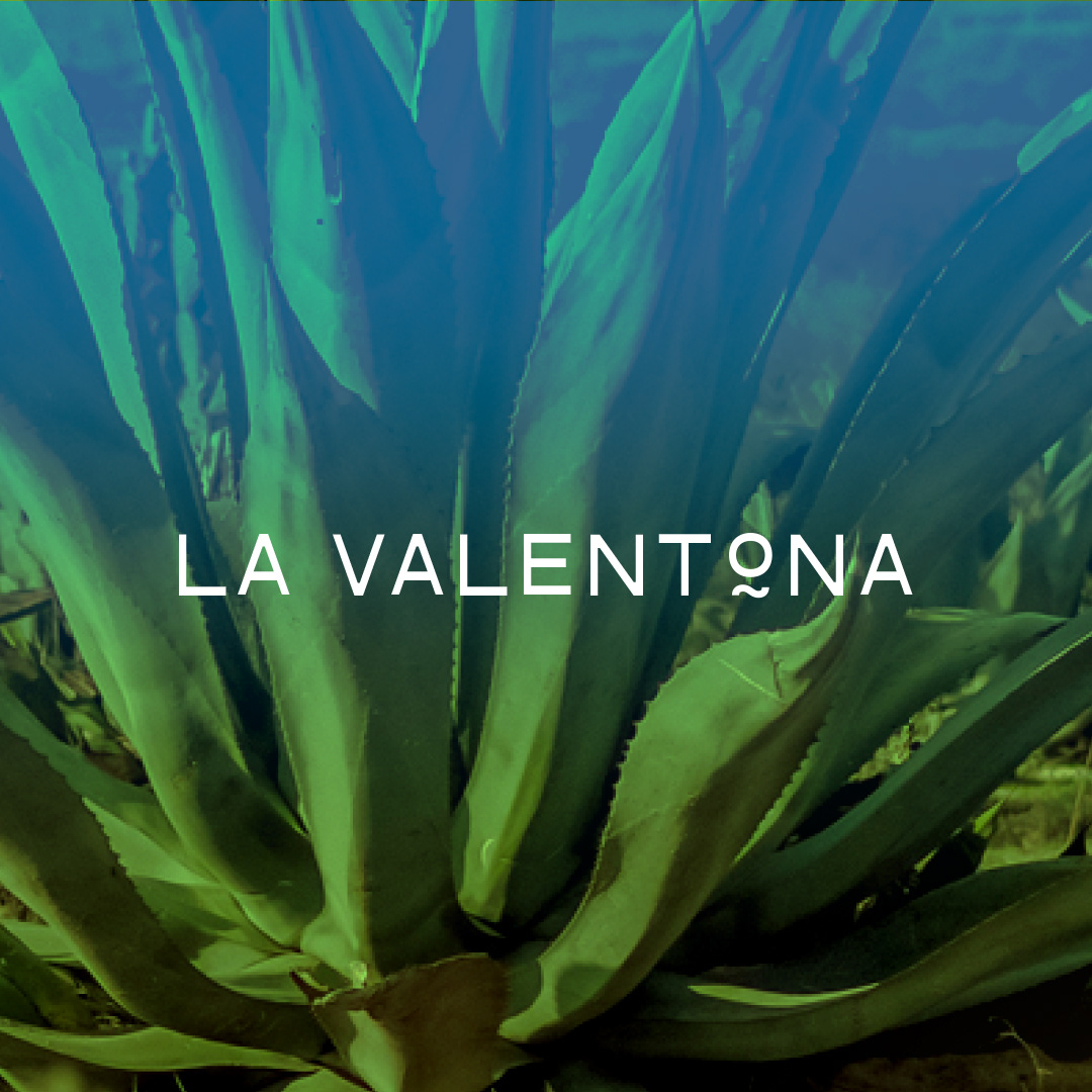
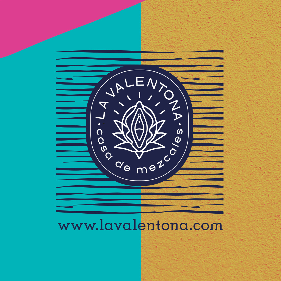
When we met a couple of days later, I instantly felt that Valentina's idea for the name was perfect: "La Valentona," which means "brave" in a feminine way. I encouraged her to embrace it for her project.
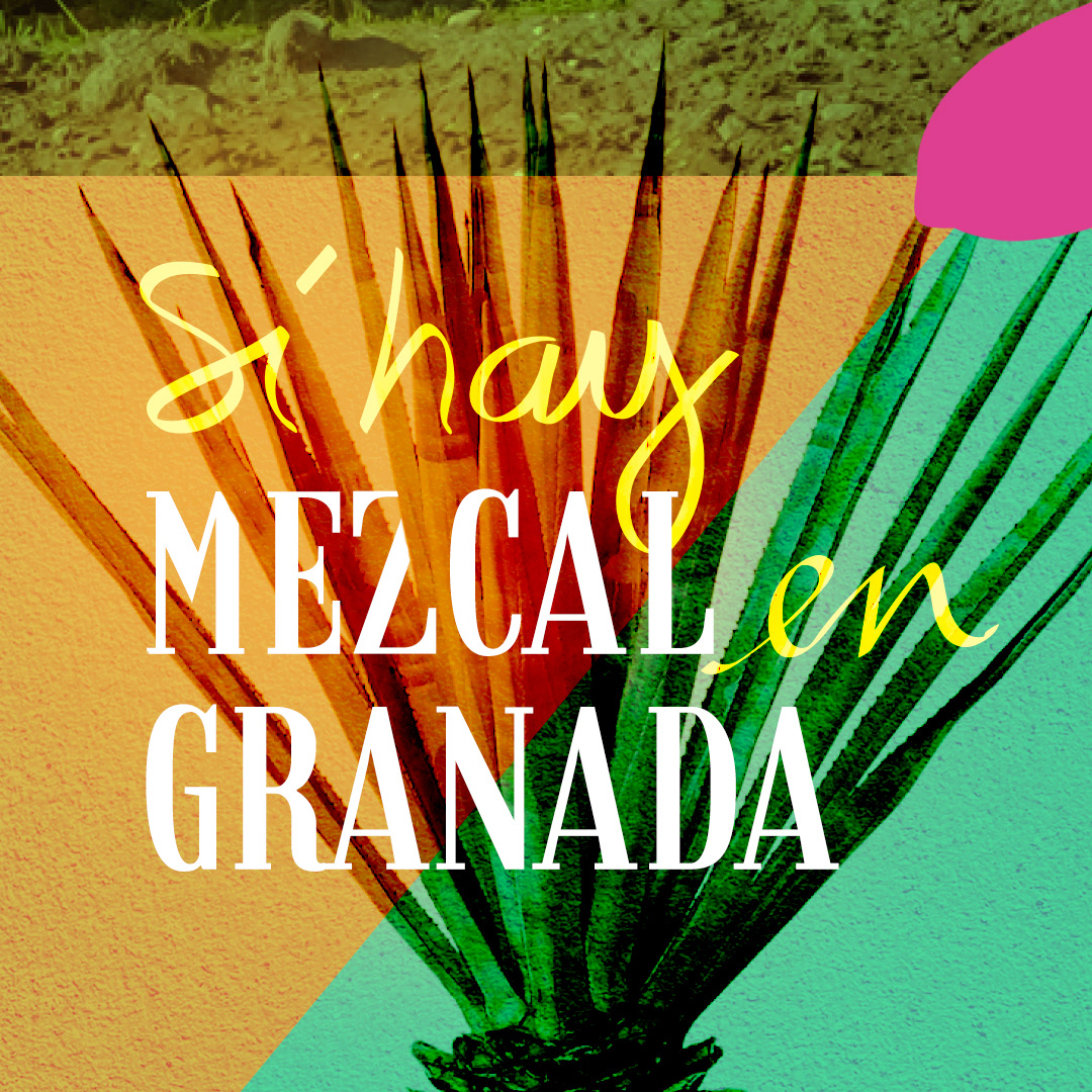
The Mezcalería would be located in the Mercado de San Agustin, which is a lively market in Granada, just a few steps away from the Cathedral. We discussed various ideas for the concept and logo during our meeting.
The Mezcalería would face competition from other Mexican restaurants and shops in Granada. To stand out, we wanted to offer an authentic Mezcal experience that would truly transport customers to Mexico.
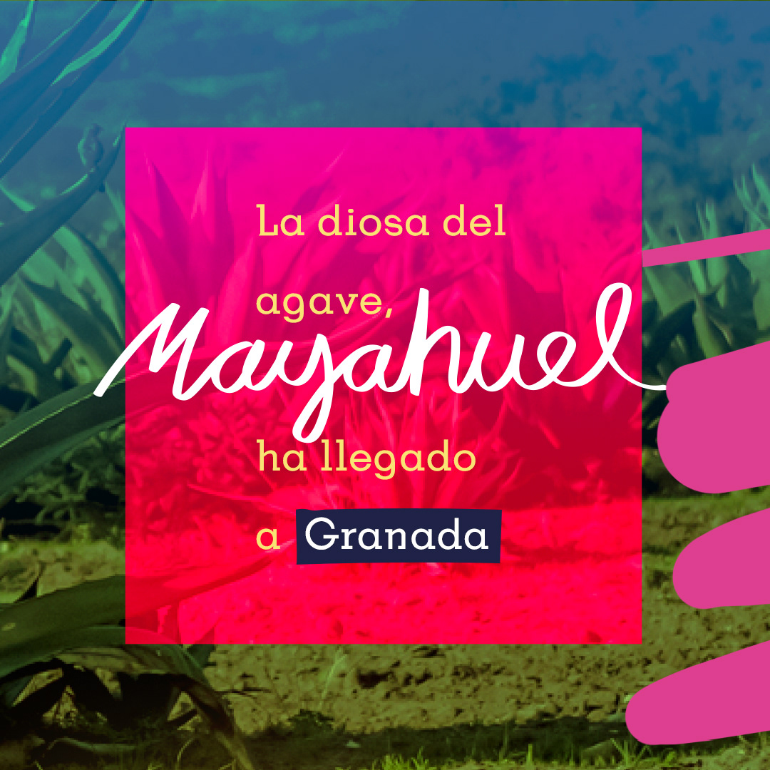
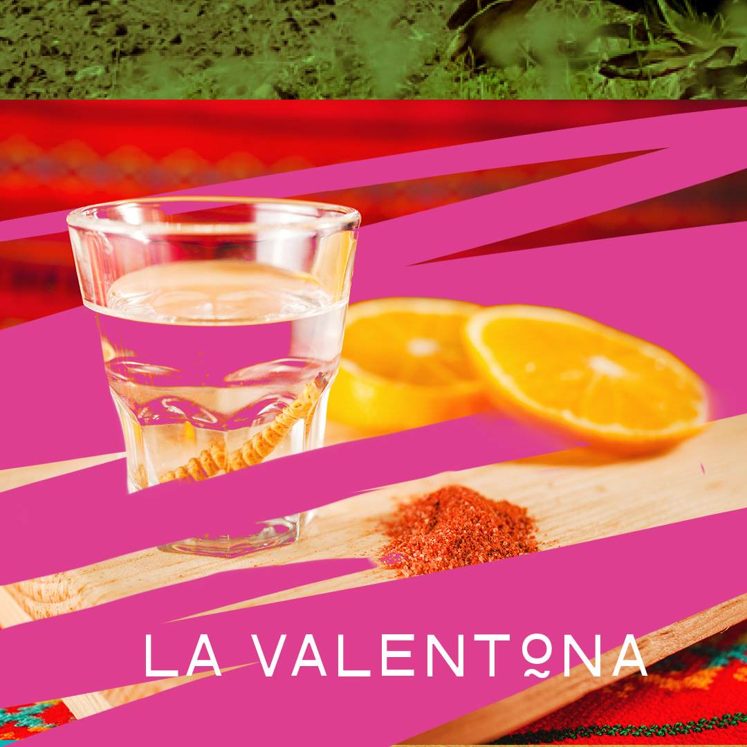
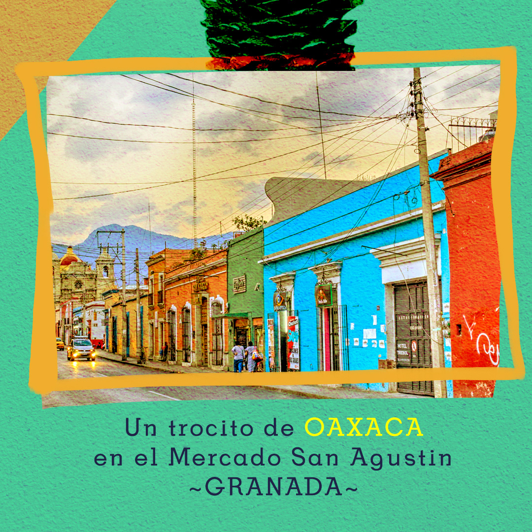
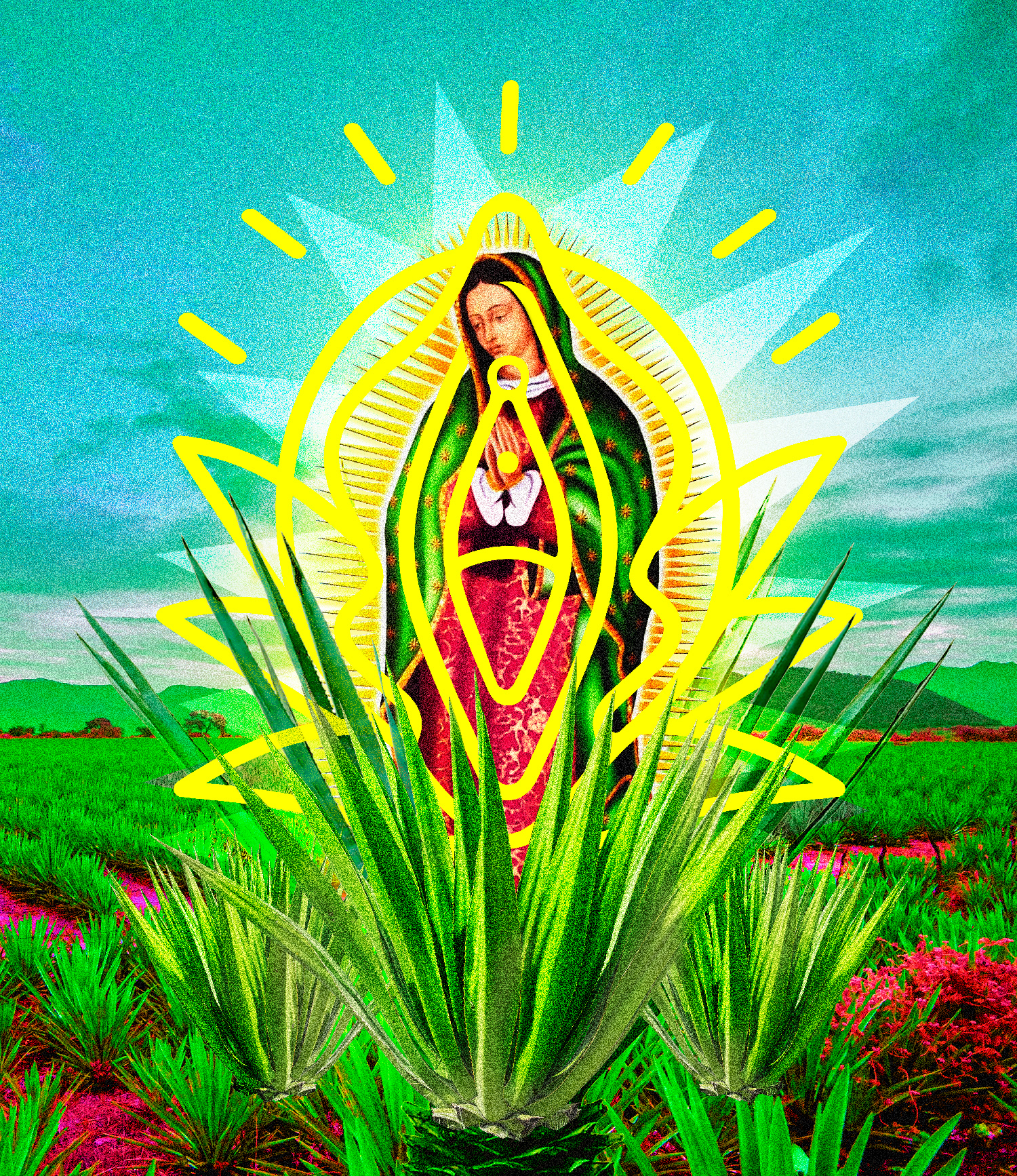
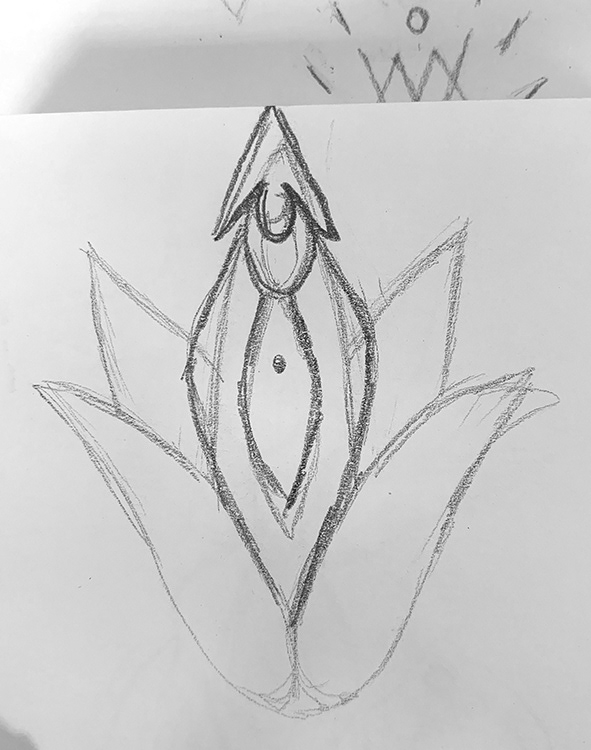
Our inspiration came from the vibrant streets, colorful murals, intricate engravings, and rich culture of mezcal and Oaxaca. We also drew inspiration from the bustling Mexican and Oaxacan markets, with their fresh fruits, lively colors, wooden elements, and tropical atmosphere. Elements associated with Mezcal, like Agave, Maguey, Worm, Chapulin, Orange, and the traditional small glass, played a significant role in our ideas. Additionally, we wanted to capture the essence of feminine strength, symbolizing Mother Earth, ancestry, divinity, the power of creation and Mayahuel, which is the female deity associated with the maguey plant.
We made a conscious decision to avoid using clichéd images such as Frida Kahlo, typical graphics like papel picado, sarapes, Mexican flags, or Mexican hats. Instead, we looked to incorporate the charm of old Mexican markets and pharmacies, the traditional Altar of the Dead, and the urban art found in Oaxaca, such as colorful murals and detailed engravings. Feminine strength was an important element we wanted to convey through the design.
Our main goal was to create a Mezcal sanctuary, where customers would feel a sense of reverence and awe, combined with sophistication, simplicity, and cleanliness
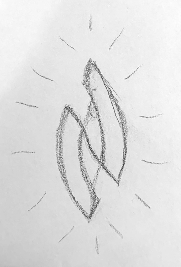
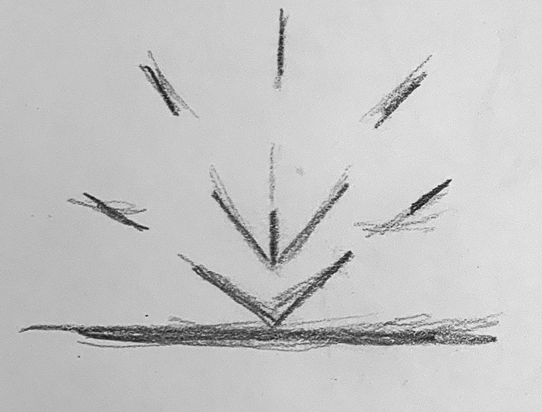
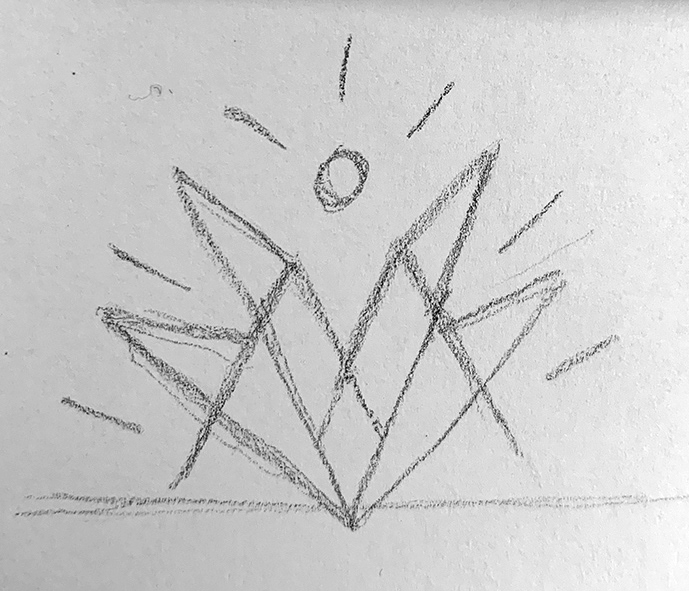
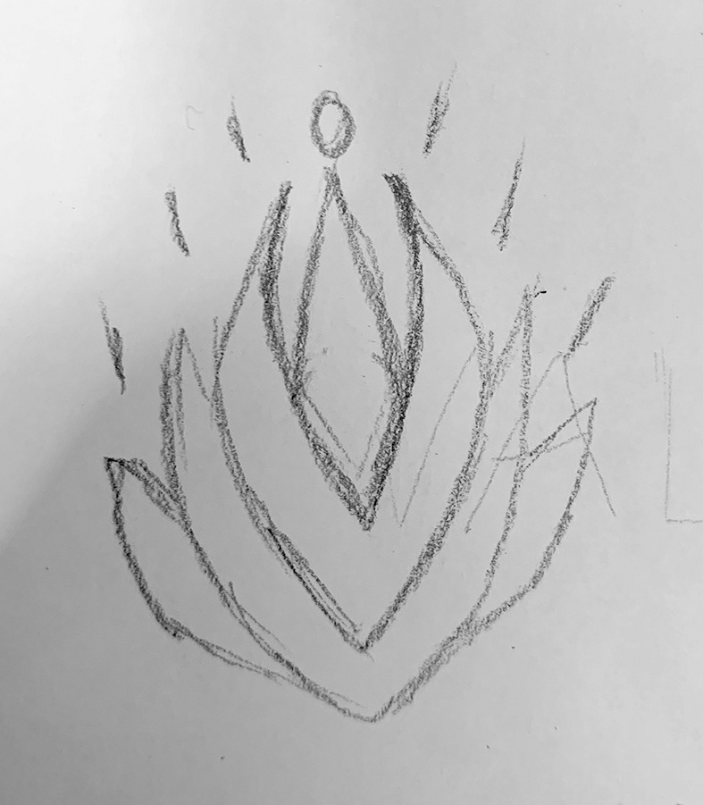
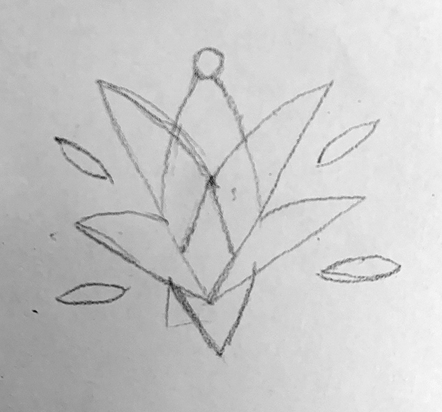
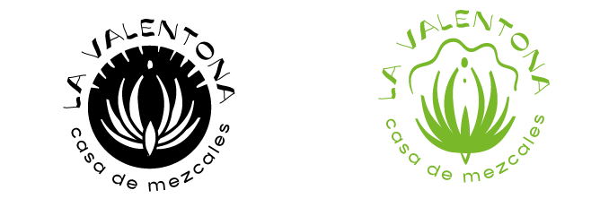
First logo drafts
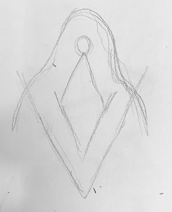
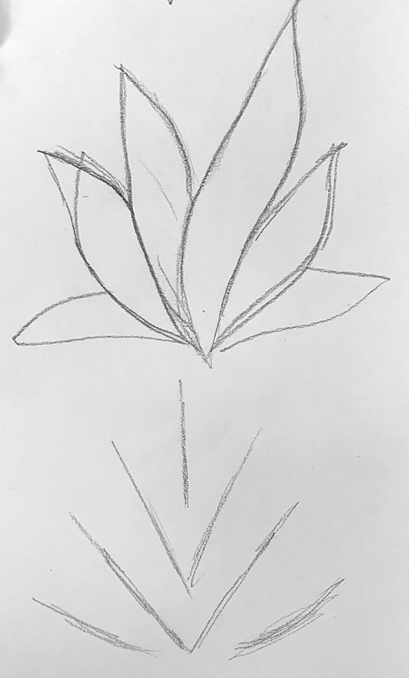
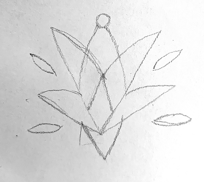
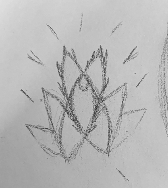
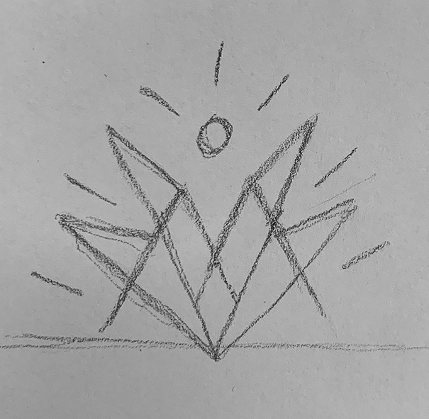
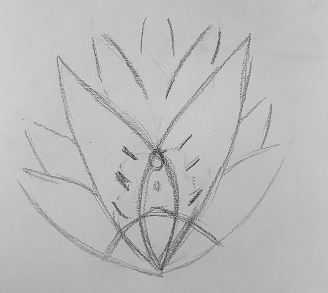
For the initial logo drafts, I began by incorporating the angled shape of the agave plant, which resembles the letter V. I combined these elements to create the first versions of the logo. To enhance the divine aspect inspired by Mayahuel, I added "halo" lines around the design.
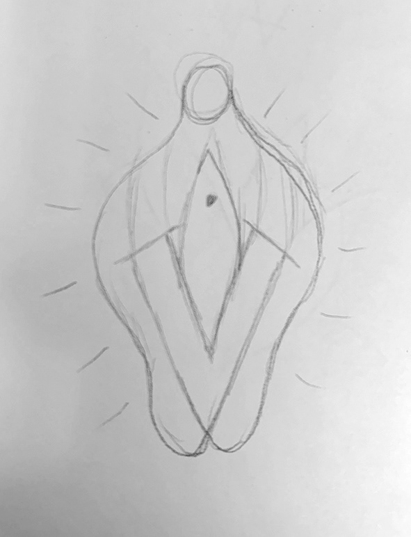
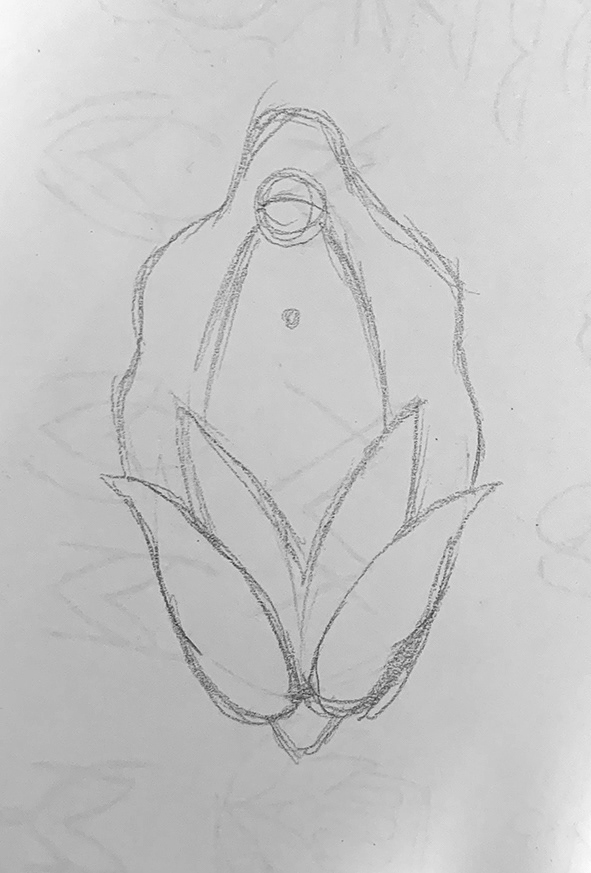
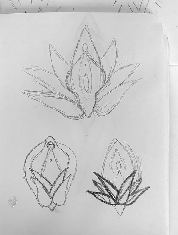
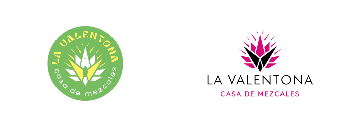
Presenting the initial ideas to Valentina
Taking inspiration from the concept and incorporating the elements of Agave, Mayahuel, and the Vulva, I created several logo options to present to my client. Usually, I deliver black and white versions, but this time I decided to add color to some of them since we had previously discussed using magenta, yellow, and orange as potential color choices.


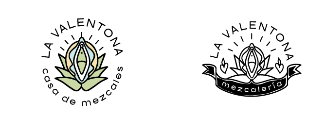
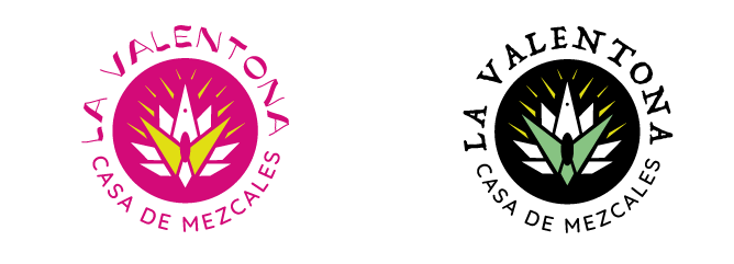

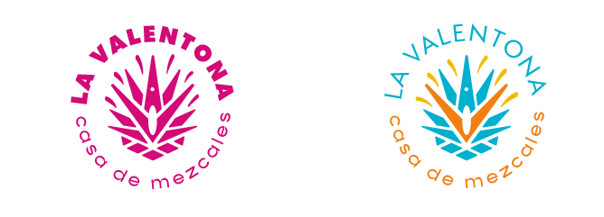
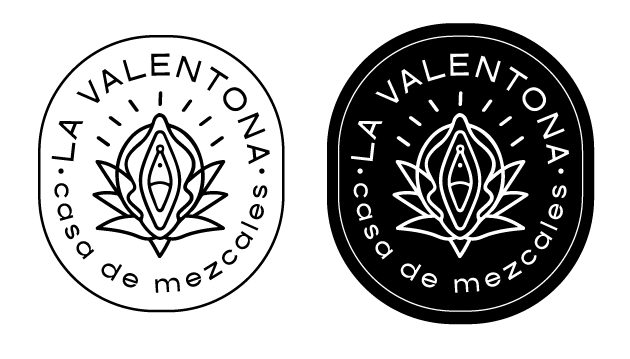
After careful consideration, my client selected three logo options that resonated with them the most. I took their feedback into account and made the necessary adjustments to further refine these options. Once we finalized the logos, I applied them to the exterior of the shop to visualize how they would appear in real-life.
Final version for the logo.
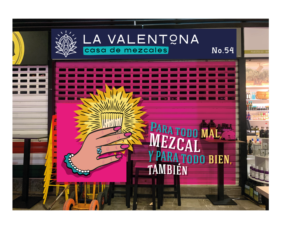
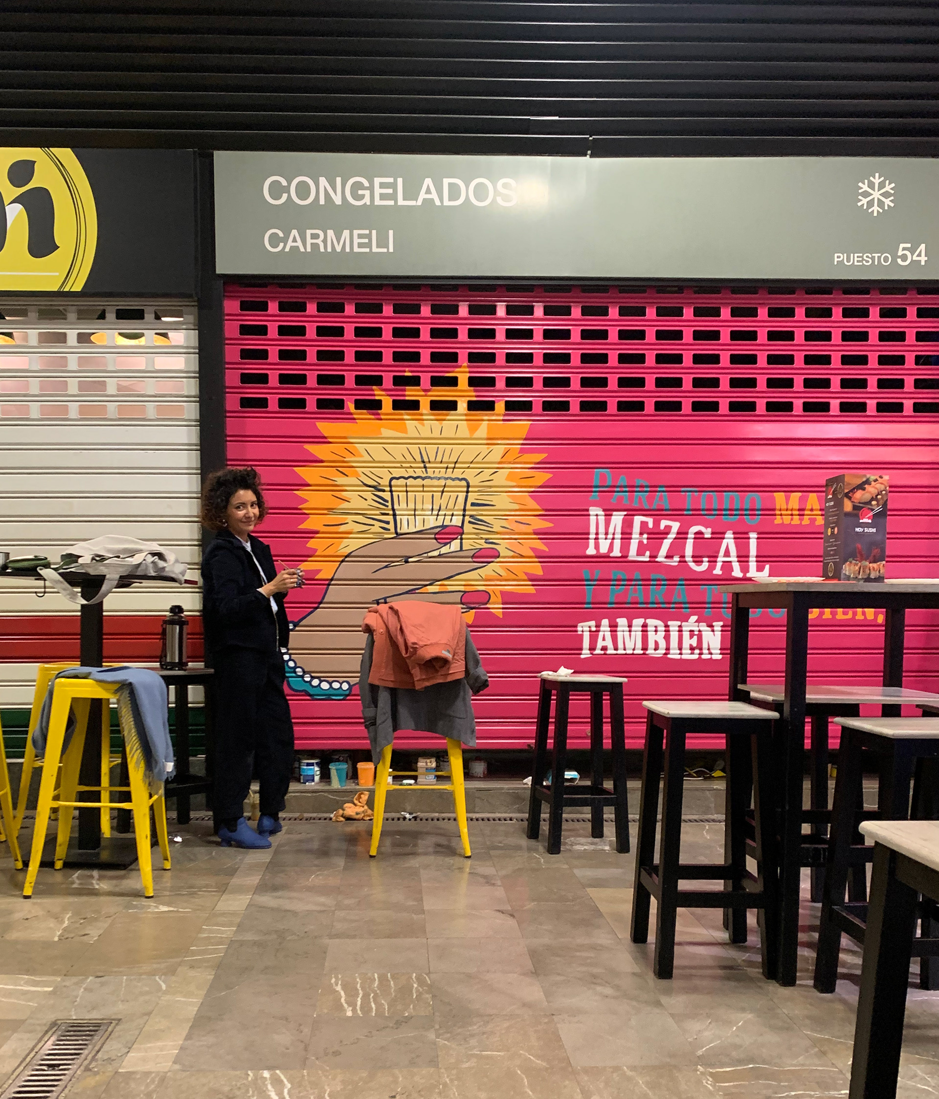
Outdoor signage
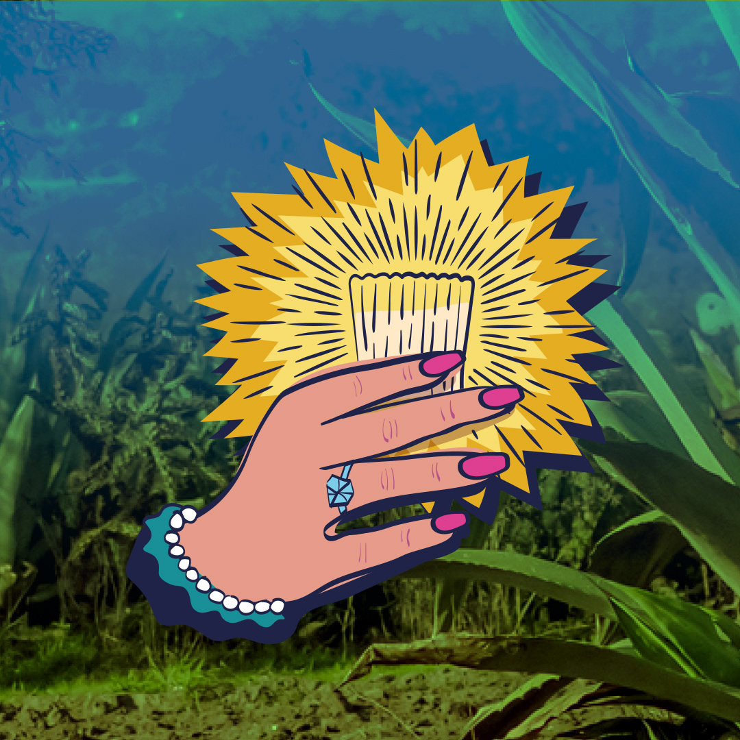
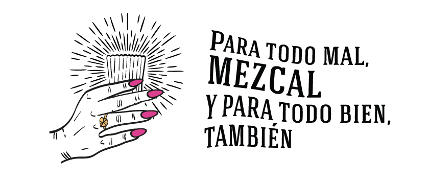
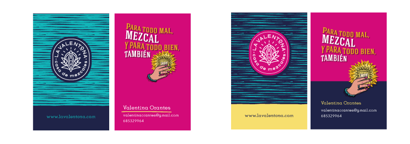
We wanted to create an eye-catching illustration for the entrance door. I incorporated the famous Mexican saying: "Para todo mal, mezcal y para todo bien, también" which translates to "For all evil, mezcal, and for all good, too". To add a touch of authenticity and symbolism, I included the traditional mezcal glass held by a feminine hand.
Business Cards
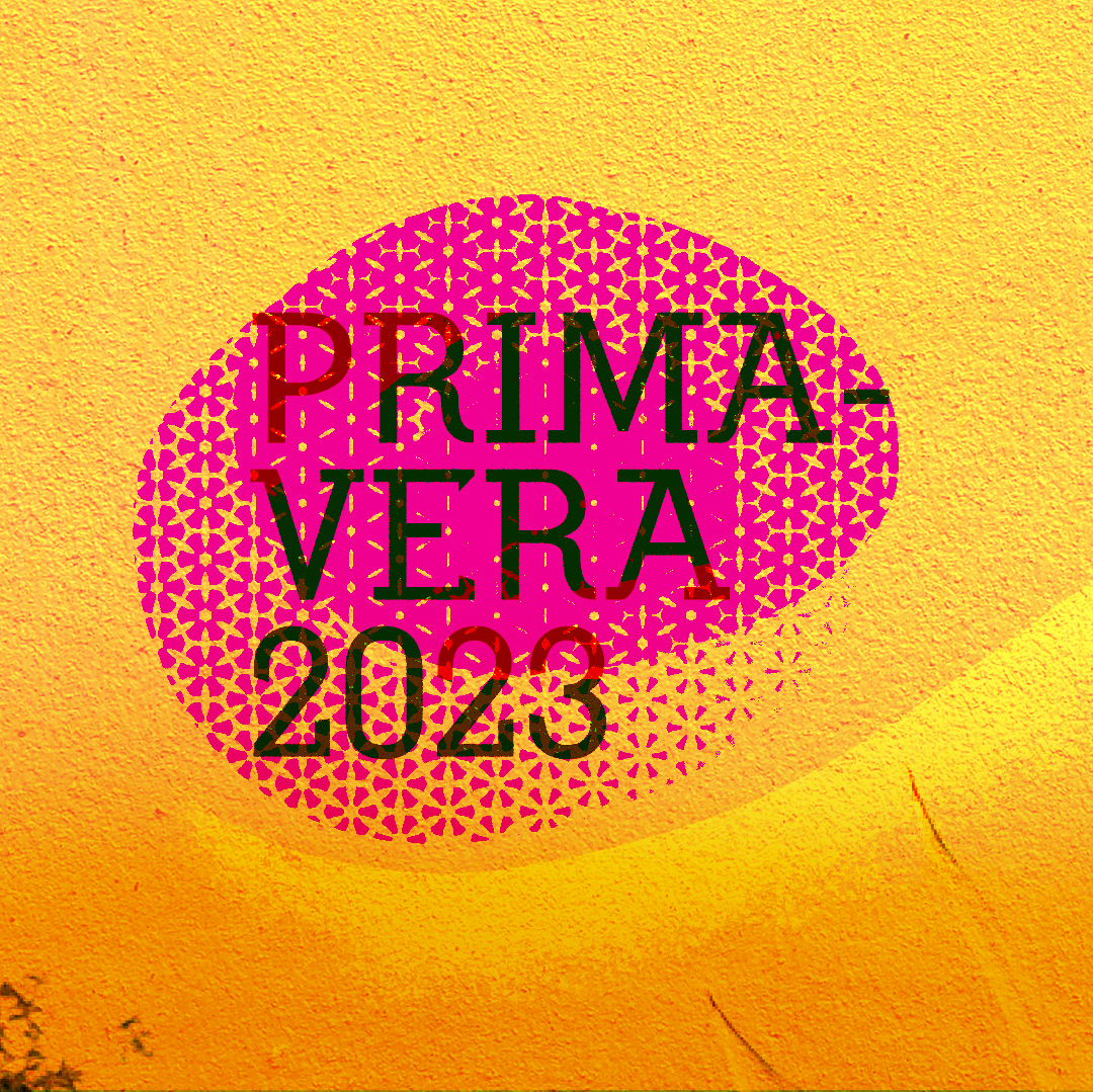
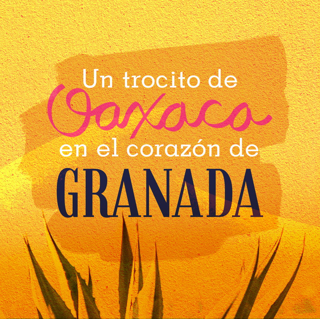
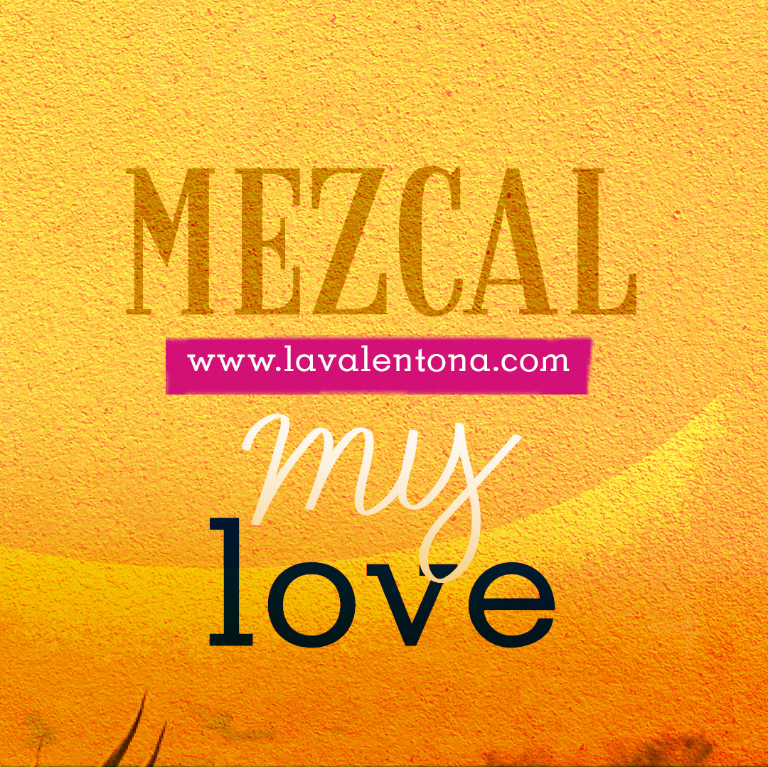
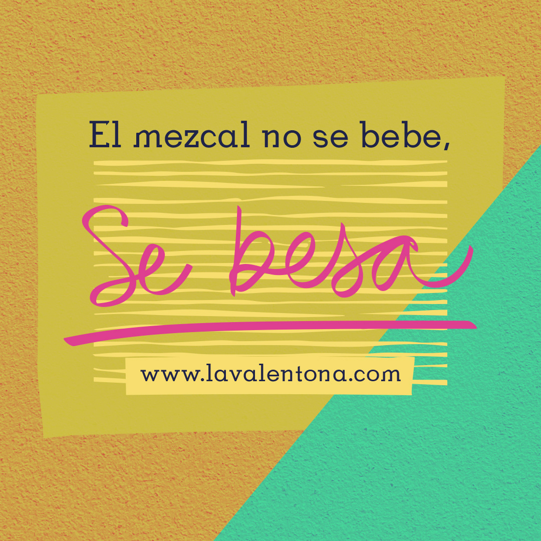
Social media imagery