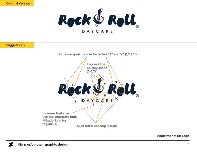
The logo
The client contacted me to help unify and refresh their branding design. I started with the logo and suggested some modifications and adjustments to improve legibility.
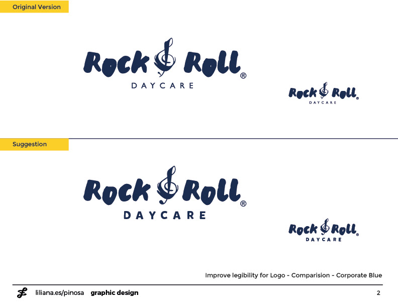
Black can be too formal
I also suggested using a dark blue colour for the logo and replace the black to bring joy.
Let's play!
I added different organic shapes and colourful elements to bring dynamism and freedom to the brand.
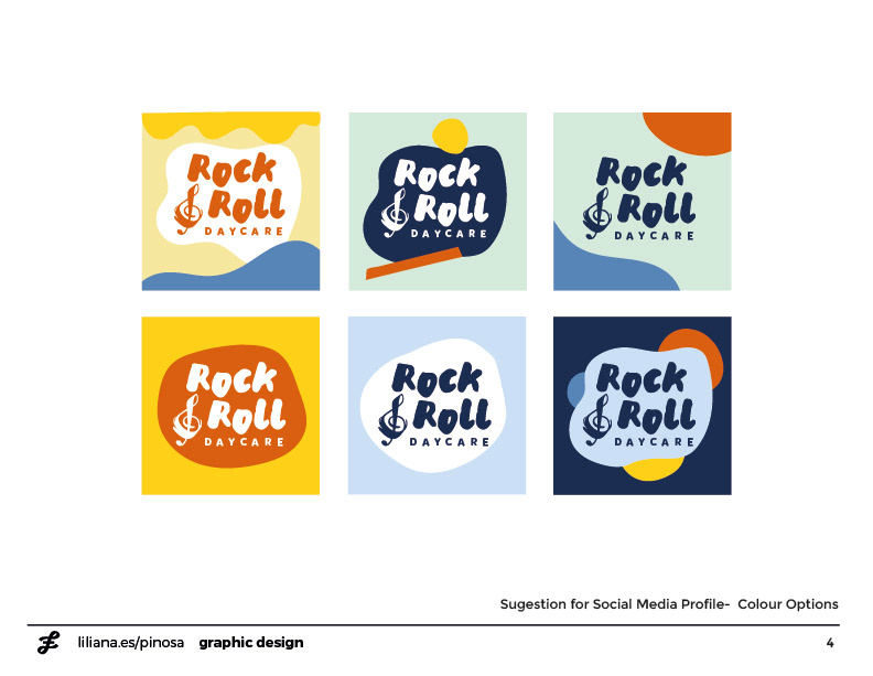
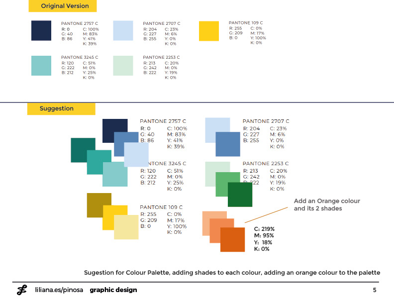
More colour!
I suggested different shades to their basic colour scheme palette and added a new orange tone.
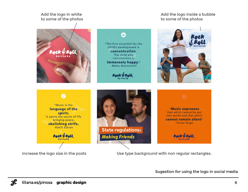
Social Media Imagery
I also suggested different ways for the logo to be present on their imagery for social media.
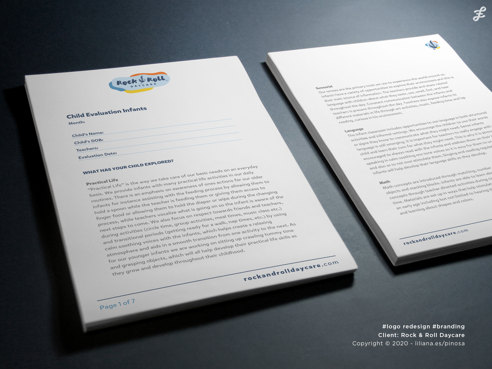
Internal forms design
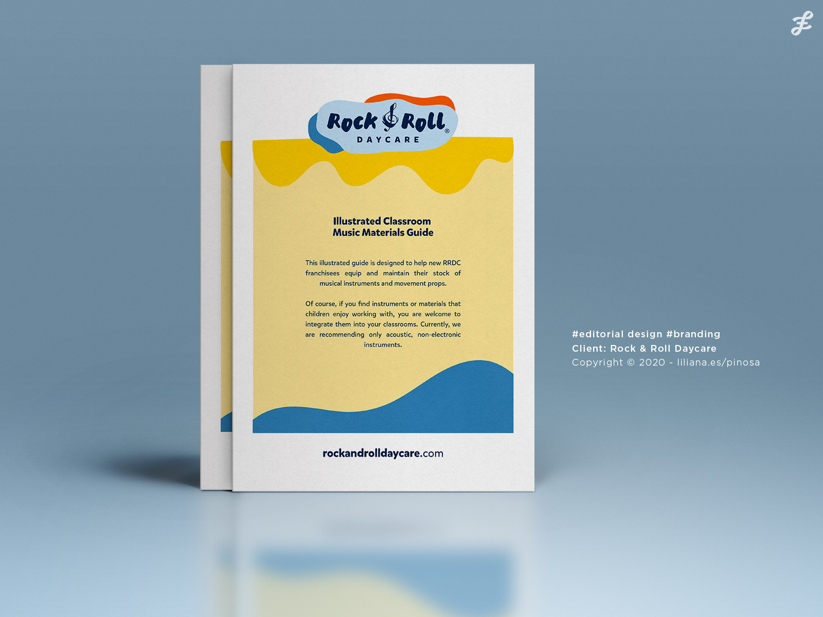
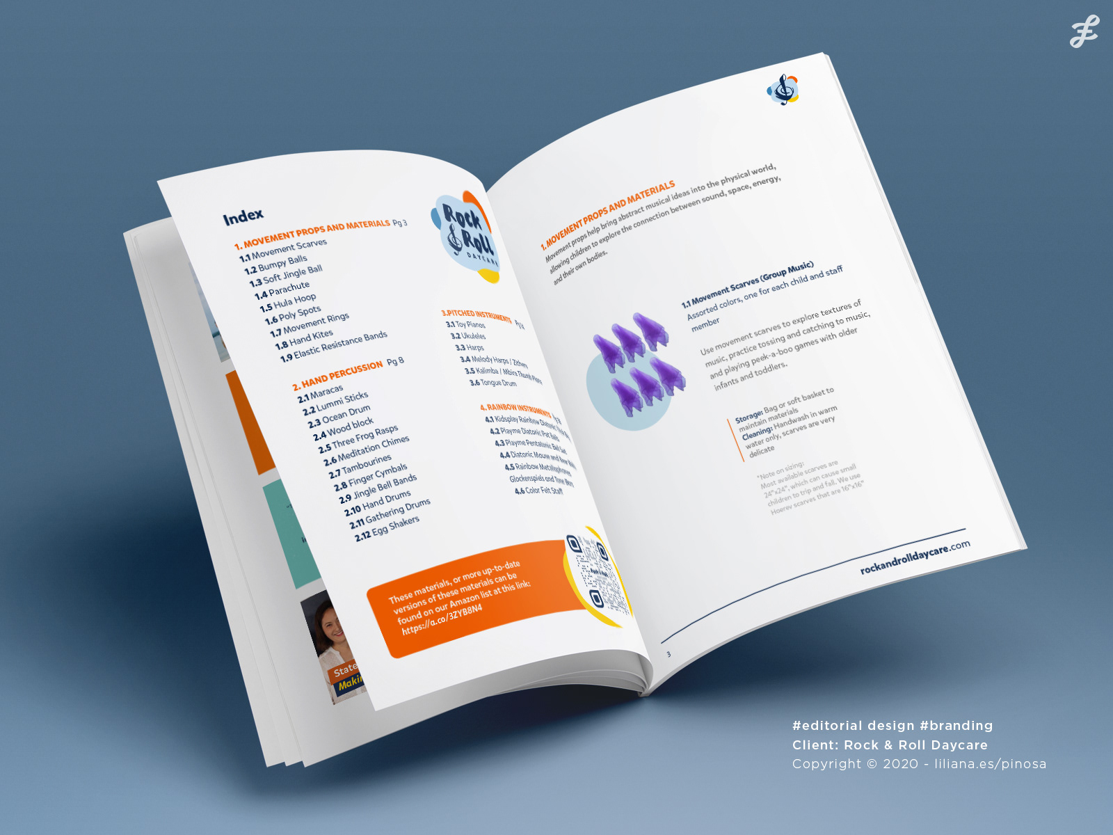
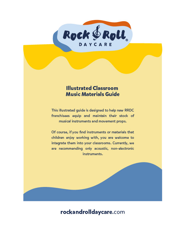
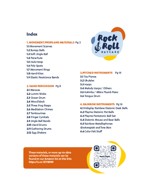
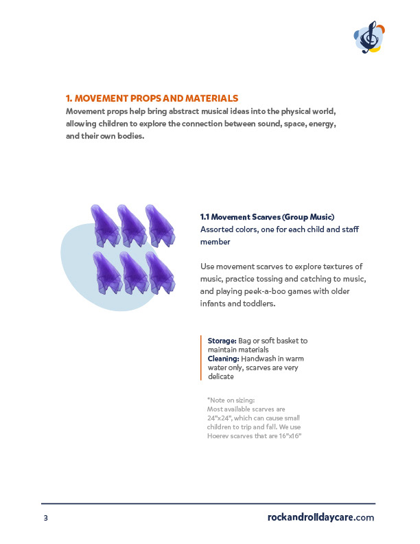
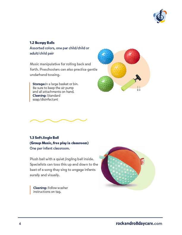
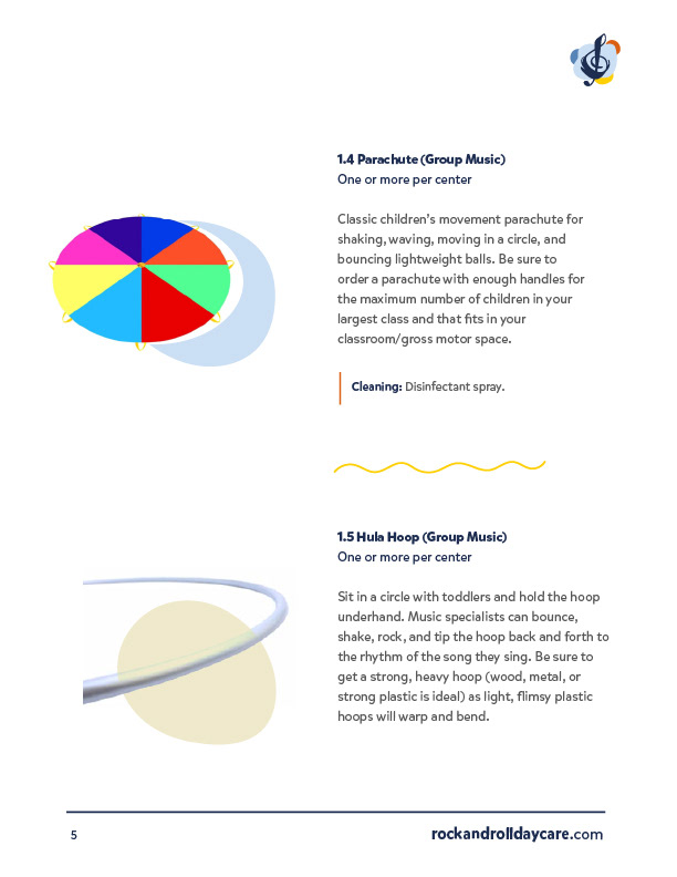
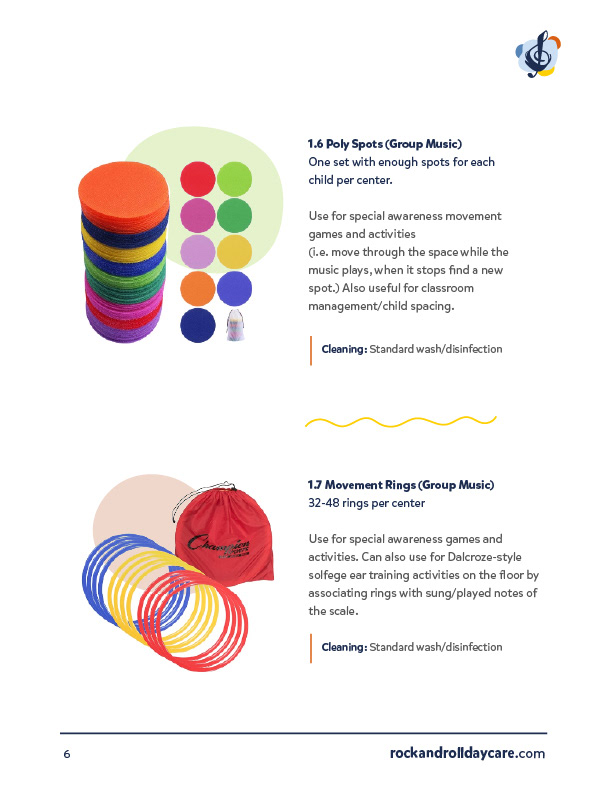
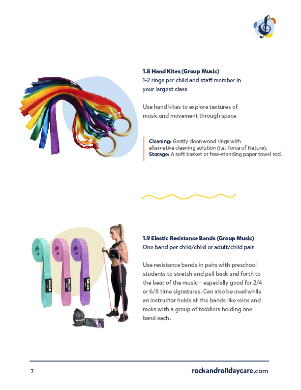
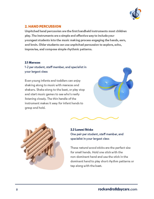
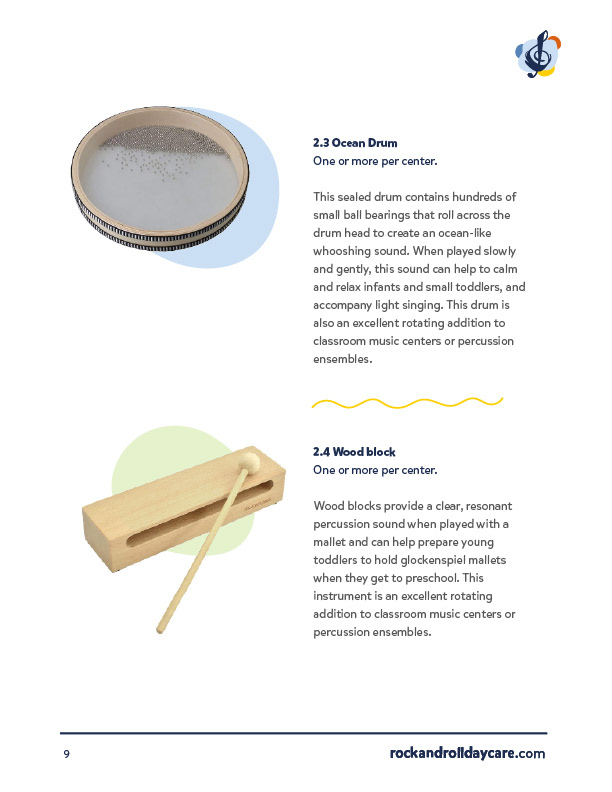
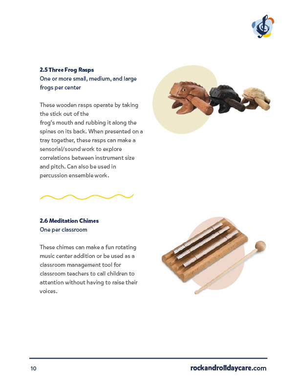
Music Materials Guide Design